Building Beauty: Week 5
Loads of activity this week! We’re in the middle of our furniture project and planning our individual project. We also had two super interesting lectures; one on the practical process of using mockups, and one on the more theoretical side of Alexander’s ideas. We had some great discussions in Nature of Order and better articulated where we should focused in Beautiful Software.
Studio: Furniture
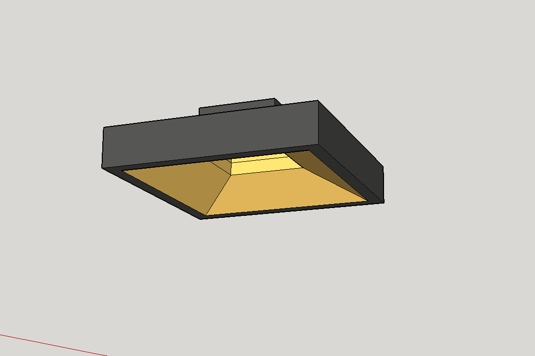
My furniture project is a floor lamp for my living room.
I want a similar type of floor lamp for the empty corner of my living room. There are a few gotchas in constraints:
- The lamp on the right is a little too bright. I will try a lower wattage bulb, but I think it’s a bit down to the height. It’s not so bad in the right corner, since it can be angled away from the sofa a bit more in the direction of the bay window.
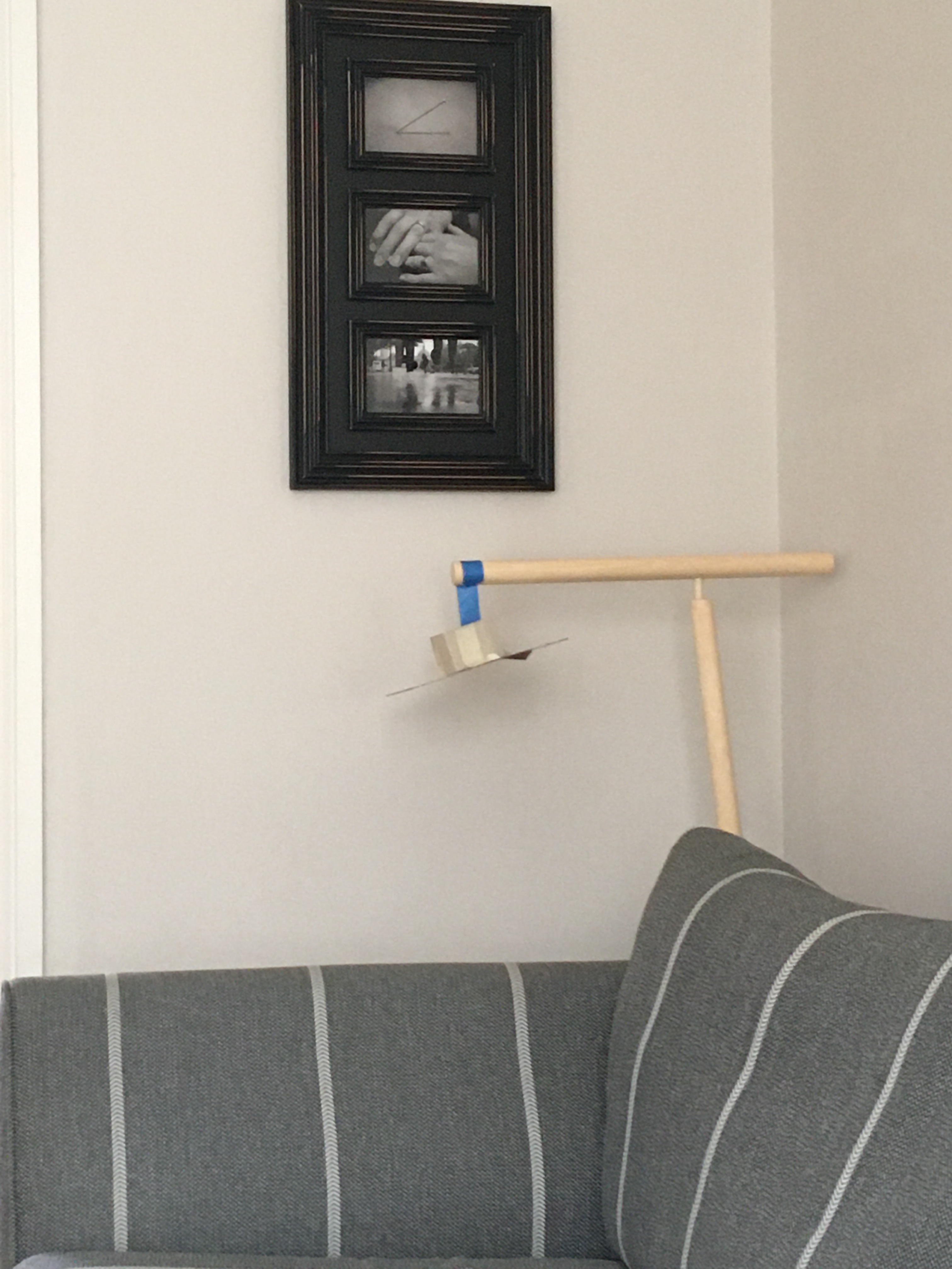
- The small picture frame on the wall separating the rooms will closely interact with whatever lamp I create. I’ll have to be careful about how that works.
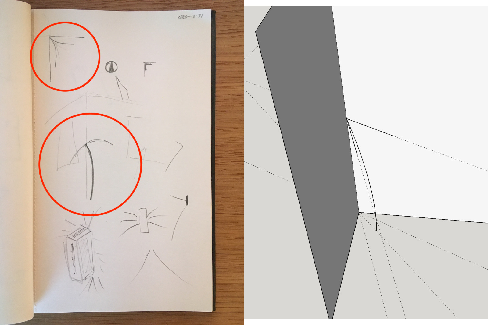
I think I count 100+ sketches, but I kept coming back to an early version. My tutor Ana agreed that the circled one has the most feeling and elegance. In the end, I decided to just try it out in a mockup to try to break out of the frustration.
Building the mockup actually made me feel quite confident in the idea.
As well as the shade being an echo of the existing lamp (stumpy part for the bulb which widens for the shade), I quite like the kind of local symmetries and alternating repetition formed by the mirroring of the “T” and “L” shapes.
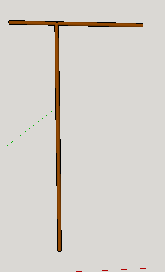
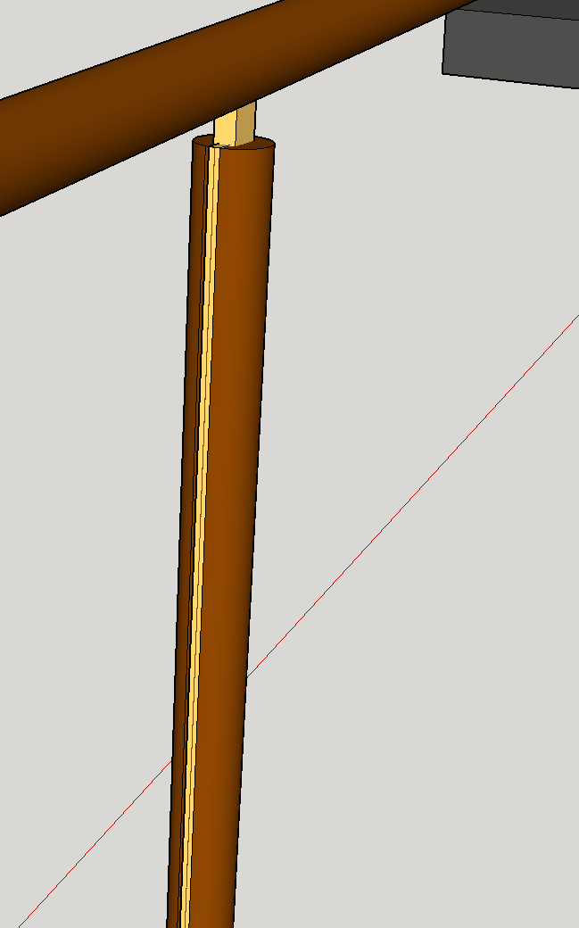
I couldn’t quite convey my feeling in sketches for the underside of the shade, so I mocked that up in SketchUp.
Or suggested experimenting with something that uses the wall itself as part of the form, and came up with this idea of leaning the main stem of the lamp leans into the corner and then the “sticks” that would hold the shade(/s) come out from the corner.
I kinda like this to a degree, but I don’t have as much feeling for it compared to the lamp above. To me, this one feels a bit like it’s trying too hard to scream “look at me!”
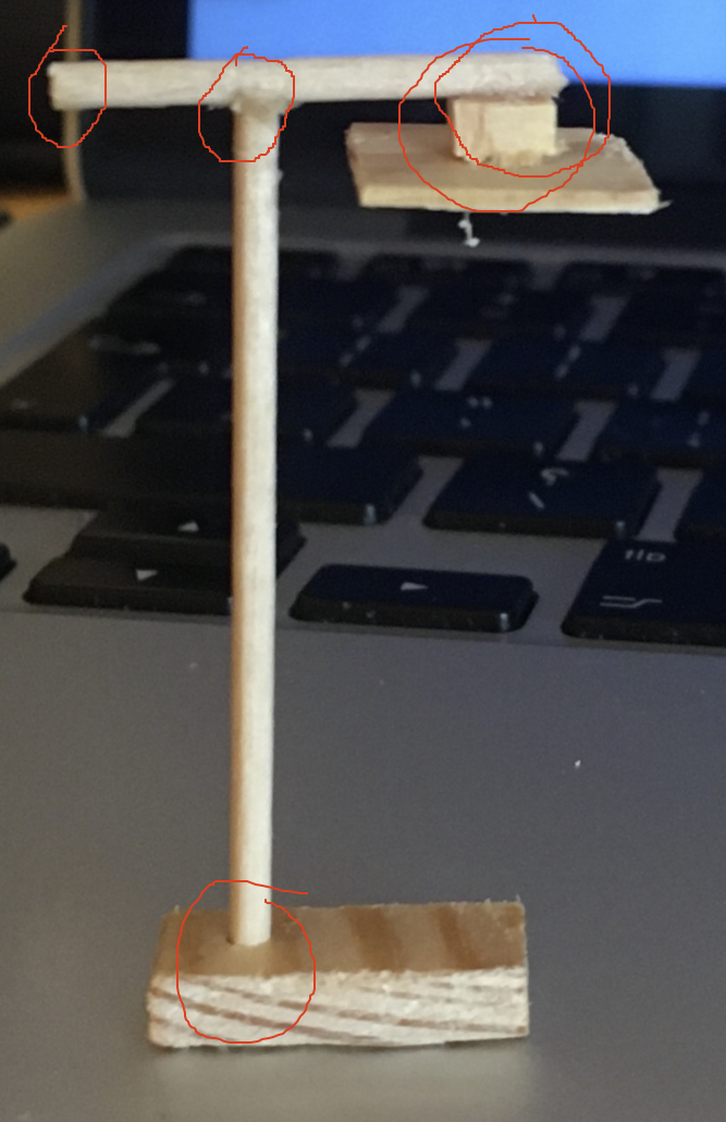
In my tutoring session we started talking about the details of the model. Ana introduced me to the idea of “latent centres” – essentially, sub-centres that exist in the main geometry of the form. These are prime opportunity locations for adding more coherence.
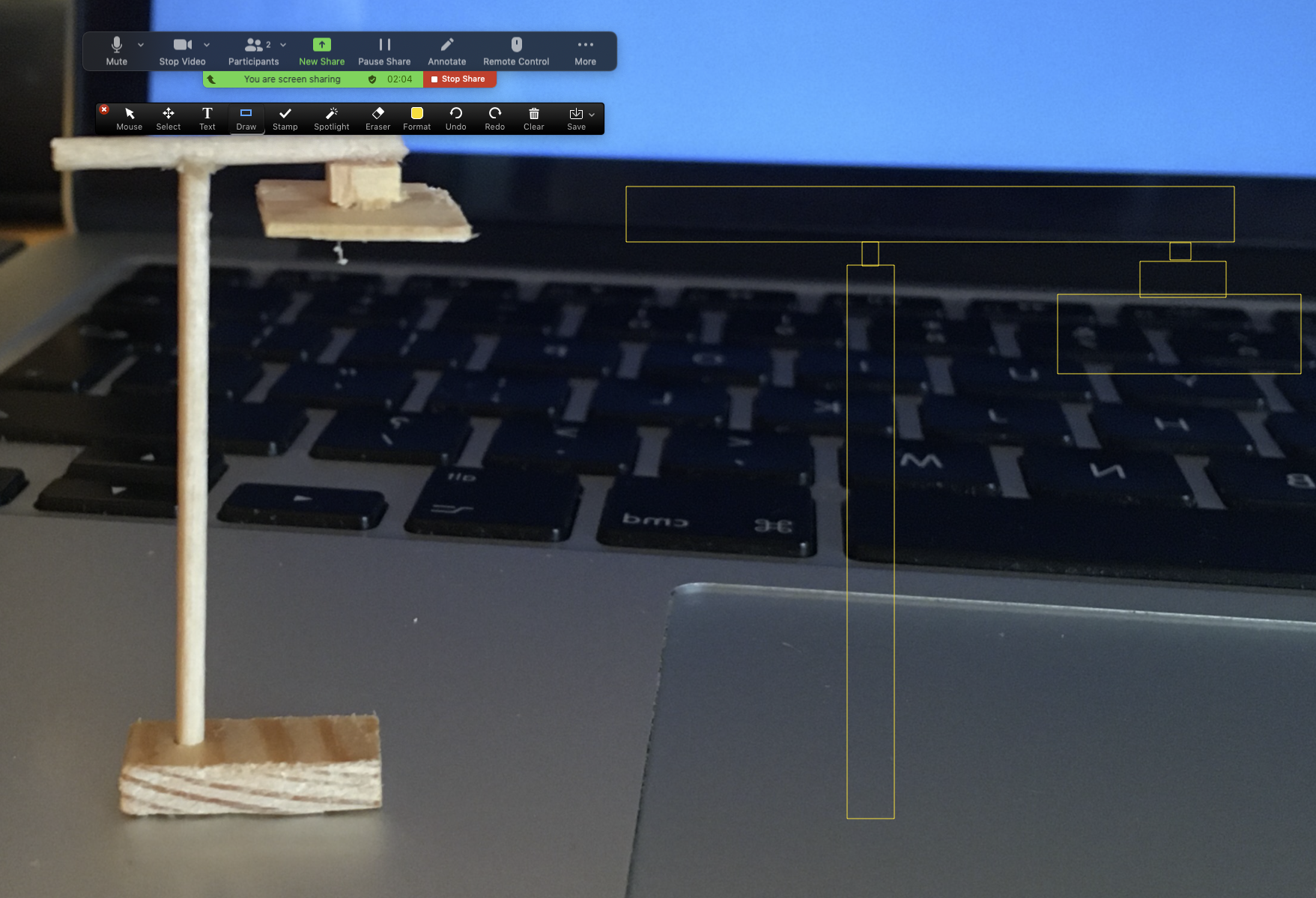
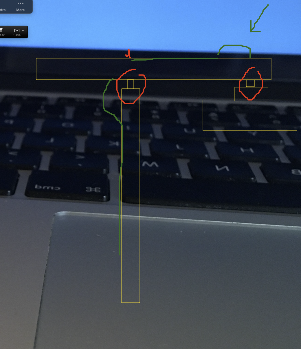
We started talking about how the cable will run. We had various ideas that we went over, and then started actually drawing them as annotations. This kick-started some really great conversation and back and forth.
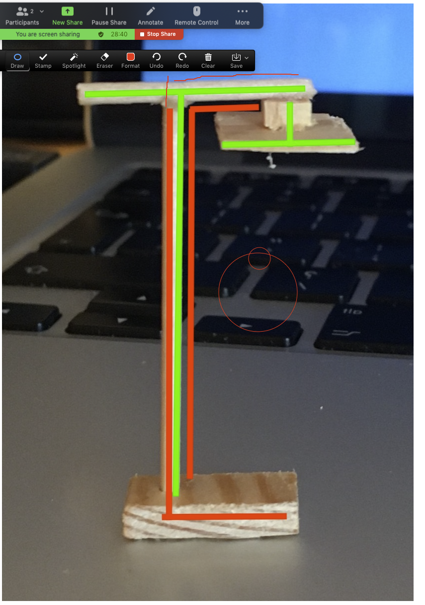
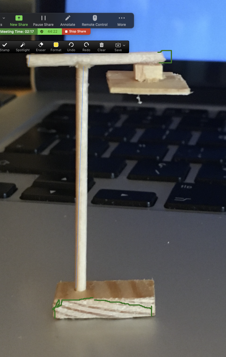
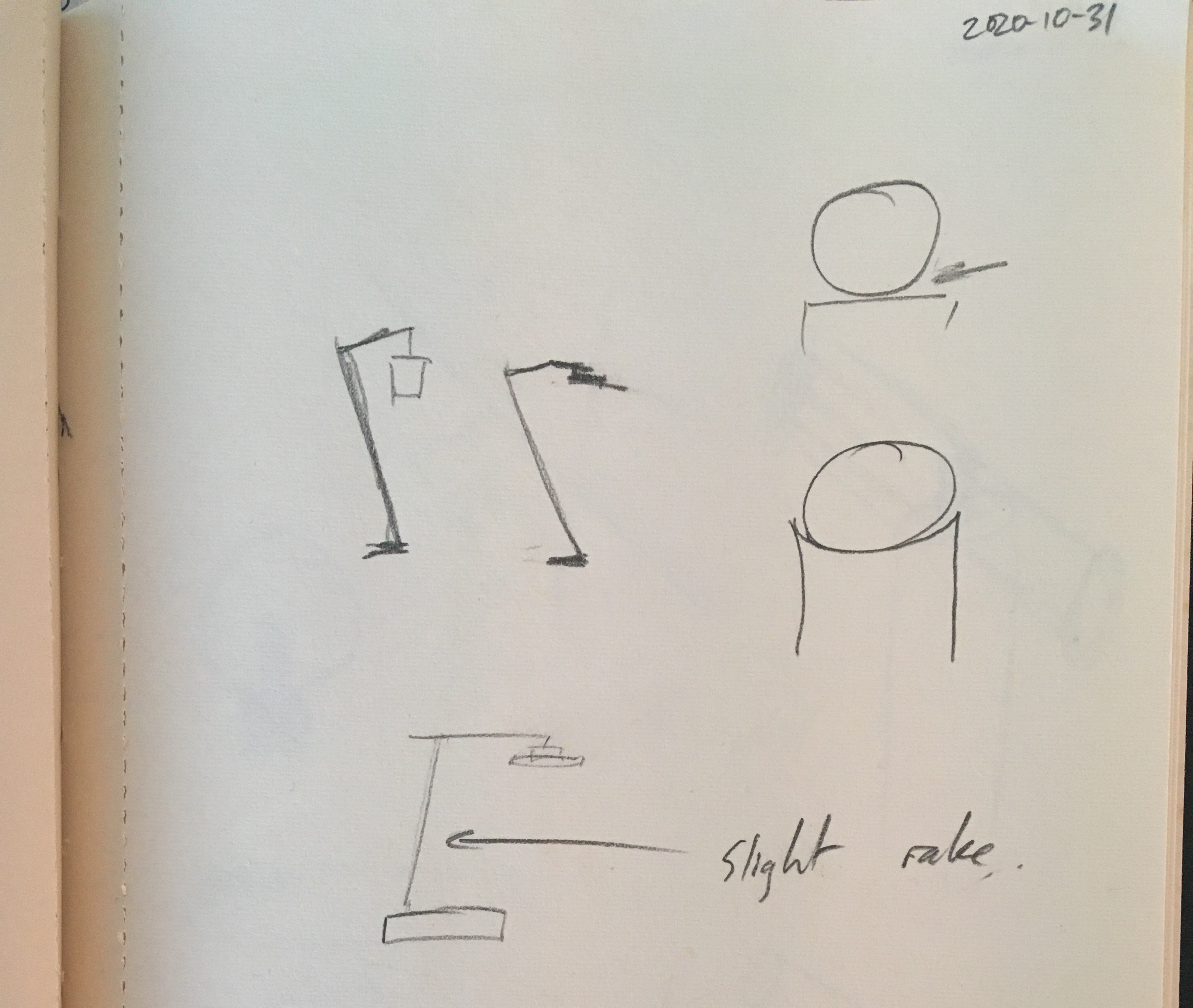
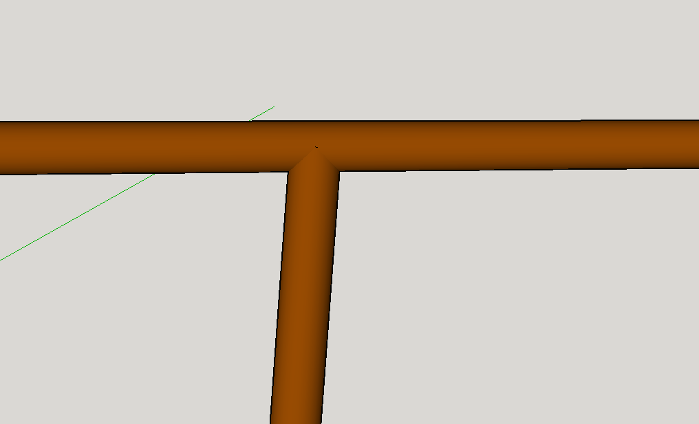
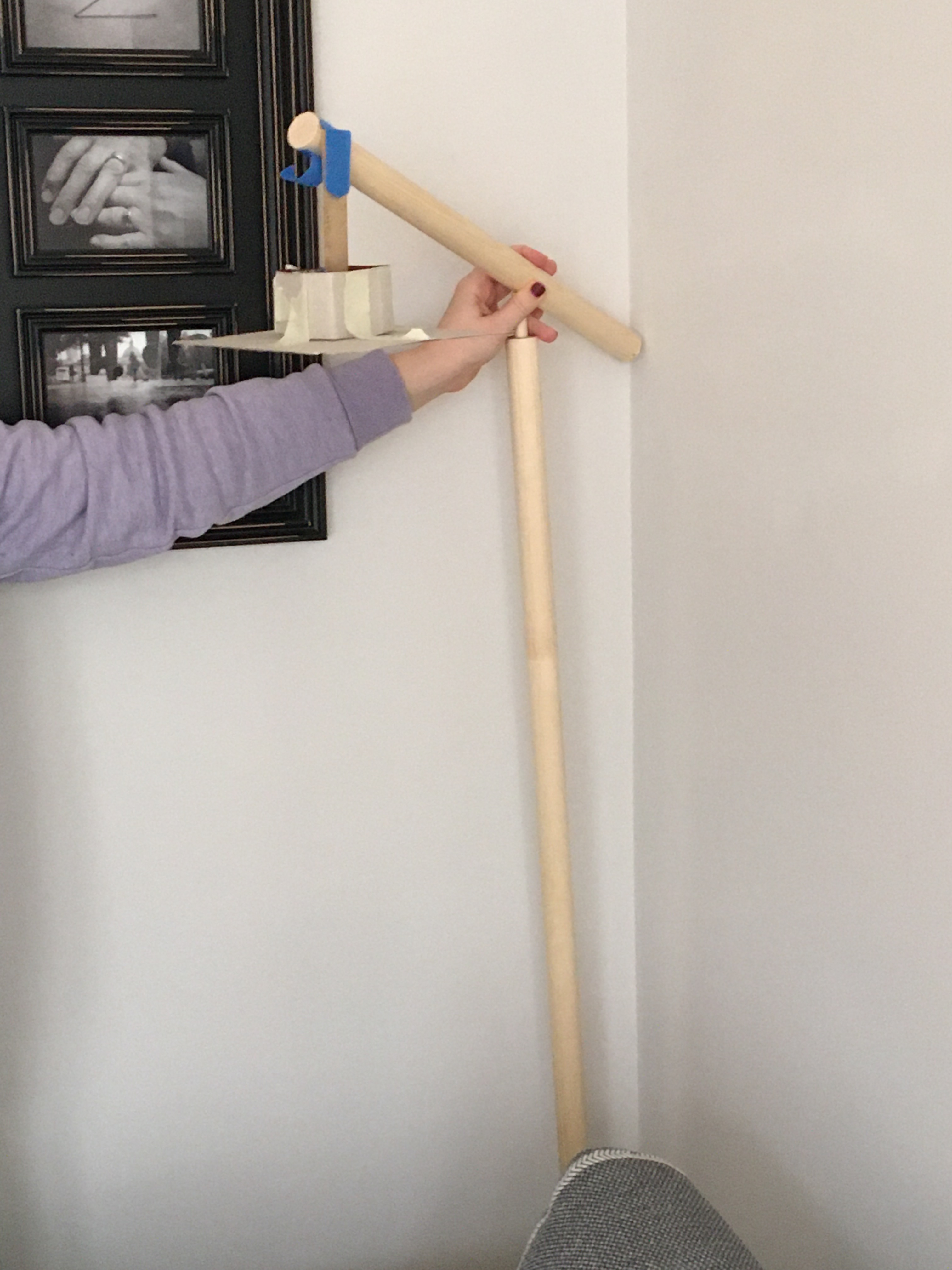
One thing I noticed (that’s hard to convey in picture form) was that the vertical pole in the model (because it was fairly hastily put together) isn’t super secure. But this turned out to be really interesting. Giving the pole a tiny amount of rake helps convey some of the movement that’s in the initial sketch. I’ve mocked this up in the thin blue line.
This got us talking about the angles on the base of the lamp. Ana suggested that it could feel less heavy if it’s tapered off at the front. This mirrors the chamfering of the underside of the shade.
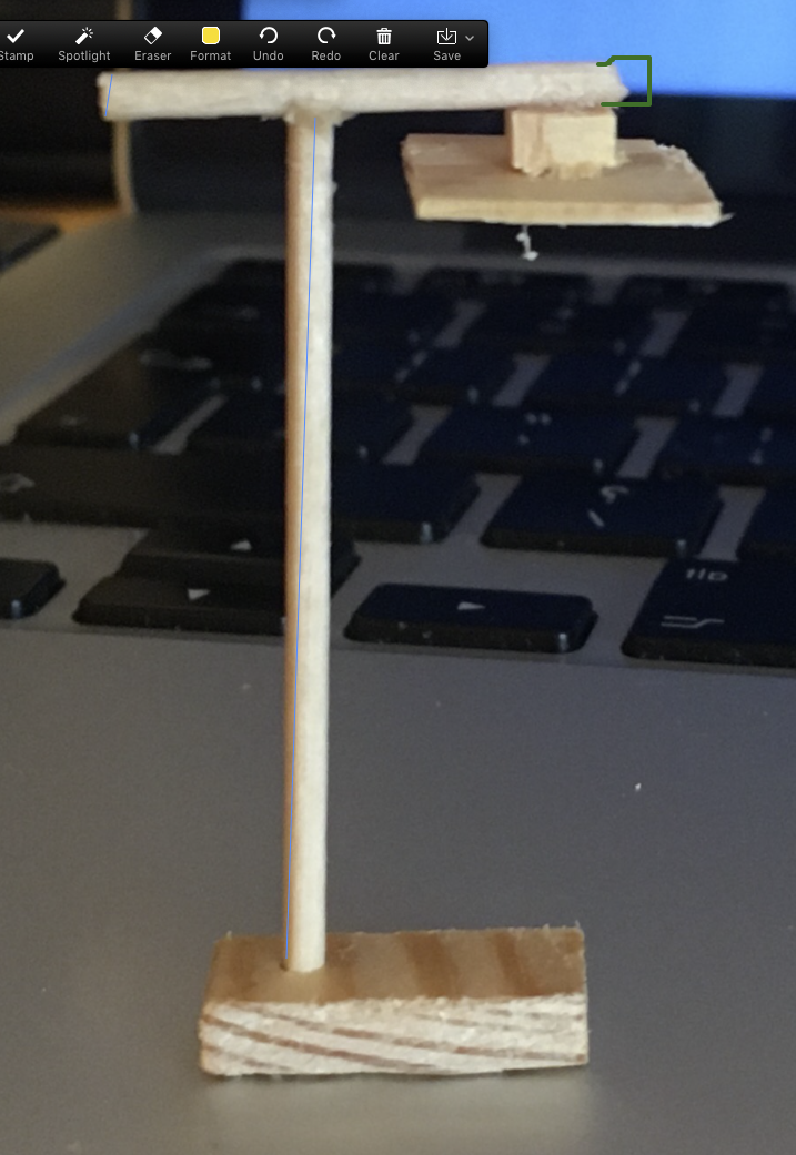
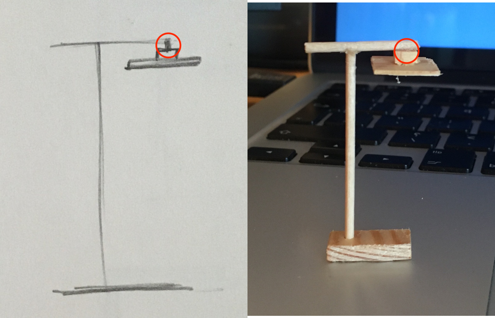
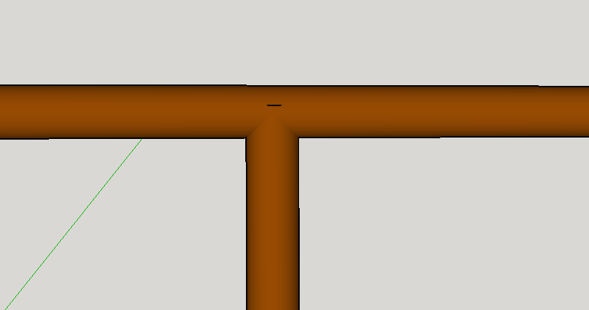
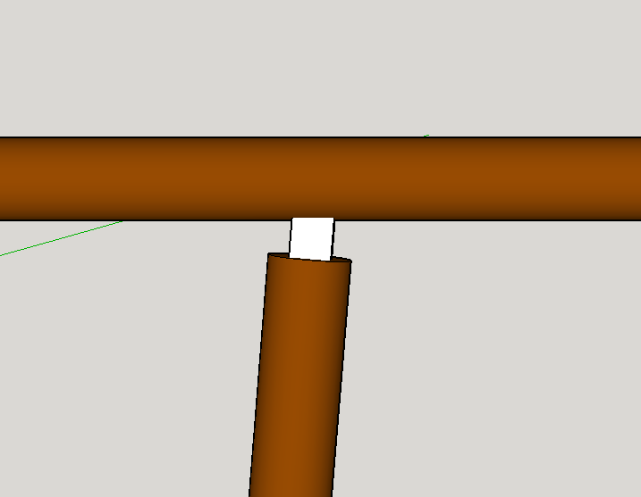
Ana noticed I hadn’t included the tiny vertical bit that connects the shade to the lamp. This was intentional on my part for the model (it’s waaay too small) but we started talking about it, and in general how the horizontal pole gets attached to the vertical pole.
We thought maybe this component could repeat, which felt pretty nice when quickly mocked up in 2D.
More discussion of cable routing, and whether the “tiny bits” actually protrude through the horizontal pole a bit.
This probably doesn’t make a huge amount of sense to anyone reading, but the experience of going back and forth annotating and coming up with new designs to explore was really fun.
The next action from the tutoring session was to try to “zoom in” a bit and sketch out the details of some of the latent centres that we identified, and figure out some of the construction technicalities.
- How are the poles connected?
- How is the cable run?
- How is the shade attached to the main structure?
- What does the base look like?
- etc…
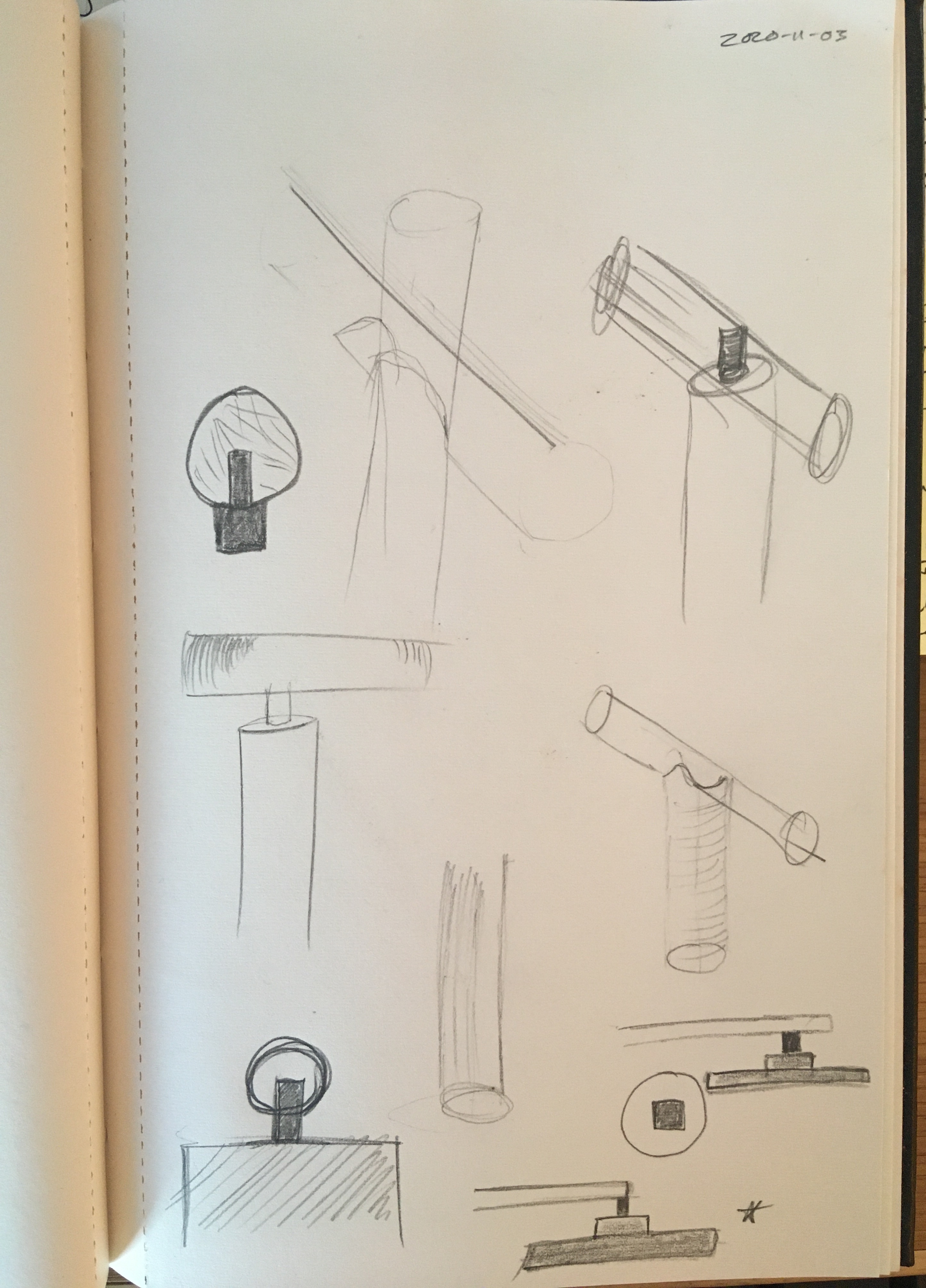
My sketching abilities leave a lot to be desired! I really struggle with anything that’s not “square” in shape, so cylinders… well, you can see how that turned out. This is where I think tools like Sketch Up come into their own.
I first considered how I might make a direct join between the two dowels:
I figure I could cut the semicircle in the top of the vertical post with a coping saw, but Ana and I felt like the slight rake in the vertical pole helped convey the feeling of movement and life from the original sketch. This would be much tricker to get right with this type of joint.
Here’s a joint idea that looks a bit more achievable, and mirrors how the shade might be attached:
I then switched over to thinking about the base. Not quite happy about any of the ideas. They all feel a little clunky.
The one that feels best so far is with chamfered edges all the way around, but still not convinced. I think a full size mockup will help figure this out.
Or maybe something really flat more like the original sketch.
Finally I had a think about cable routing. The idea I’m liking in theory is to make a channel in the dowel to embed the wires (they’re pretty slim because the lamp will be using LED strip lights) and then fill the remaining gap with a contrasting colour wood.
Lots more to experiment with of course, but I’ve found being able to mock up in higher fidelity is really helpful, after the main concepts have been sketched out by hand.
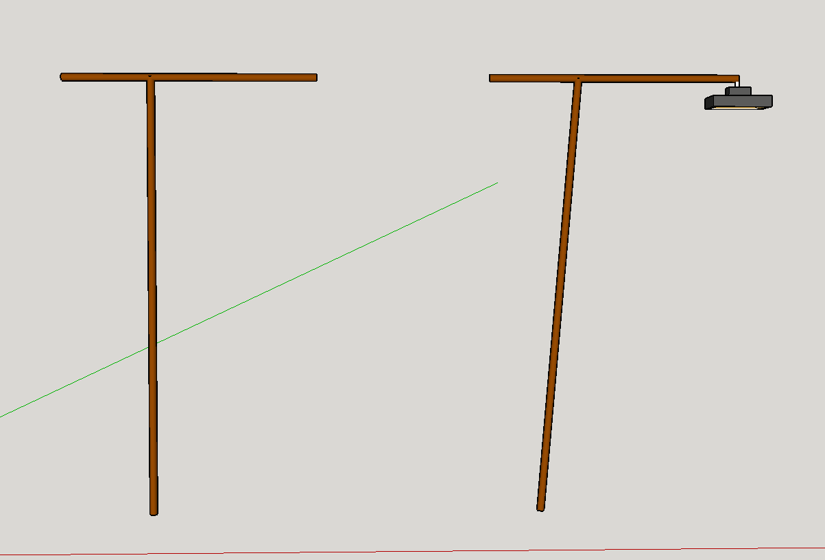
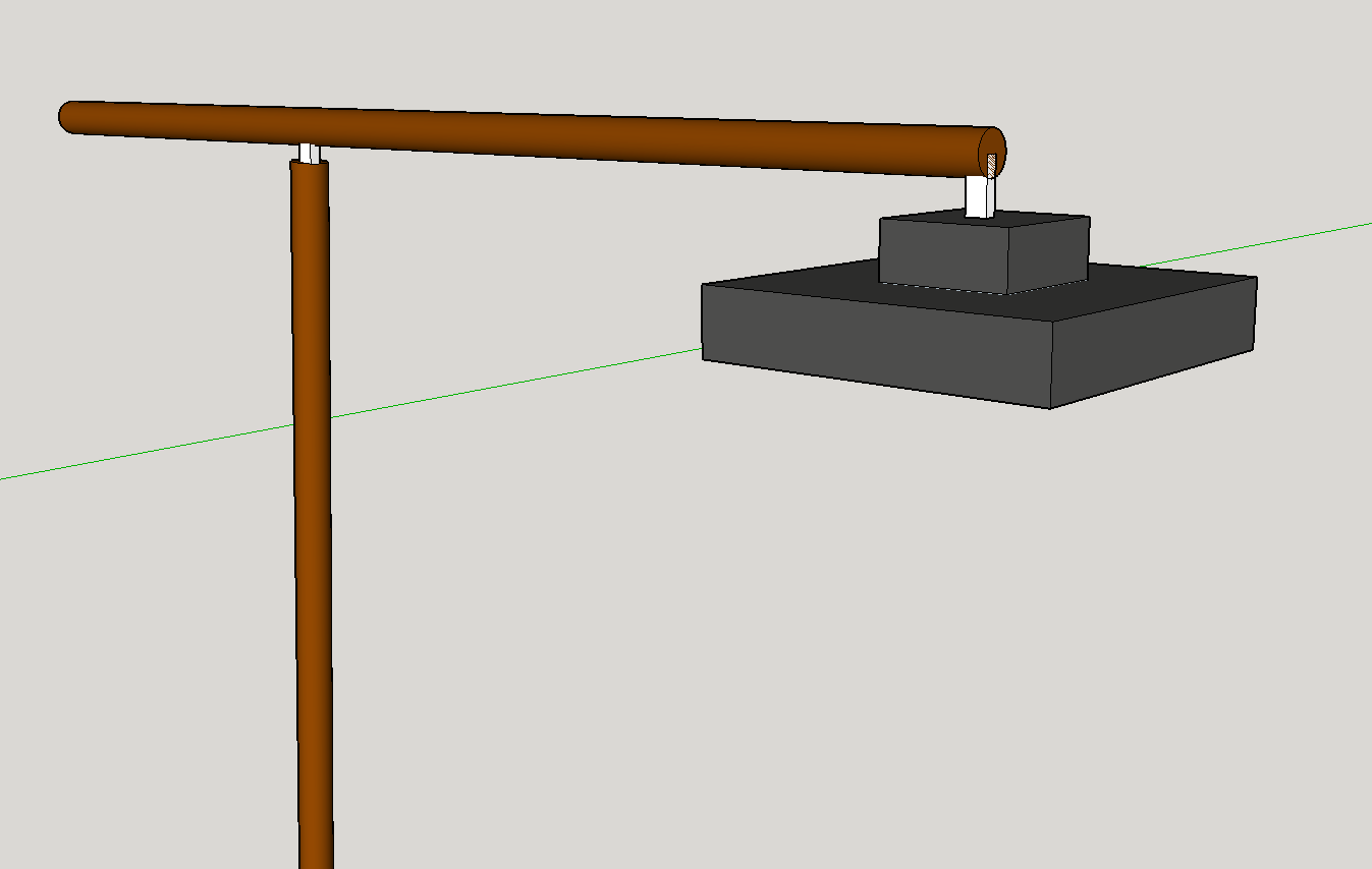
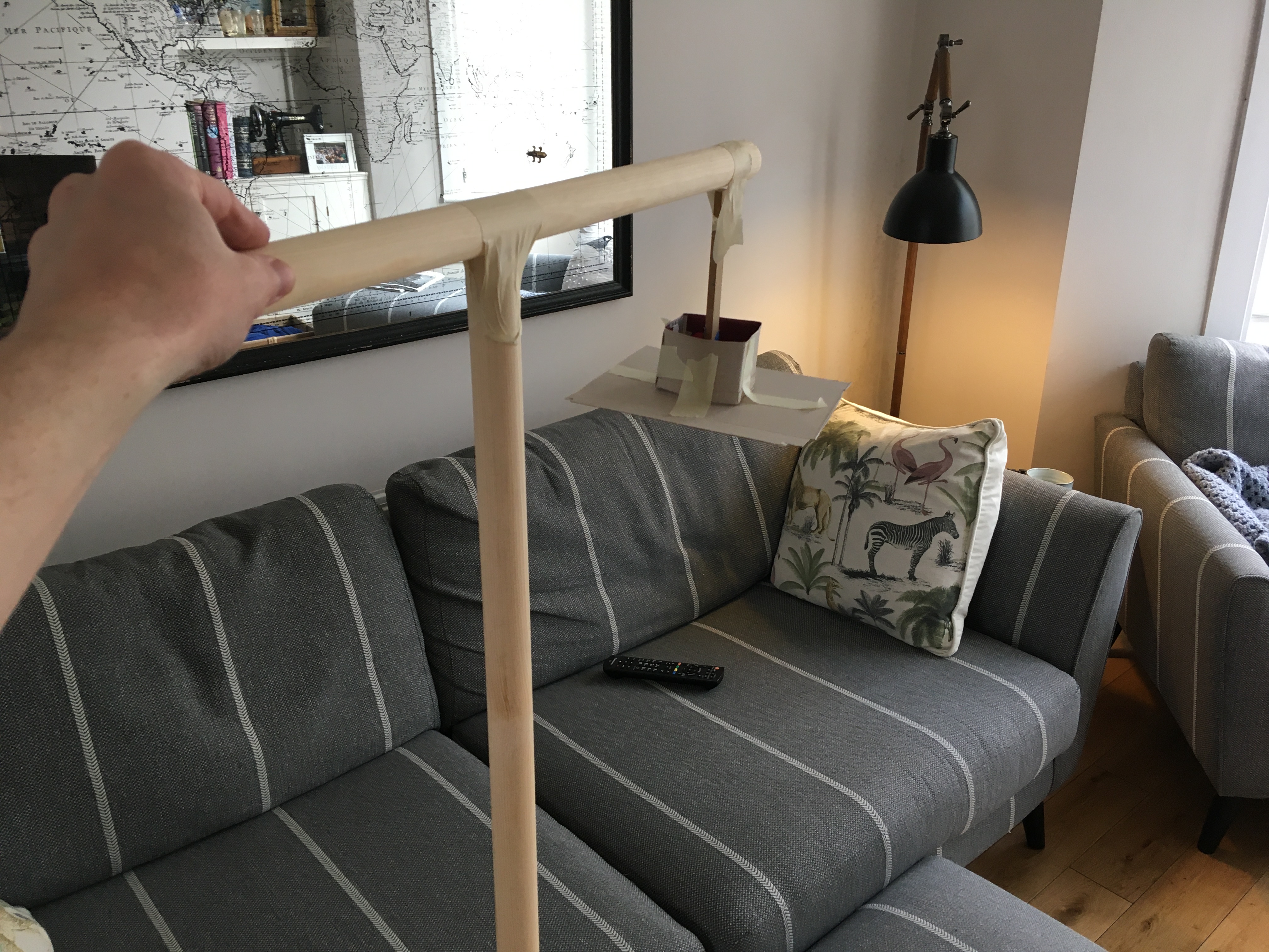
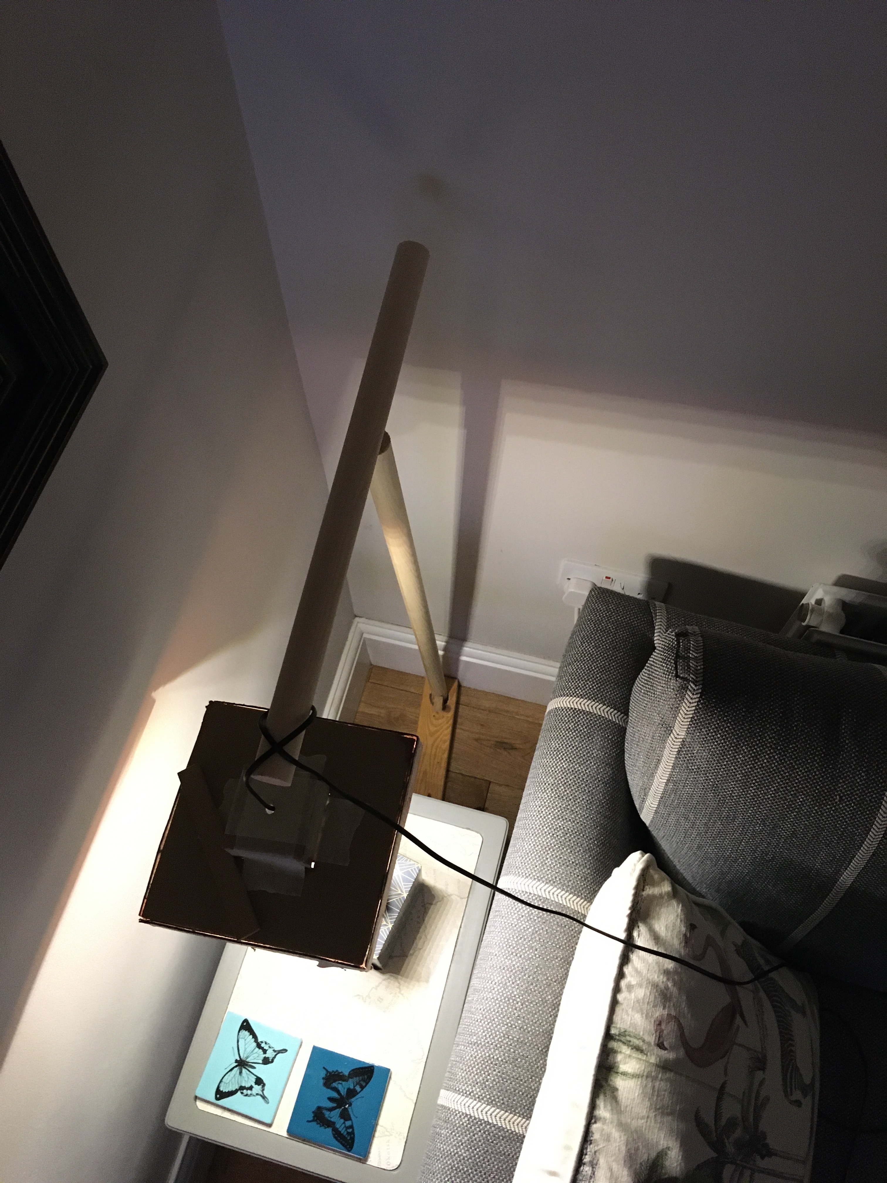
At this point I moved on to full scale mockups. V1 was as simple as I could possible make it, just to feel out the main proportions.
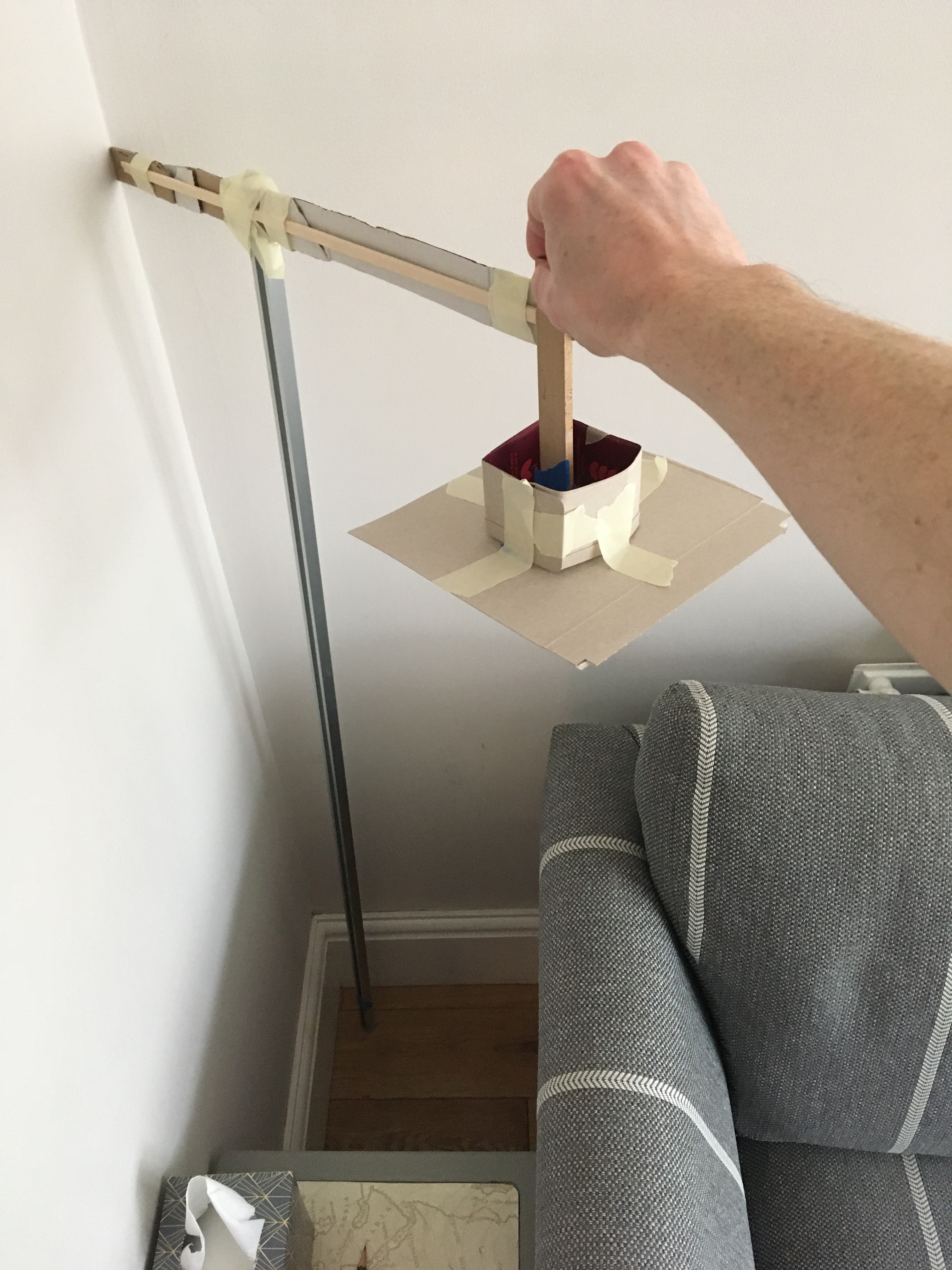
This took all of about 20 minutes to throw together. While it’s clearly not representative of a finished lamp, it does give better information for a starting point – the length of each main piece, and the rough dimensions of the shade.
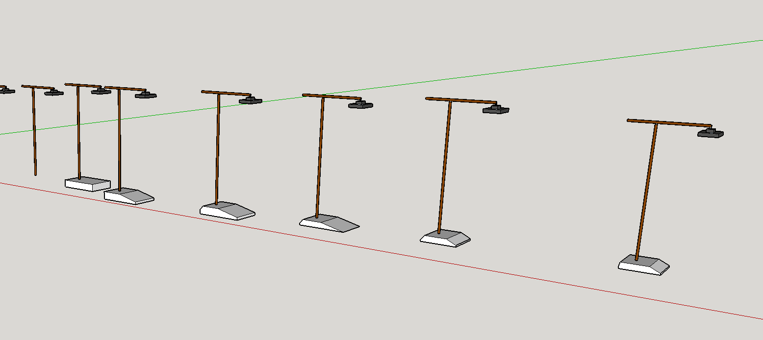
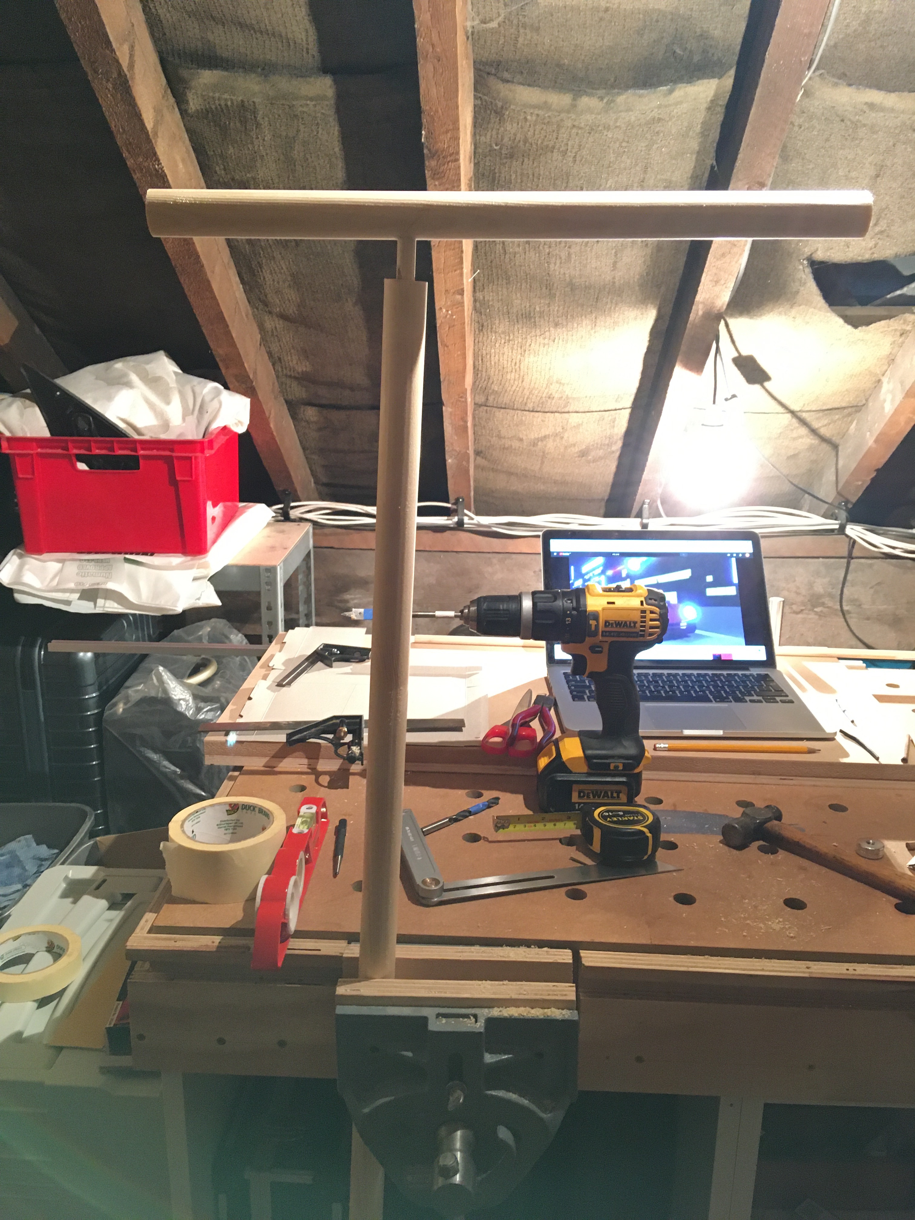
The final lamp will be made from oak dowel, but oak is expensive. I wanted to make a higher fidelity prototype, so I bought some cheap pine of the same dimensions.
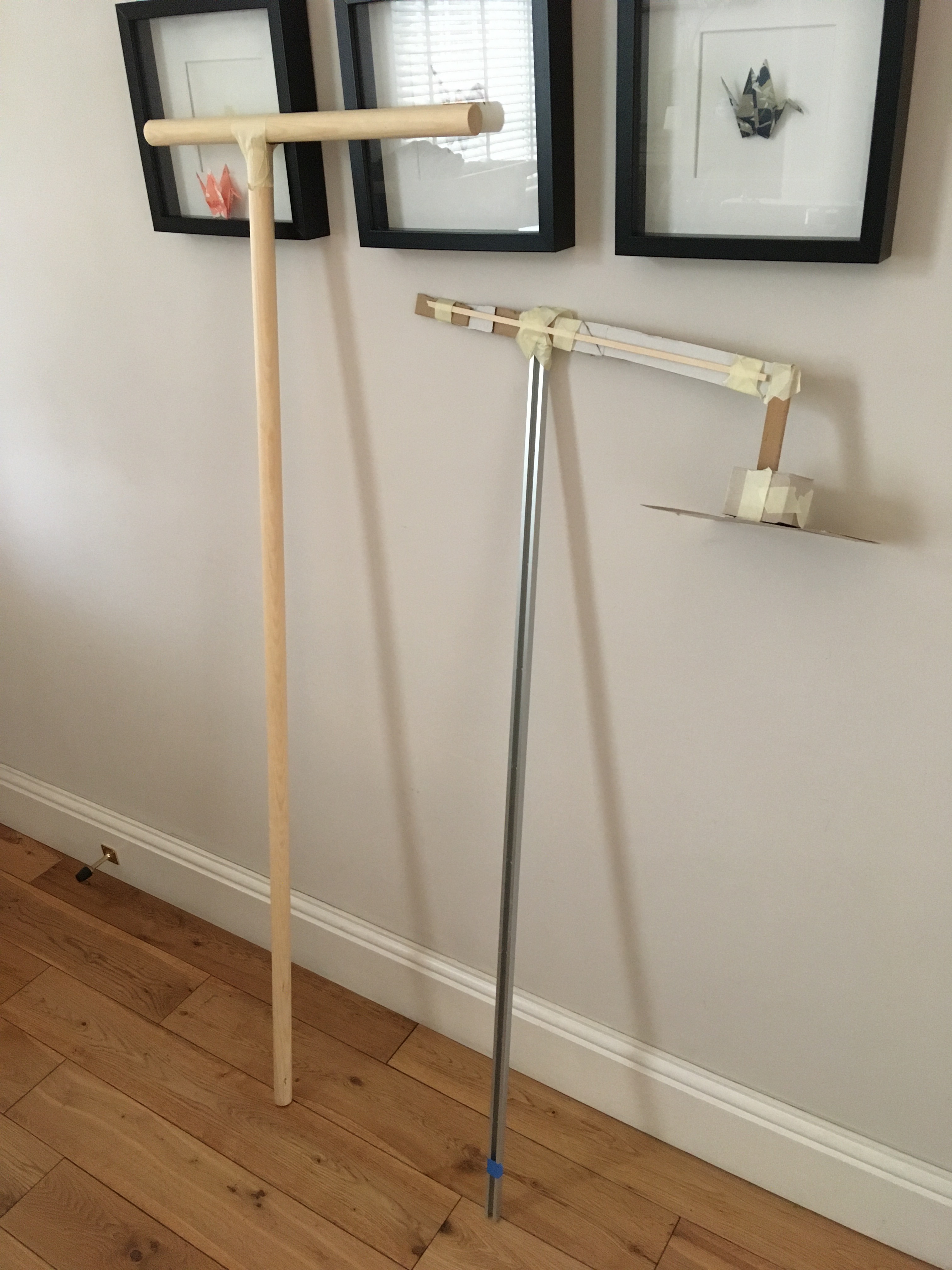
I felt the first full size mockup was too short, so I made the pine version a bit taller. Again the construction was as simple as possible at this point. This gives more flexibility to change as many parts as necessary before moving to increasing detail.
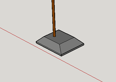
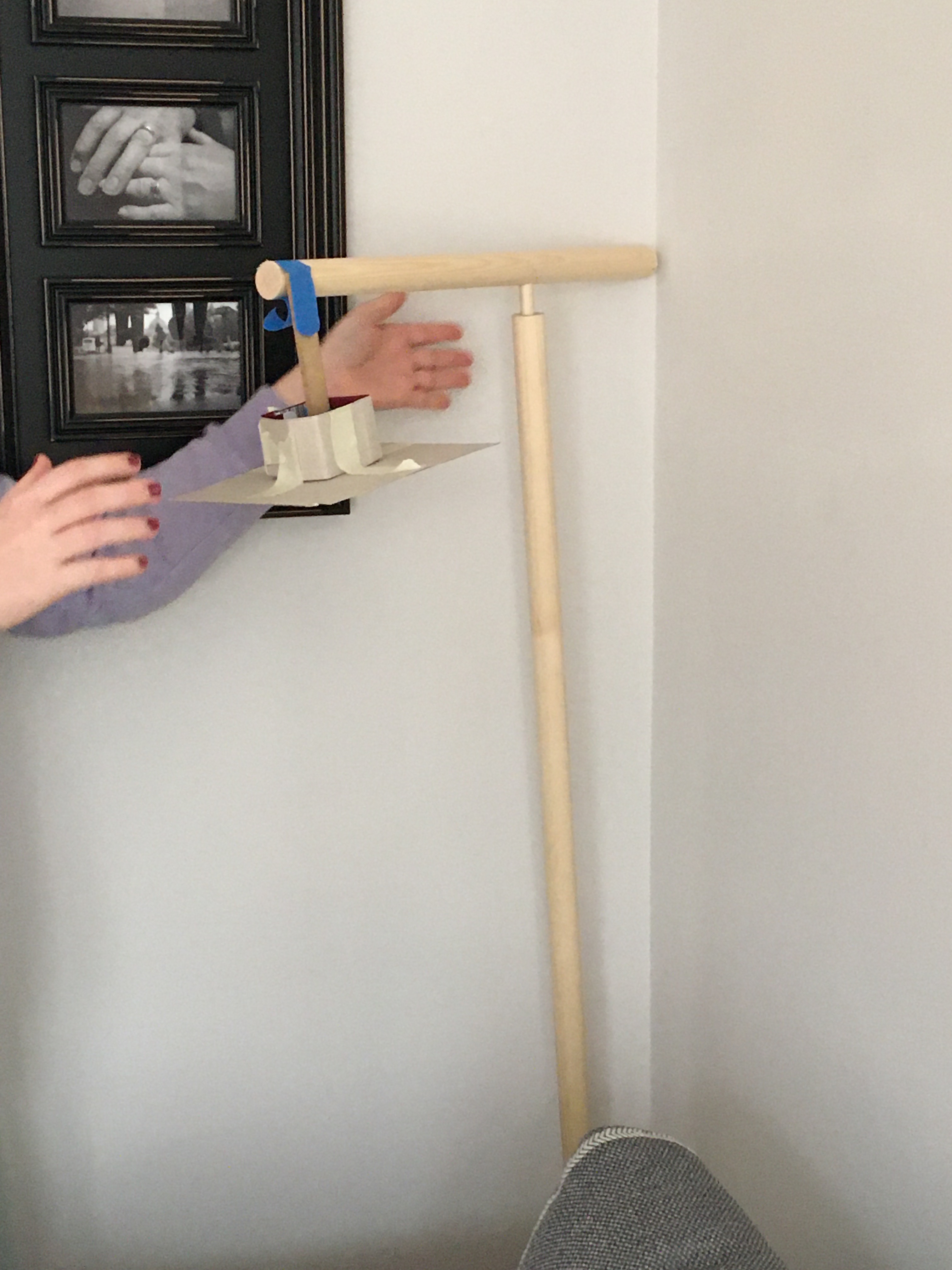
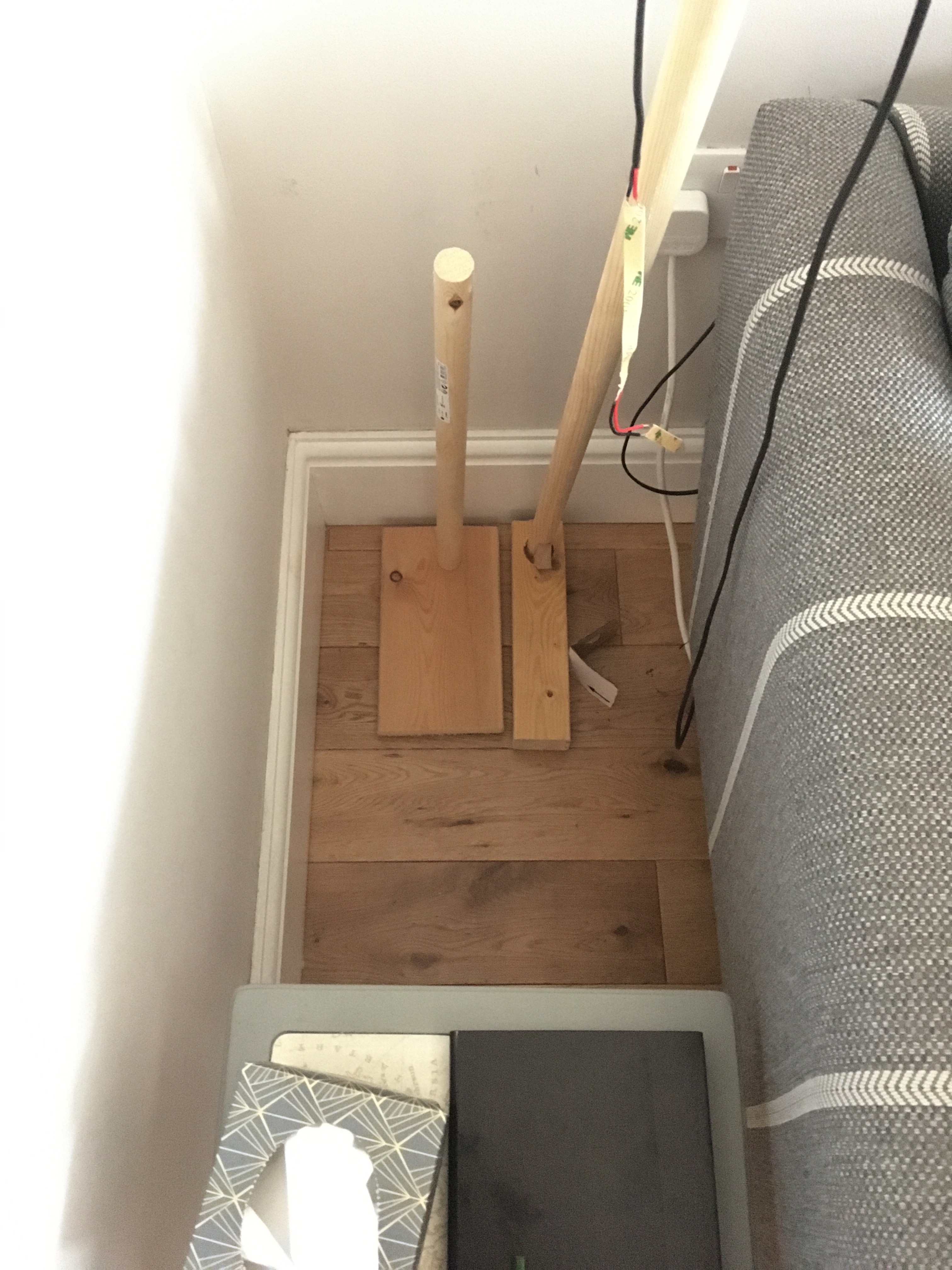
The next step was figuring out some of the details – the connection between the main poles and the base. I didn’t put as much thought into the base at this point, and it’s clear that it’s not the right choice in either function or ornament. It’s way too narrow to keep the lamp stable, and the proportions are weird. Still, gives a good sense of direction of where to go next. Very happy with the joint of the poles, though they need to be a little closer together.
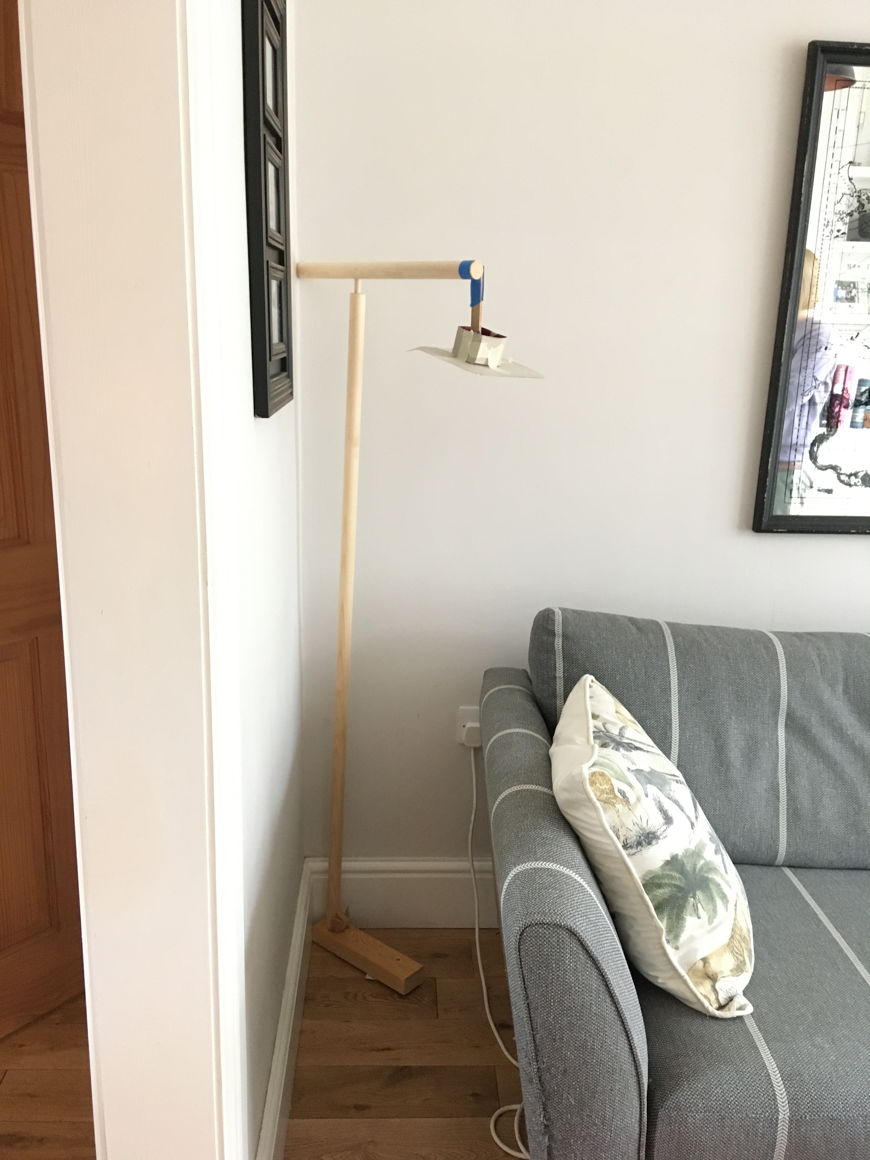
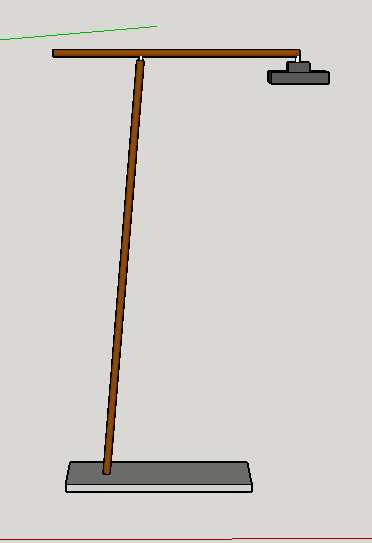
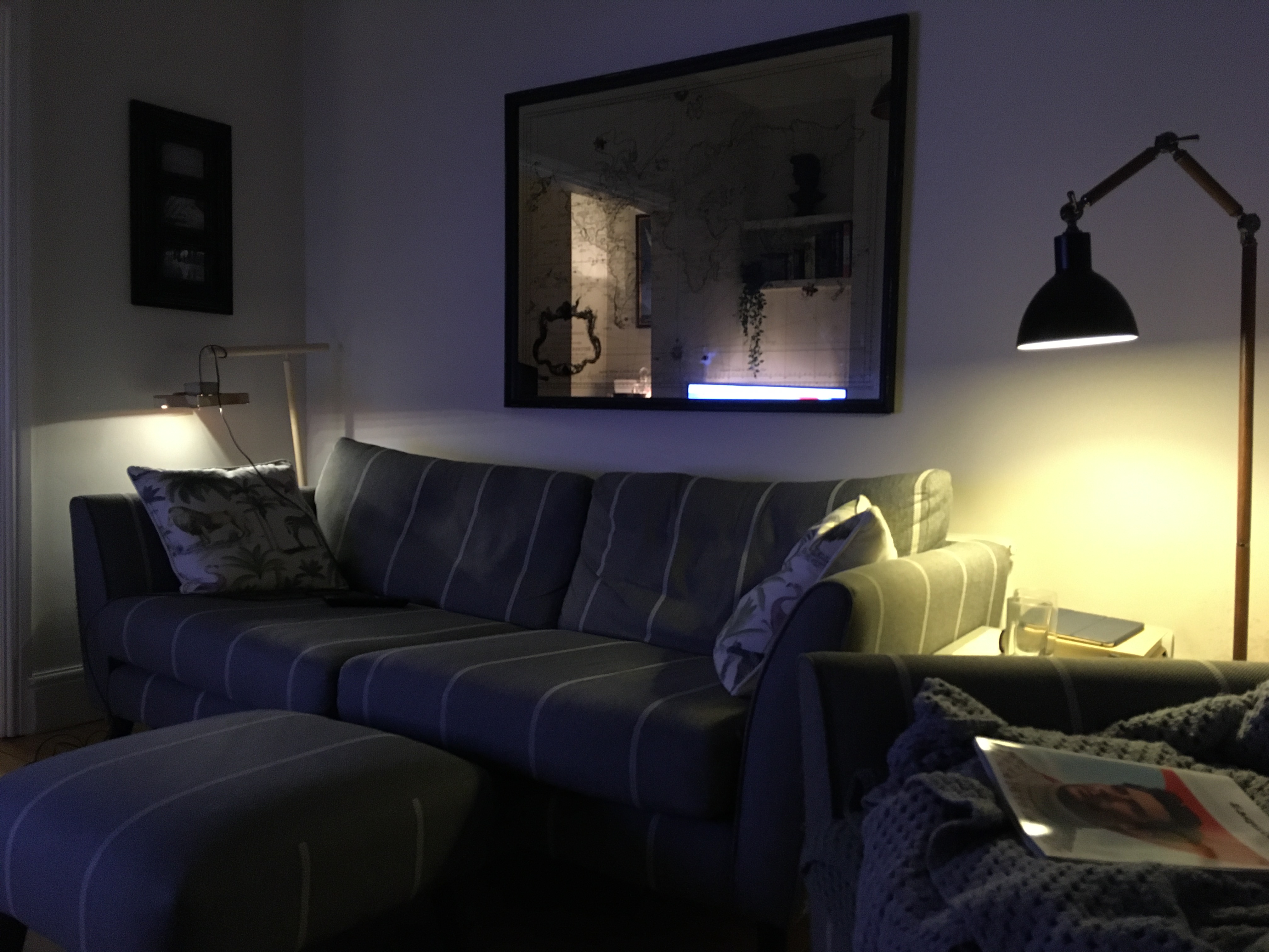
On reflection, the taller frame didn’t work so well. It clashed with the picture frame on the wall and felt a bit overpowering. Before shortening the vertical pole, I had a play with the angle of the horizontal pole to confirm that the sketch version was the better choice.
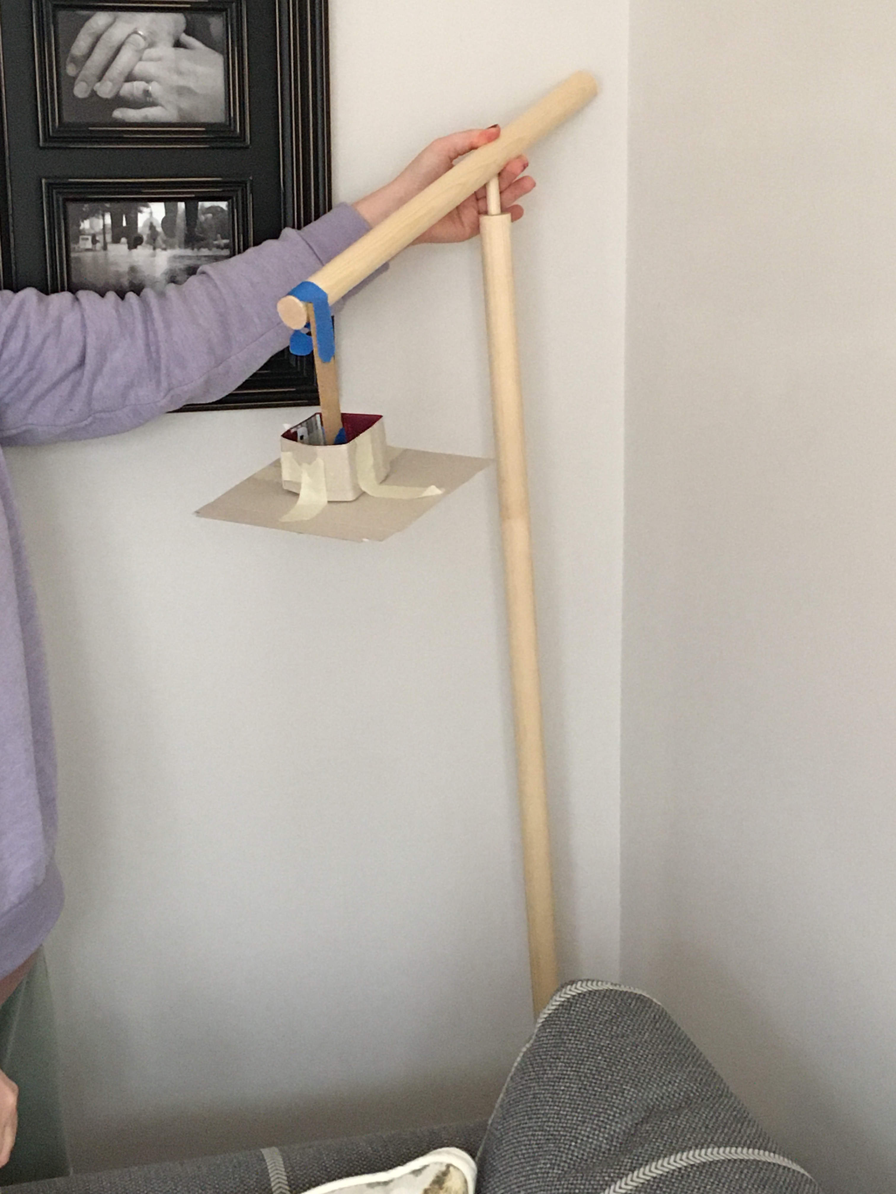
Shortening the lamp worked much better. If anything, it could be a little shorter still.
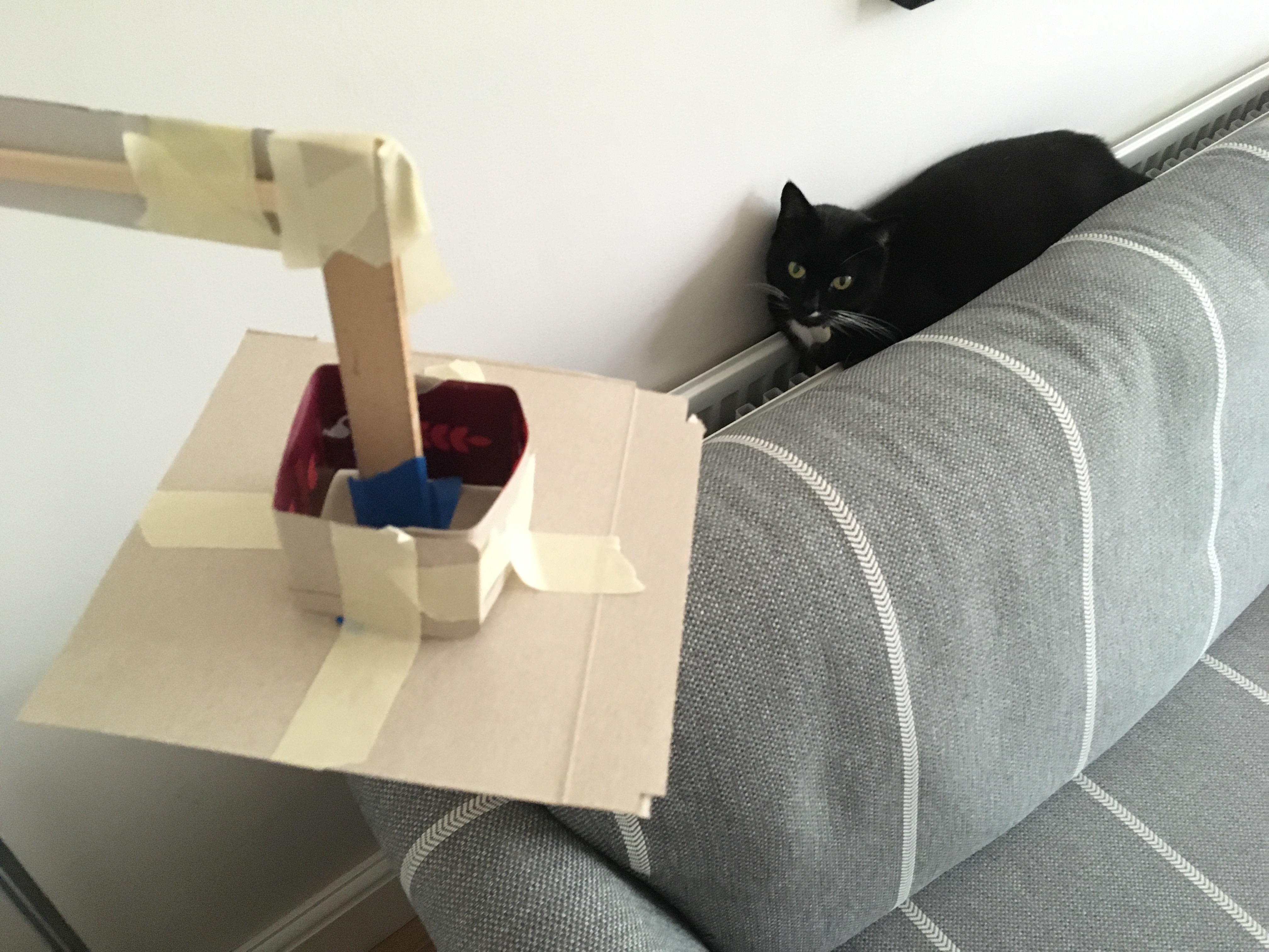
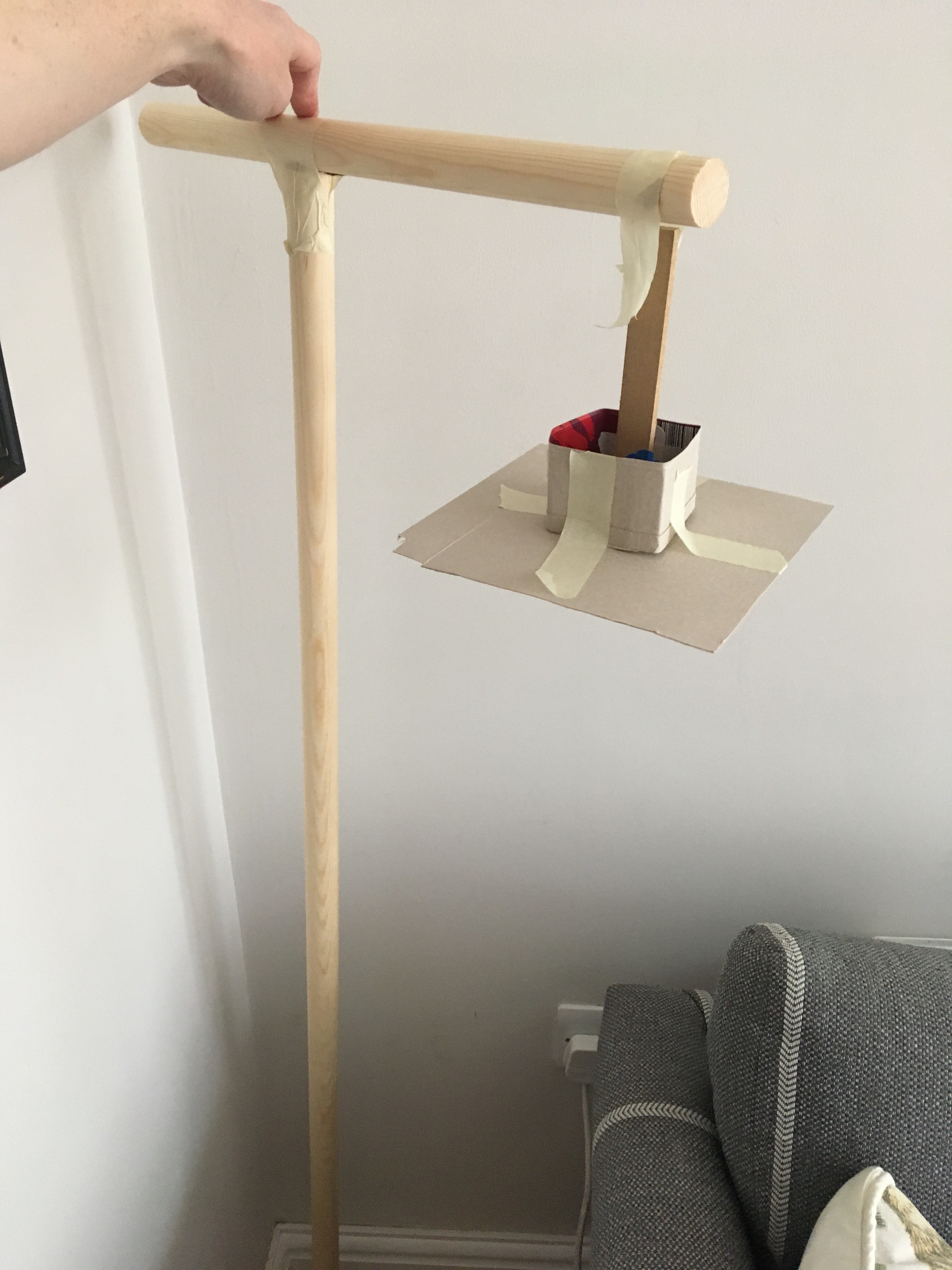
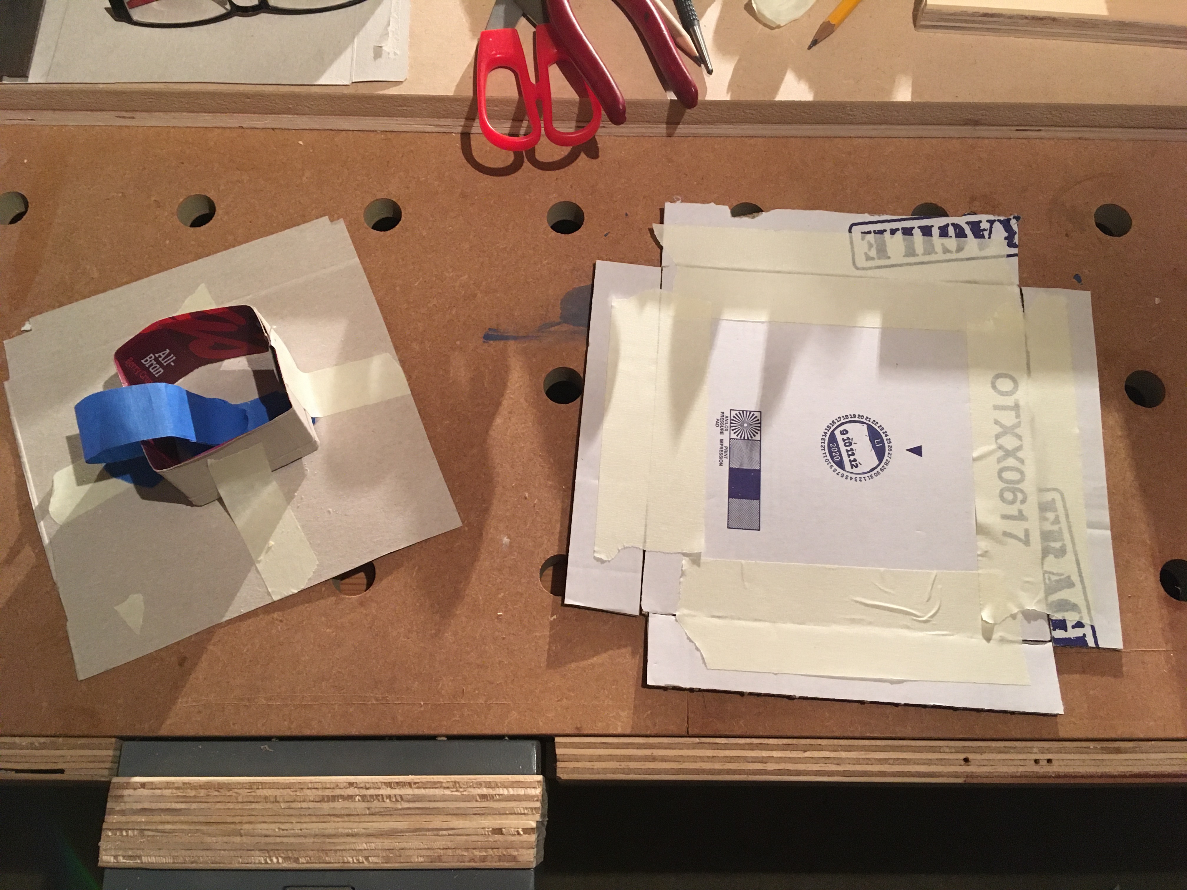
Now I’d got the basic geometry and structural parts mocked up, I started to focus on the shade. The initial mockup lacked any depth, so I put together a more realistic representation from cardboard instead of card.
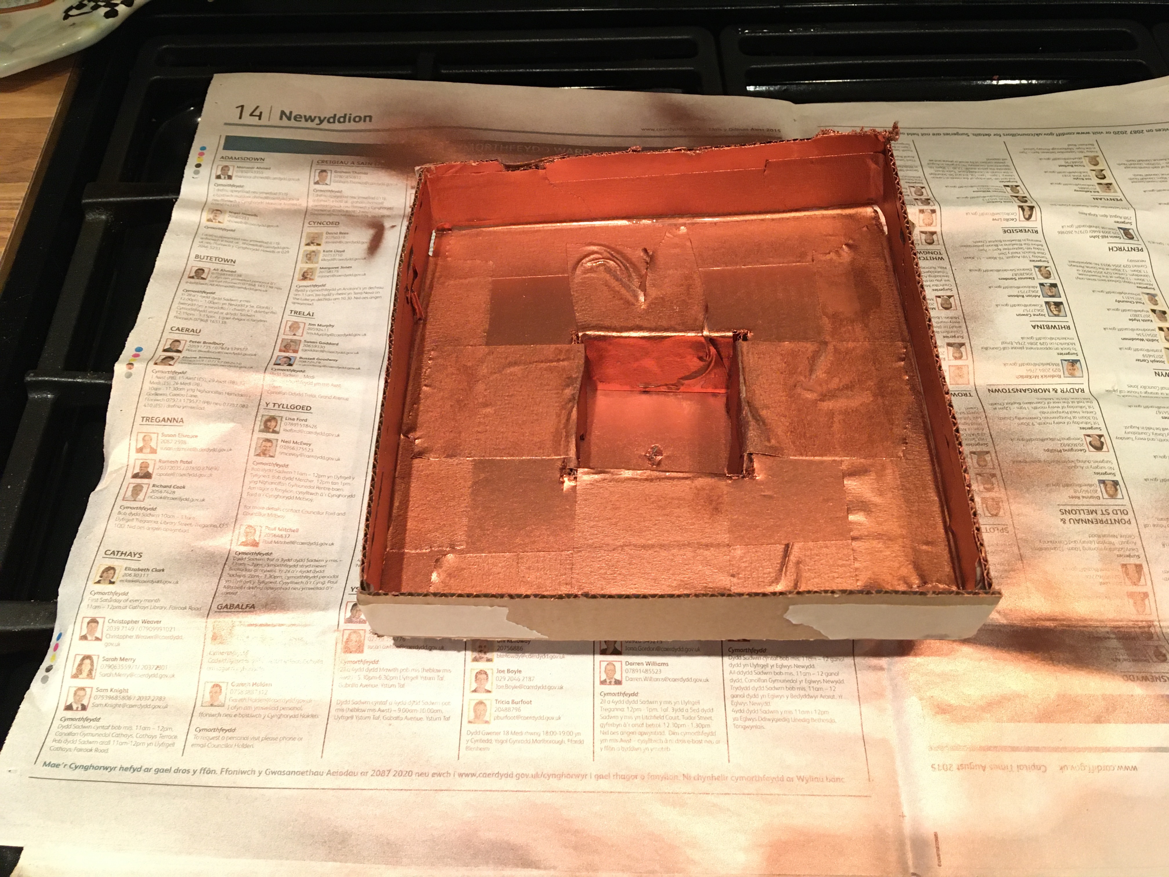
I also used some spare LED striplight to test the lighting effect from the shade.
I also tried the shade with and without a diffuser to get a feel for the light. The diffuser made the light too dark, though the colour was nicer. I need to experiment with adding some more striplight with the diffuser, or using different colour temperature lights.
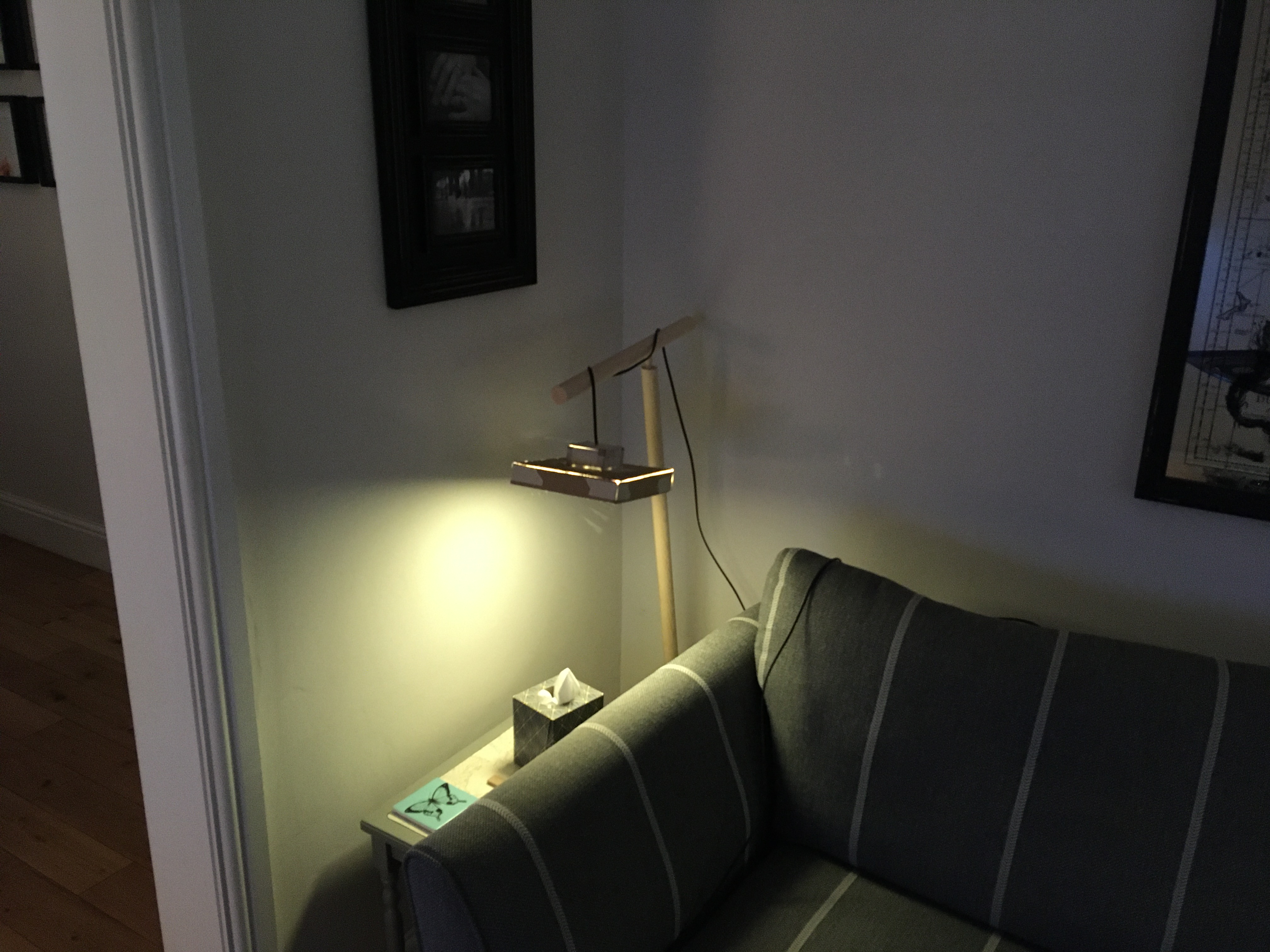
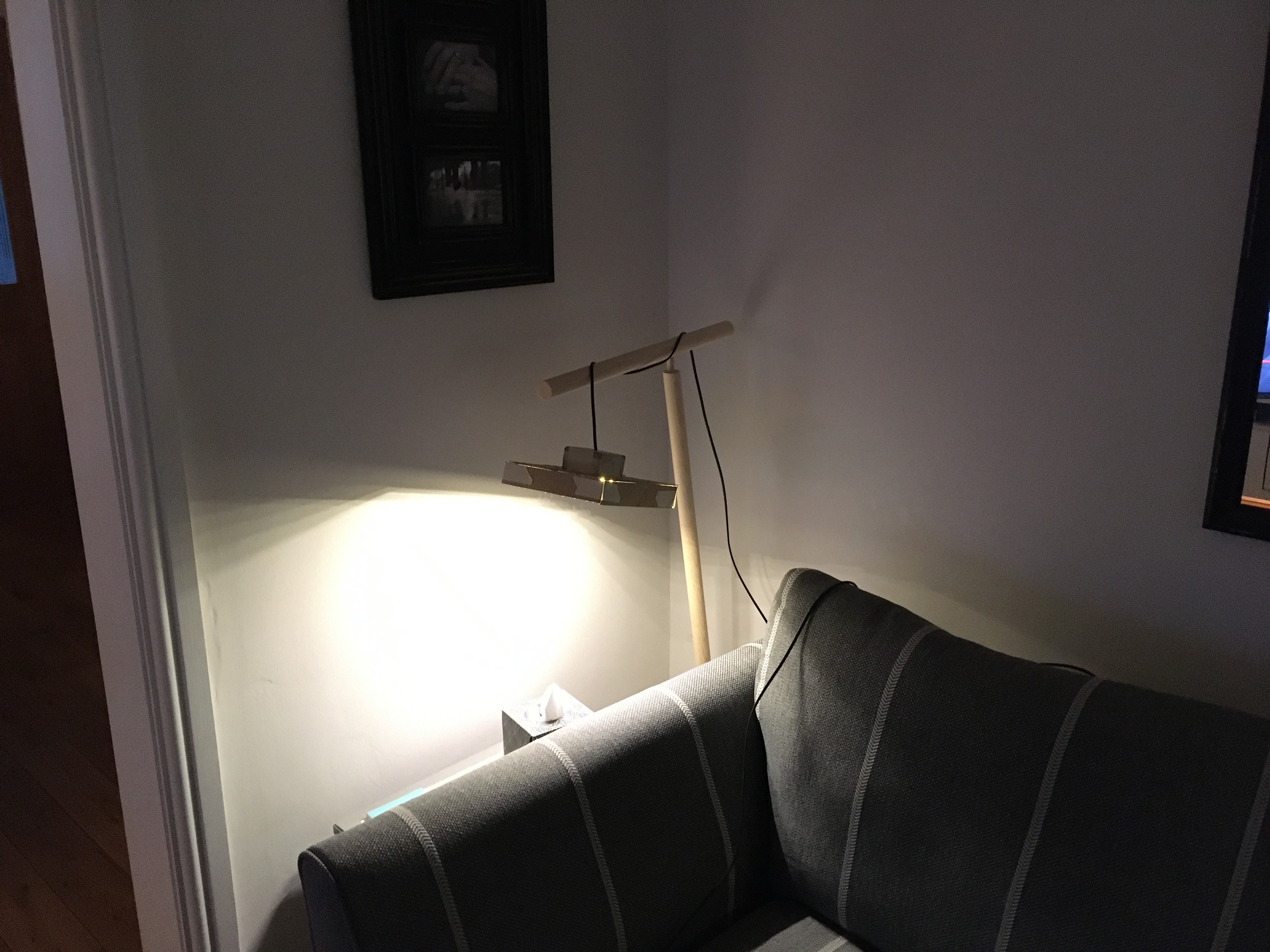
I’m not yet happy with the way the light falls from the shade. The straight line created across the wall seems too stark, so I’m thinking about how to smooth that out.
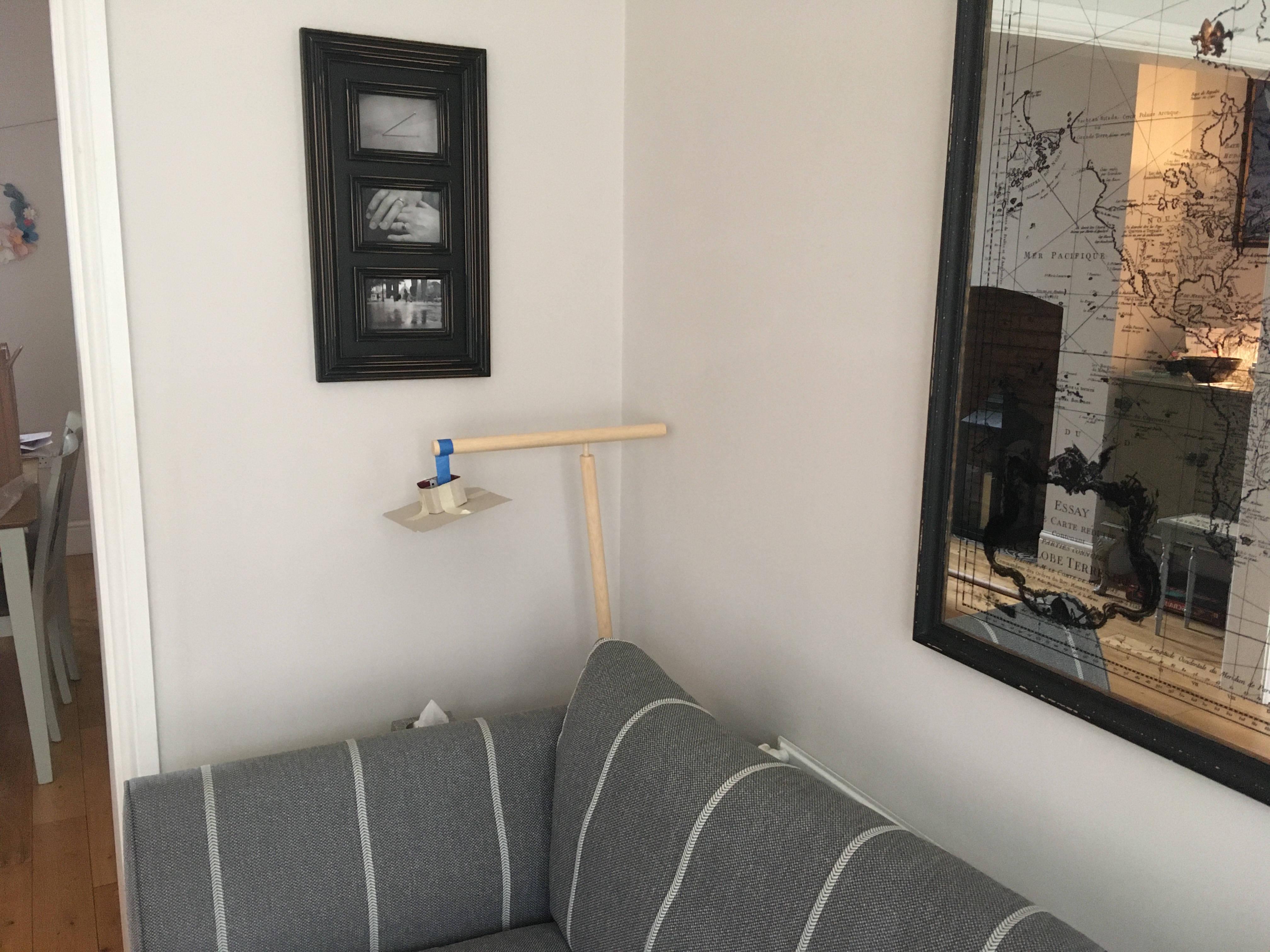
Finally, I quickly mocked up a new base, which was much better.
Studio: Individual Project
Over the last week or so we’ve been shaping our individual project proposals. The pandemic is making life difficult to do anything in the community – a key goal of the brief – so my fallback is to investigate the opportunity that increased remote working brings for having more control of our workspaces.
As expected, the feedback on the proposal was that by not involving the community or other people there’ll be missed opportunities for learning some important skills.
I’m working on some leads, but at the moment nothing concrete.
Studio: Mockups in Practice
We had a really great lecture from Saul Pichardo illustrating how he uses full scale mockups in practice. It was great to get a sense of how this works in the architecture world. In software we routinely spike code and iterate, but it’s more difficult to see how this works in physical space.
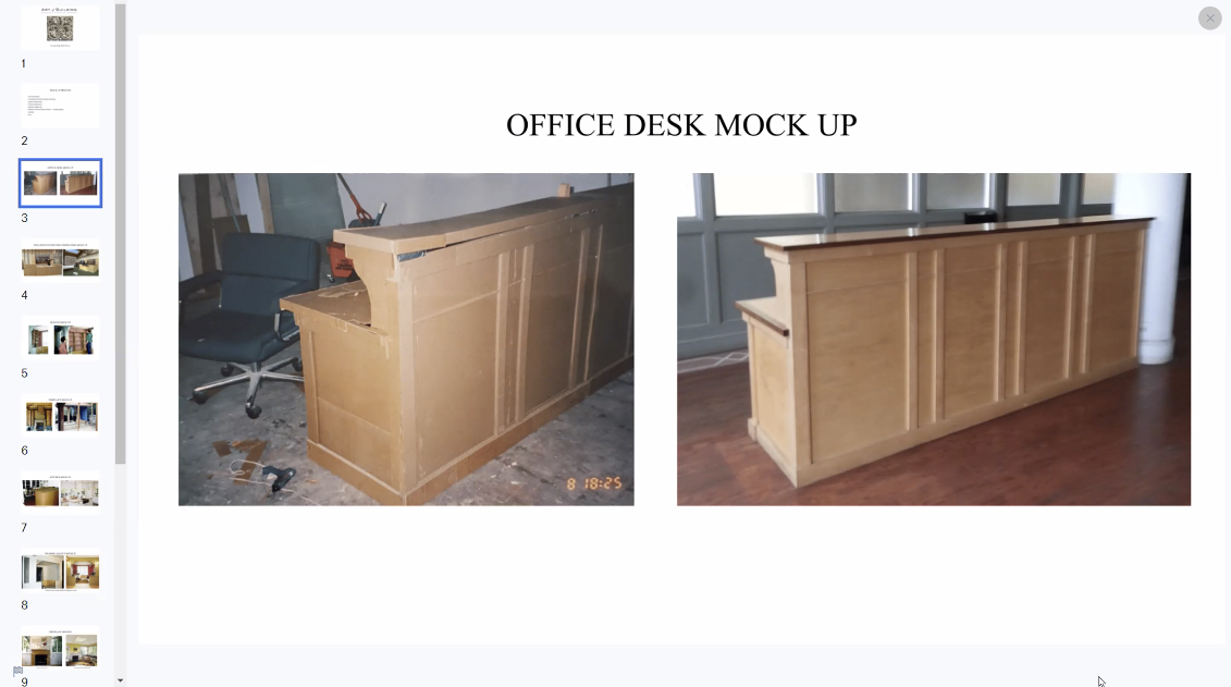
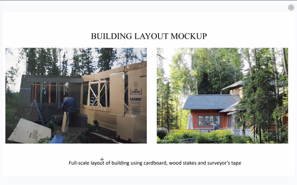
The most important element is getting immediate feedback from the mockup. Not necessarily using the materials; trying to convey and communicate information.
Mockups are powerful as everyone in the room can share the experience, which is harder to share from a sketch.
Mockups are cheap to change. If you go sketch -> real and make a mistake, changing real materials is really expensive.
Not every element needs to be mocked up. The strong centres are the ones that we want to check. If those elements are off, they’ll affect the whole. Making mockups adjustable is a good practice to learn. If they’re too permanent you’ll be reluctant to change.
Studio: Self & Space
Self & Space is intended as indirect support for projects, somewhere between the pure theory of Nature of Order and pure practical projects of Studio.
This week we had an overview of Iain McGilchrist’s The Master and His Emissary.
I need to re-watch this to be able to summarise it well, but the gist is that we (in the modern world, and especially the Western world) rely far too much on the left hemisphere of our brains. This results in us thinking in a far too mechanised way, which inevitably reinforces itself and leads us away from creating things with life.
This was a really interesting session, and a book I’ll likely read once I’m done with Nature of Order.
Nature of Order
In the Nature of Order classes we did more Mirror of the Self tests. While the discussion was interesting, I’m not sure I feel any closer to fully understanding how to interpret the test.
One thing that did become a little clearer, I think, was the distinction between “emotional” feeling and a feeling of wholeness.
We had quite a discussion about these birds.
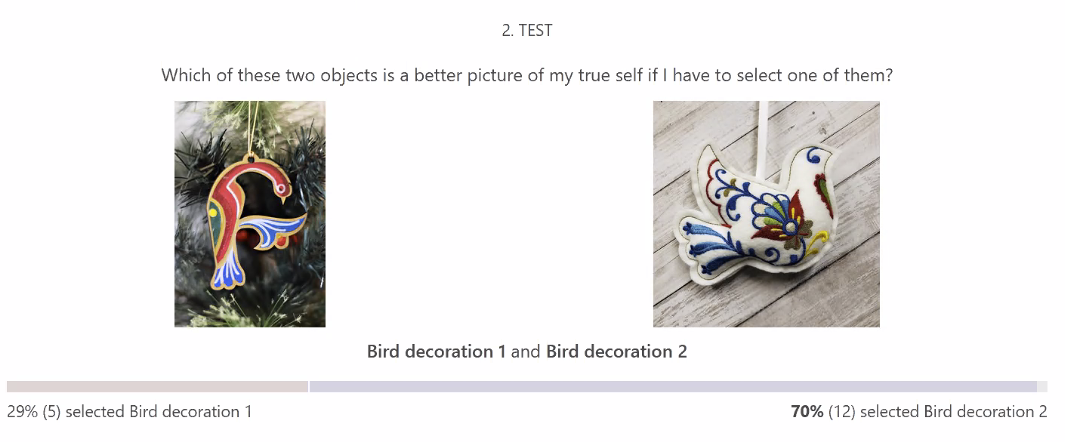
There were various talks about how happy and/or sad each is, but on reflection I think it doesn’t really matter.
The right bird is on the “happier” side, yes, but only marginally. The left bird however, has a much greater feeling of sadness (while also incorporating some joy, through the movement and colours).
Taking a more technical term to articulate this, I think the left bird has a much greater dynamic range of feeling.
In Chapter 10 about the pictures of Paris. Alexander says:
I think it is fair to say that what makes the Paris of these pictures a great place, a sustaining place, is the depth of life which it releases. (p384)
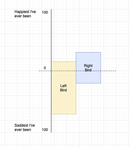
Of course, it’s not only happy and sad, it’s a multi-dimensional graph with almost infinite axes.
To me at least, the left bird conveys many more axes, at much greater extremes of range. The bird on the right’s graph would be more like the size and shape of the pink-ish part at the centre of the graph above.
I think applying this idea to some forms is more difficult. A bird figure inherently conveys life because we can associate it with a real-life bird. A building or table or carpet needs closer inspection of centres to assess the dynamic range.
Alexander goes on to say:
What exists in these places is something in balance… (p385)
Which leads me to these tables.
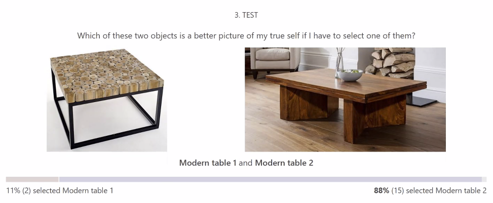
The right table is simpler but it is more balanced. To me, the left table for some reason feels much more jagged, like it has positive values on only a few axes in one direction. The right table has fewer extreme values but a more balanced set of values across all axes.
To return to the birds, I feel that both are reasonably well balanced, so now it becomes a question of range. Which of them has an overall wider range of values for all its axis. To me, that is the left bird.
This week marks the end of Book 1, The Phenomenon of Life.
Software
Here are my very rough notes that describe the 5 different categories (or indeed, Levels of Scale) that Greg spoke about in relation to the types of project we might undertake. I might well have got the names wrong, but you should get the gist.
1. First Level (Self Learning / Pedagogy Tools)
One of the goals is to develop a set of pedagogical tools that allow people see that they have a way of perceiving what is a living thing and come to an agreement about that.
Pedagogical: the method and practice of teaching, especially as an academic subject or theoretical concept: the relationship between applied linguistics and language pedagogy
When I do this in a group setting I’ll take an image from my phone (or point at something outside) and ask which parts of this photograph are more alive than others. We can see that the trees in the picture are grown and the pickup trucks are manufactured. And we can tell that some of the things we manufacture have more of the quality that the trees do.
Someone needs a mentor while they’re reading Nature of Order and when they’re making something to help them understand which has more life.
How to run people through a series of things so that they get what you mean and start to draw and evaluate how much life they have in their drawing? Not so much of a mystery / woo woo thing to them.
Ask people to outline the area that has more life. Could go further and ask about centres. Would need to be fuzzier because centres are more about fields.
Can you imagine small tools / lessons that can be done online to help people “get it”?
Basically get people to improve their life-observing abilities.
Self-learning tools for the individual, and/or for students (who are slightly more interested).
2. The Second Level (Automated Decision Making)
Automated decision making procedure / AI.
We don’t have a (automated) tool that allows us to judge the amount of life in a photograph.
Can a computer identify more life?
3. Third Level (Neuroscience)
Show things lighting up in people’s brains when they see living structure.
Chris tries to build a picture of the external world. What if you show people there’s actually an internal process happening.
In Pattern Language they had both a cognitive part and a feeling part, and they had to have both. Both rational and mushy.
4. Further Applications (Empowerment Tools)
Something about using these abilities to help people do planning, and building and protecting their environments, or learning how to run their own environments.
Help people make arguments against things happening in their communities that they feel they have little control over.
The basic issue is that we need a place for people to do that. Needs to be so well informed for people to argue with it. When you have a nice demonstration of a good alternative, it can be really helpful.
Gatemaker fits here mostly. It assumes you’ve done a bit of the first things. From my video you get a sense of being harmonious with the existing environment while building.
5. Application of Process
i.e. how you go about building this software – the byproducts.