Without Good Copy, Typography is Useless
There are plenty of blogs that showcase pretty typefaces and suggest techniques to refine your legibility. Some even (rightly) say that text is a user interface. Although I wholeheartedly agree that typography can make a website beautiful, there’s a step that seems to get missed out in a lot of these articles – good copy.
Good copy lends itself to good typography
Here’s an example:
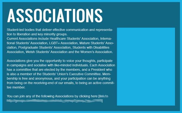
At first glance it looks pretty terrible, but actually the copy isn’t too bad. Lets see what we can do when we’ve got a good starting point.
With a bit of reorganising the section is already looking a lot more readable. I’ve made the list of associations in to a vertical list instead of buried in the explanation text, and abstracted the key message and positioned it like a byline. I’ve also split up the copy in to really short digestible chunks – each making a single point.
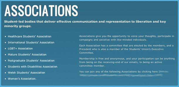
The most important information is that there are a bunch of groups people can join, so I’ve given these some more weight.
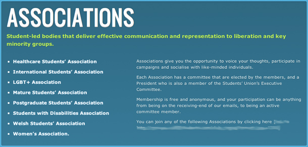
It’s looking much better now. The key points are highlighted, and users can scan through the list of associations to see if any are relevant. The explanation text in the right column still looks lost though.
As each chunk is written as a loose sentence the key point falls at the beginning. You can highlight these clauses to bring a bit of attention to the explanations without needing to highlight the whole lot — distracting from the more important parts highlighted earlier.
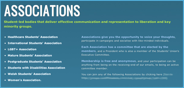
Now the copy is taken care of all thats left to do is work on the typography and add a nice big call to action button to move people to sign up.
Pay attention to the copy and the typography will come naturally. No typeface, leading or kerning will make bad copy work well.