Tracking work through knowns and unknowns
I’ve been experimenting with a new way of tracking work for the Adessium-funded Alaveteli Pro project. Instead of the typical checklist-style approach, I’ve been thinking in terms of “uphill” and “downhill” work.
Creative work is not linear
Creative work is not like a production line.
In manufacturing, individual parts are fabricated from an already known schematic and then integrated on the line to form the end product; again, according to a well defined blueprint.
Creative work is the polar opposite. There’s a fuzzy idea of the end product, and the steps to get there are a series of decisions rather than a simple execution of instructions.
Creative work narrows in on certainty
In the production line example all tasks are certain. Each machine has been programmed such that you’ll get the same outcome each time the machine activates. Unlike a production line, creative work progressively narrows in on more execution-oriented work.
As we iterate the amount of uncertainty about the final form decreases. We start off with lots problem-solving, figure out the tasks, work on them, problem-solve a bit more, do some more work, and continue this iterative process until we’ve built something like we initially imagined.
Problem-solving takes more time than execution
When you’re problem-solving – making decisions about how to achieve your fuzzy idea of success – you’re in a much riskier part of the process in terms of time spend. It’s not necessarily guaranteed that you’ll spend more time in this phase, but the probability is far greater.
You go down rabbit holes, find unexpected roadblocks, get things wrong, make progress, go round in circles, take one step forward, take two steps back, prove a concept, bash your head on the desk… you get the idea.
All this takes time. It’s an uphill struggle.
You also find more tasks as your understanding of the problem develops, so early on in the project the amount of work actually grows rather than shrinks.
If you’re interested in the answer to “when will we be done?” how do you know when the task list has settled? How do you know when you can start thinking in a more linear way? How do you know whether a particular task is in the early problem-solving phase or the more certain execution phase?
So why do we track creative work linearly?
We typically track creative work in the form of a linear todo list. Maybe we use a series of tickets attached to a milestone rather than a todo list, but they reflect the same process – complete each of the items and the work is done.
So by that measure a project with 5/10 tasks completed should be half way through, right?
Except it never works out like that.
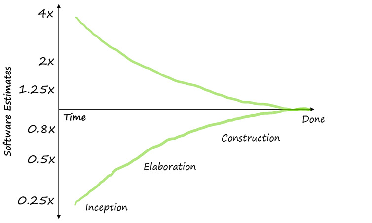
Each task inevitably takes a different amount of time. Some are a matter of minutes, while others take days, hours, or even weeks. This leads to attempts at quantifying effort – abominations like story points for example – for each task so that completed effort can be subtracted from estimated total effort as an indication of “when will we be done?”
Except it never works out like that.
Tracking uncertainty (problem solving) vs certainty (execution)
Understanding these two modes of work has helped me understand why linear tracking is of limited use for trying to establish the progress of creative work.
Over the last few years Basecamp has been developing a novel idea for tracking this in the form of “Hill Chart”.
Work that requires problem solving is more like a hill. There’s an uphill phase where you figure out what you’re doing. Then when you get to the top you can see down the other side and what it’ll take to finish.
A Hill Chart is a simple bell-curve shaped chart where a task’s progress is indicated by a point on the curve. Split in half, the hill represents the two types of work.
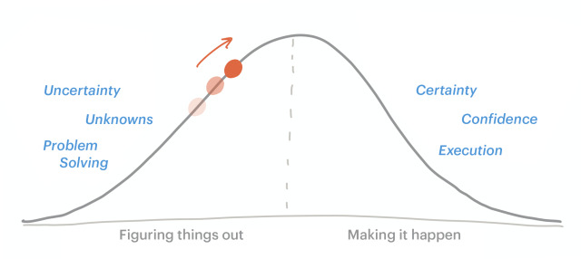
A task on the left is still largely in the problem-solving stage. It moves uphill as we’re “figuring it out”, testing our initial theories and discovering the tasks that need to get done.
The top of the hill signifies that “we know what to do”. There’s little ambiguity left about the project, we just need to crack on and build. In terms of our world of software, we have a good idea of the UI layout, what backend we’ll need to support that, and how it all connects together.
The point moves downhill as we get in to the more execution-focused work. We’re actually building out the UI and making it look presentable. We’re writing automated tests and writing the code and hooking it up to the UI. We’re “getting it done”.
I really like the hill analogy. Walking uphill can be a bit of a slog. It takes loads of energy, finding your footing is harder, and you wonder whether you’ll ever make it. But you’re elated once you reach the top. Going downhill you have gravity and momentum on your side. You can feel the end is in sight because you can see where you’re heading.
Hill charts help with scheduling
If work is still in the uphill phase, I know that any estimate of what’s left to do will have a huge variability.
If there’s a deadline – self-imposed or actual – then getting the work “over the hill” is critical to ensure it will get done on time. If we’re nearing the end of a project and we’ve got tasks on the uphill side, we’re just asking for a bad time if we hit big unknowns.
Once we’ve got to the top of the hill, you can be much more confident that there’s less chance of things going wrong. You can be more certain about getting the work done in time for a new project, or if something urgent comes up you can put it on hold and re-allocate it when a new window of appropriate size appears with the confidence that it should get done, because you’re mostly just executing – you’re not likely to be stumbling trying to figure out how to solve the problem.
Hill charts help with allocation
When you know which type of work you’re looking at, you can also make better decisions about who to allocate to the work.
Uphill work takes serious thinking, so you probably don’t want to allocate that to someone along with a mountain of downhill tasks that’ll distract them from being able to think deeply about the problem. Equally, if someone’s only done uphill work for a while, sometimes it’s nice to just work on execution to feel like you’ve made something real.
Or, you might be looking at your list of tasks and notice that you’ve got a few that are nearly at the bottom of the hill but have been neglected for a while in favour of figuring out some of the really hairy uphill work. In this case you might allocate a sprint to just getting these done so that they’re off the deck and don’t have to think about them any more.
Perhaps a task has some difficult UI considerations, so you might pair a designer on it to do some deep user research for the uphill phase, then, once we’re confident about the concept, assign programmers to build it out.
A different task might need some deep domain knowledge held by specific people, so they take on the uphill work and end up with a frontend-focused concept, so a designer and programmer with good JavaScript skills take the downhill work, as you know they did some similar work a few projects ago so the implementation side will be really familiar.
What I’m trying to say here is that job role doesn’t necessarily imply being best placed for either type of work – its much more about understanding the context of the work.
Using hills outside of Basecamp
I first came across Hill Charts as Ryan was developing the idea on Twitter and at conferences, which got me thinking in this way, and they soon released them in Basecamp. But we’re a GitHub-driven team. What to do?
Here’s a little write up of what I’ve cobbled together and how its been working for me. This was originally written as a post on the Shape Up forum so assumes a familiarity with some of the terms used. It might be worth having the glossary open as you read through.
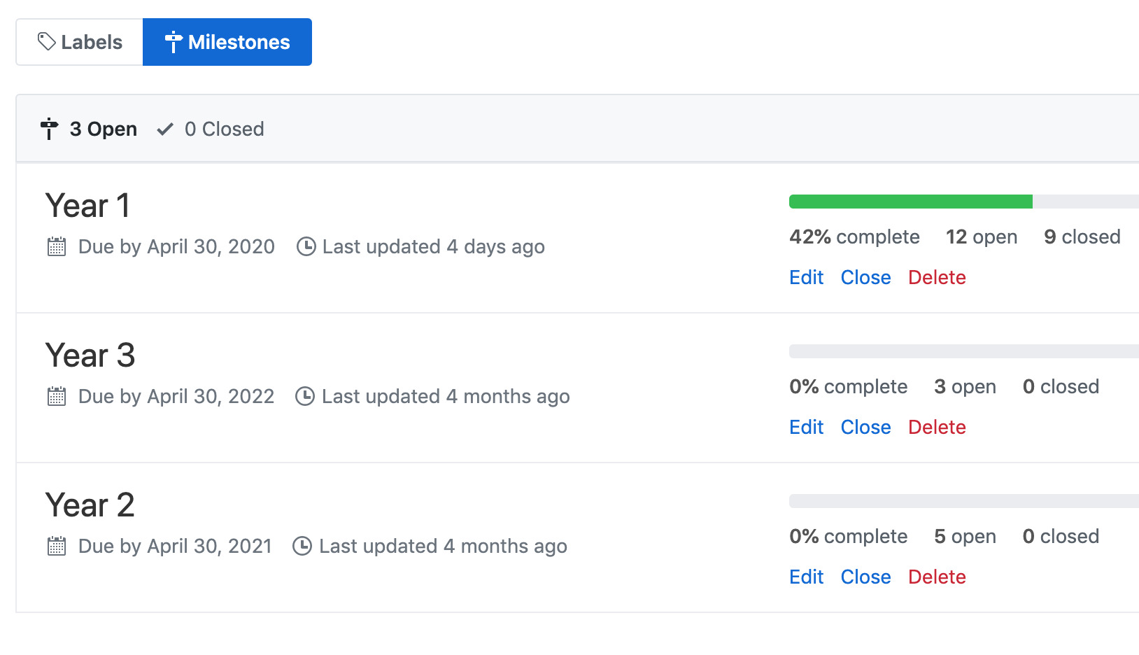
For a bit of context, the project will run over 3 years, but won’t consume the whole team’s time over that period.
What this means for someone looking after project progress is that I want to see what we’ve committed to in each year, and how all that’s progressing. Each commitment is pretty high level – more like an unshaped raw idea. For this project, we’ve also set a budget (or appetite) for each commitment.
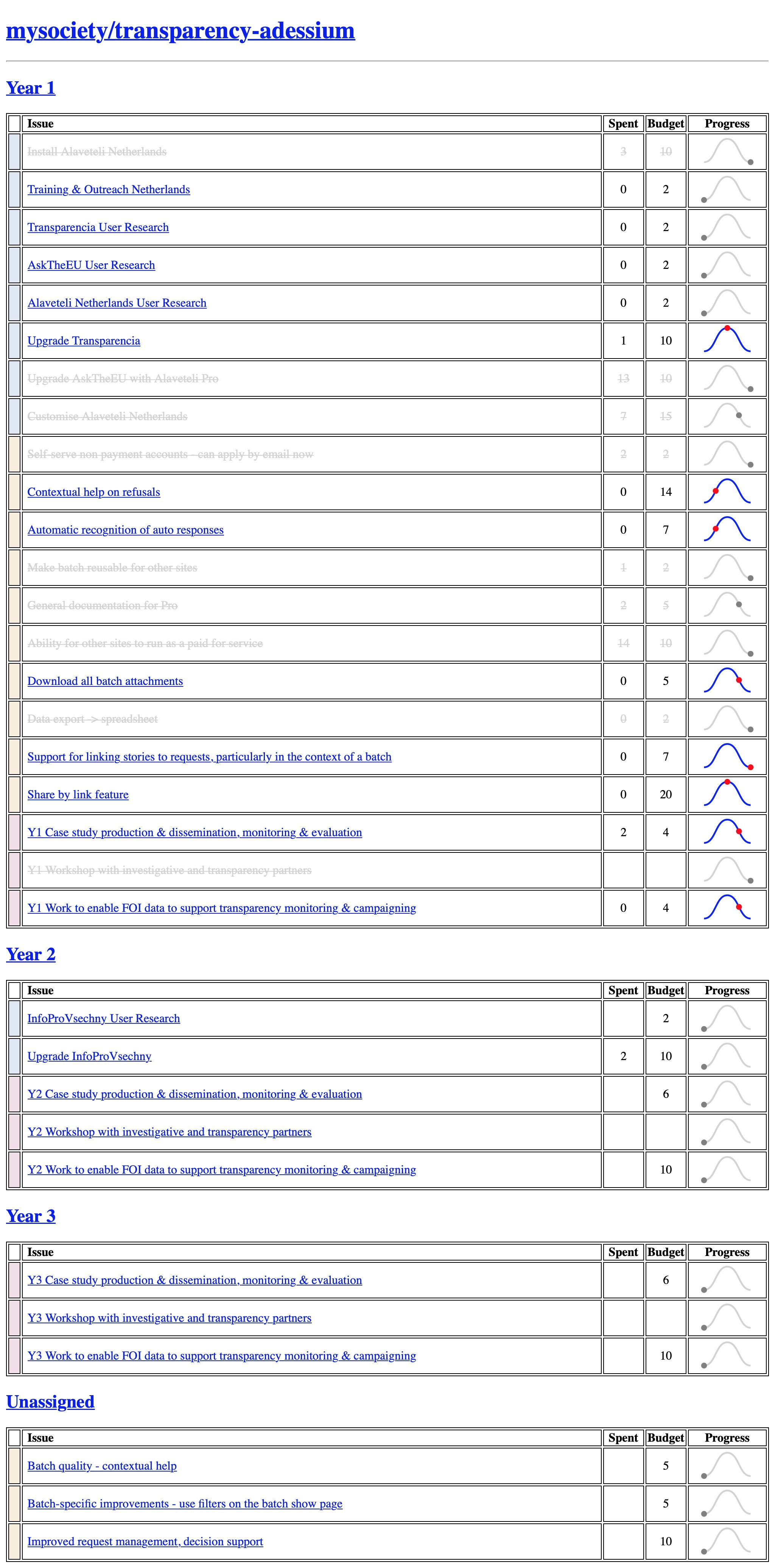
We primarily use GitHub for task tracking, so I wanted something that would align with our existing workflows as much as possible. This “dashboard” is just a static HTML page generated from data pulled in through the GitHub API.
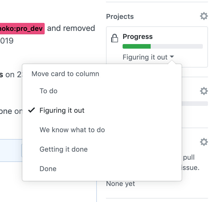
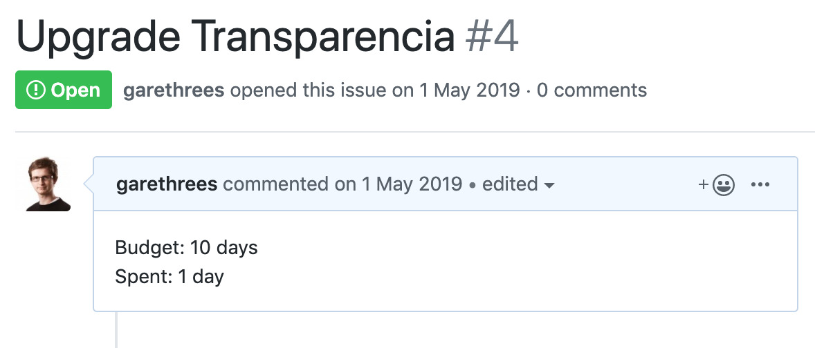
Each line in the table is a GitHub issue. The spent/budget is parsed out of the issue description, and the hill chart progress is driven by the columns in a Project associated with the repository.
The Project is set up with 5 columns (To do, Figuring it out, We know what to do, Getting it done, and Done) that correspond to positions on the hill. For people who’ve read Shape Up, they’re more akin to Raw Idea, Shaping, Shaped, Assigned to cycle, Done.
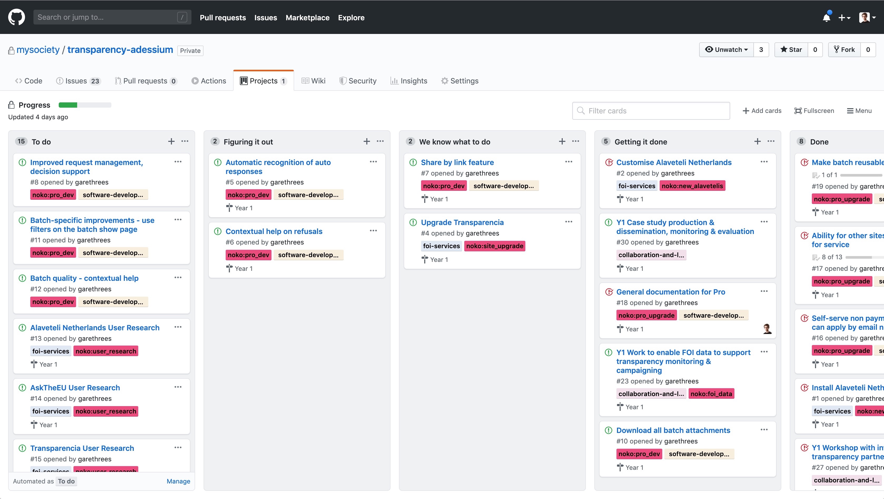
I don’t actually use the project board view at all. It’s easier to manage the progress via the sidebar of each issue.
The budgets are pretty loose, but serve as a rough appetite for us. They’re updated manually by editing the issue description and parsed out for the dashboard.
Each Year corresponds to a GitHub Milestone. Again, I don’t really use these in GitHub – its just a nice way of grouping the commitments allocated in each year. Any issues without a milestone are grouped under Unassigned. These are things we want to work on over the project, but haven’t yet decided which year we’ll attempt them in. This will grow over the course of the project as we get more raw ideas from users.
As we shape the raw ideas (Figuring it out column) I update the issue description until there’s a pitch we’re happy with and ready to allocate (We know what to do column).
This has been really nice to be able to just scan for a point on the hill to answer questions like:
- Which commitments need
shapingso that we can make use of some upcoming development availability? - Which commitments can I assign for development this sprint?
- Which commitments have we assigned for development that haven’t moved to done that might need some
scope hammeringor other un-sticking?
It’s not lost on me that the implementation of this is linear – moving the cards across a board – but the important thing is the thinking behind each step. Having language around uphill and downhill work to be a great level up in thinking about “progress”.
It isn’t quite the use that Basecamp intended. They only allocate shaped work to a cycle, and then track more granular scopes of that work on hill charts, allowing them to scope hammer and prioritise different pieces of the implementation during the execution phase.
I’m using them at a slightly higher level of abstraction, but its still helped even on the macro level.
Happy to answer any questions!