Building Beauty: Week 22
Studio
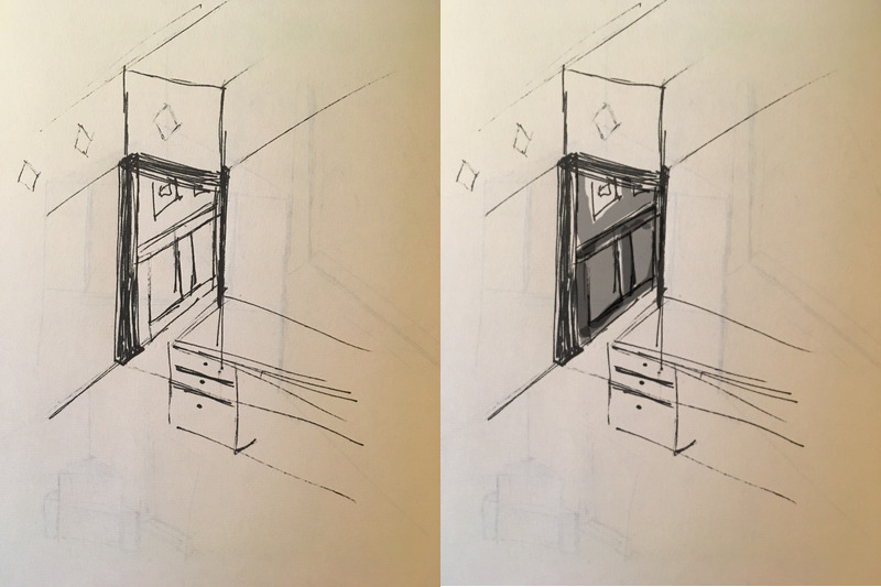
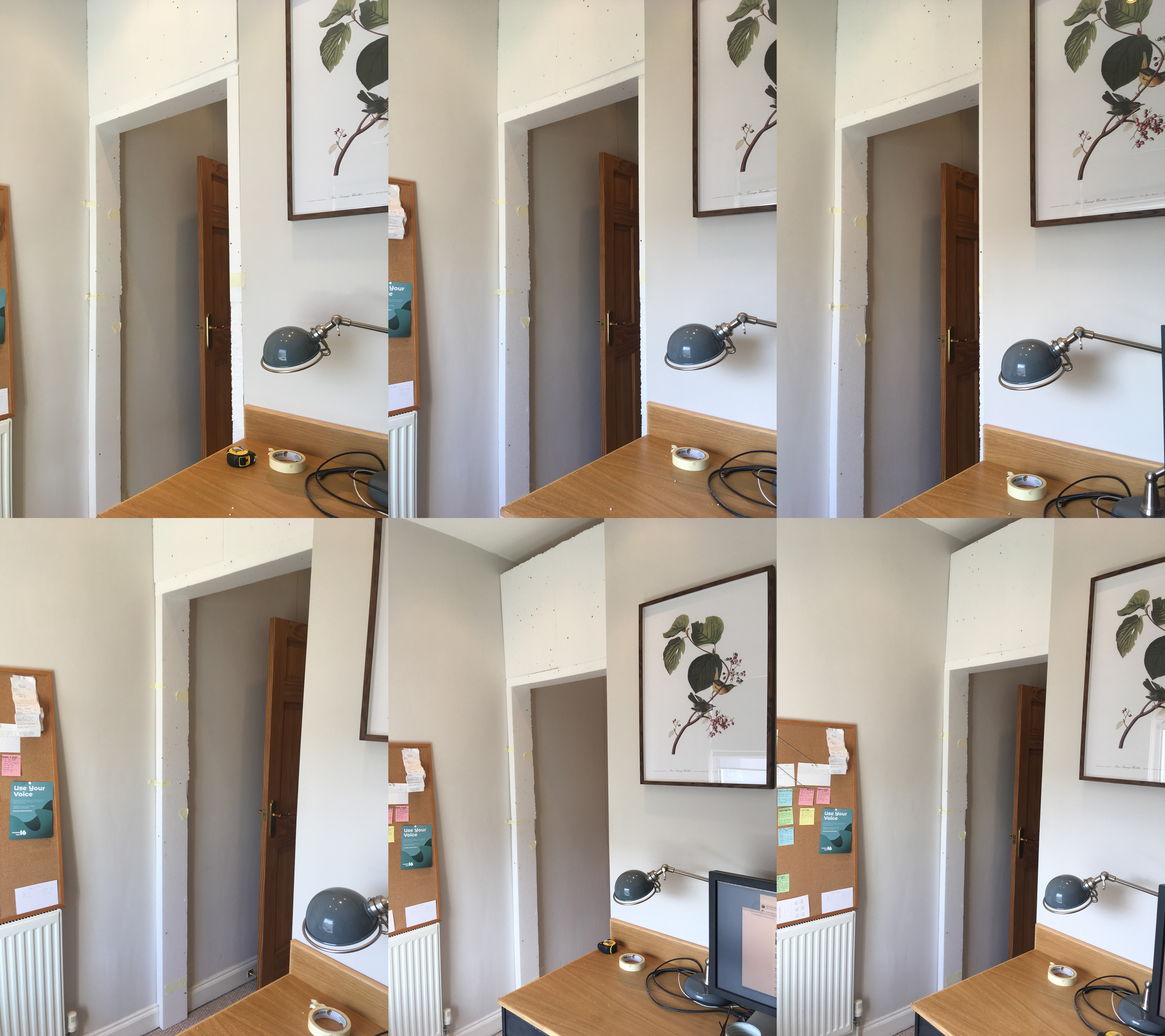
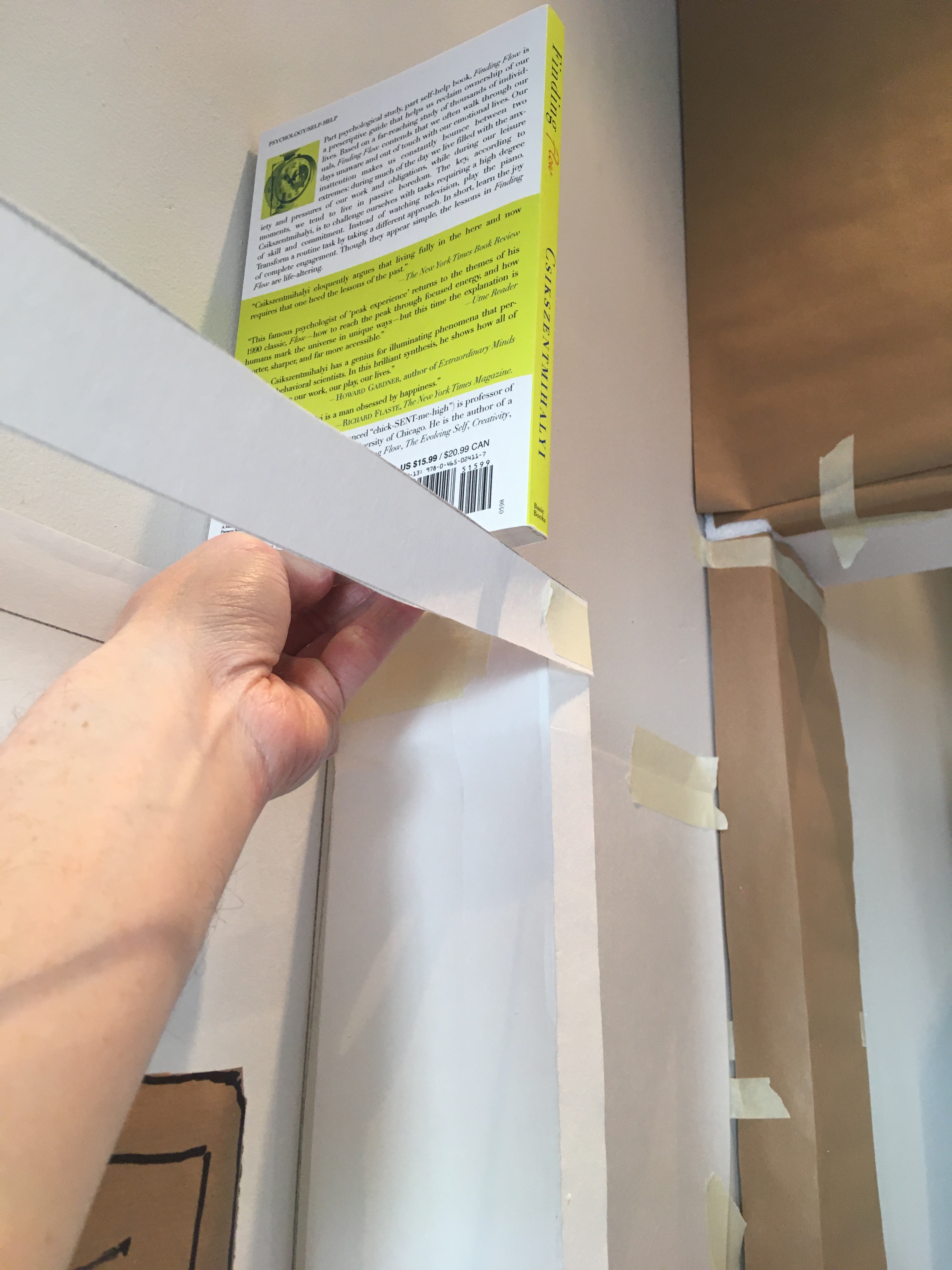
Last weekend I’d moved on to 1:1 mockups of the hallway.
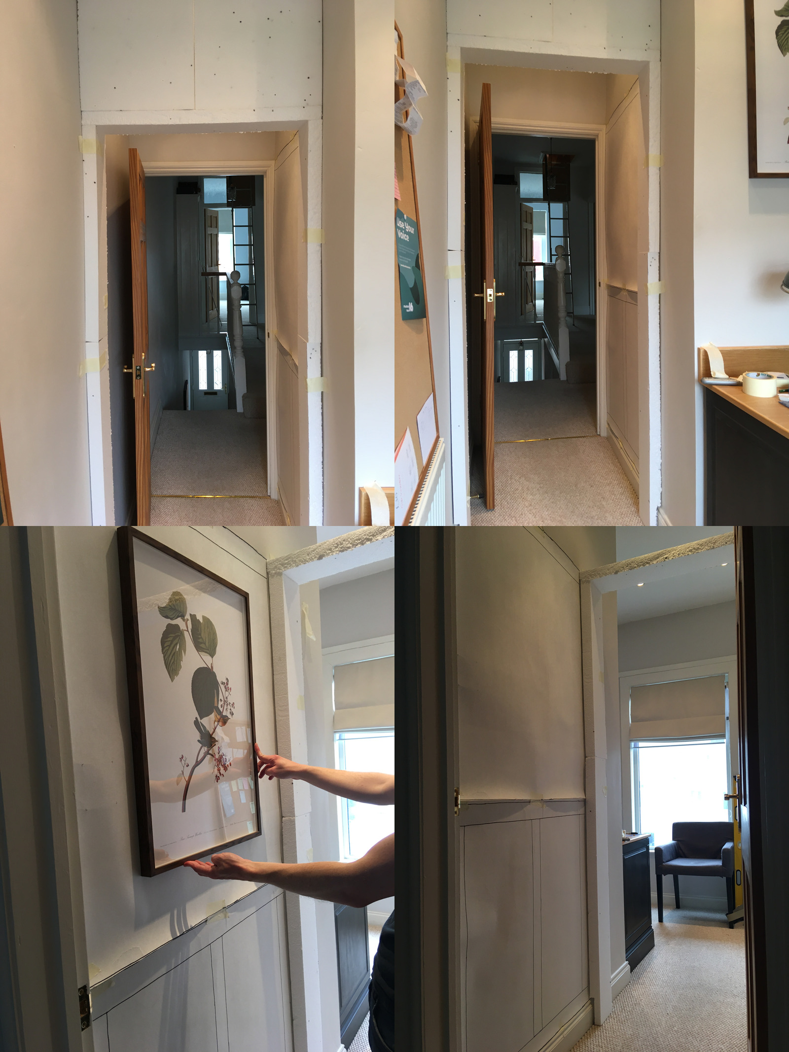
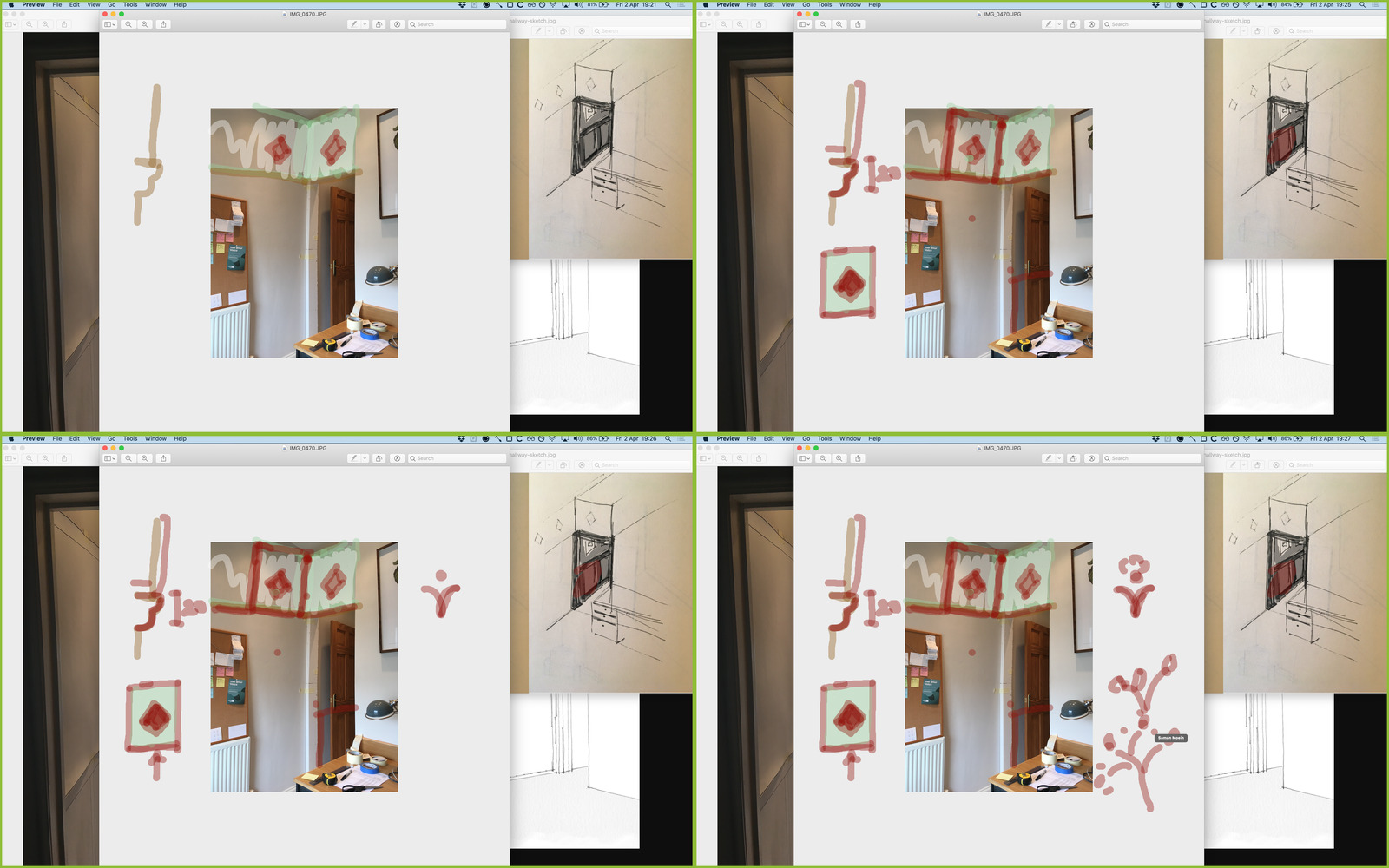
I didn’t get to show these until late on Wednesday, but then had a couple of bits of feedback:
- It feels a bit squashed because it’s pushed back from the desk wall so far
- Add some colour to the frame – it’s really dark in the sketch
In my tutoring session with Saman, we explored these and a few other ideas.
We talked a lot about whether the arch should be flush with the desk wall or set back, and started getting specific about the thickness of the archway, what moulding to use, and whether to add some sort of ornament at the corners (e.g. a corbel).
We digressed back to the window for a bit, re-exploring the window seat idea, and, if that wasn’t going to work, how to enhance the frame.
We then got back to the archway, and had a play around with some ideas for the decorative frieze.
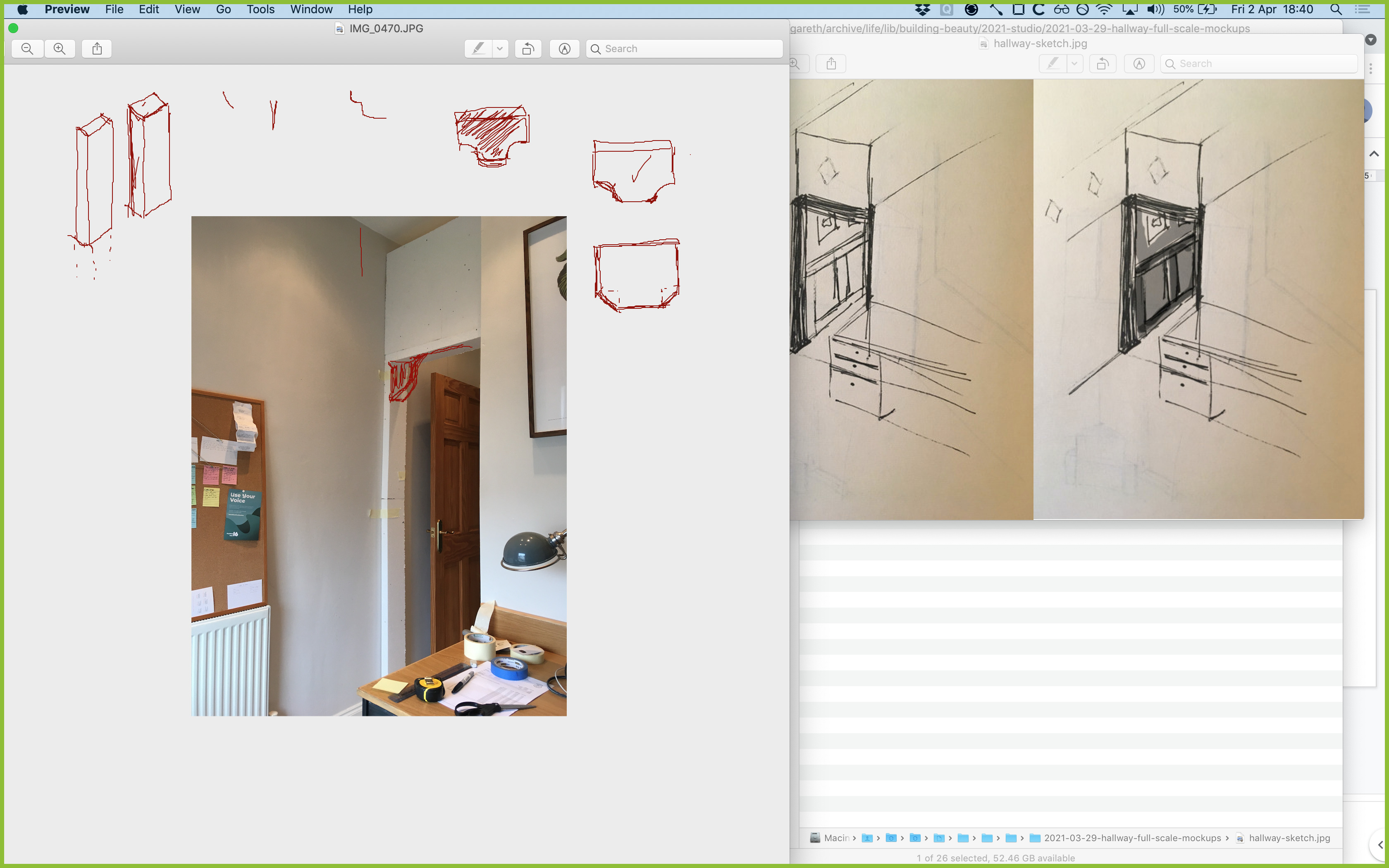
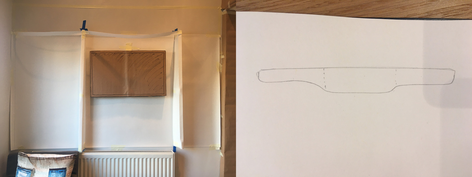
Another round of mockups…
Lots of fine-tuning the position. In the end I figured out that the best feeling was where the frame was inset, but so that you could still see the right and side of the frame. This ended up being 1.5” set back from the desk wall. I expect I’ll have to fine-tune this when I use the actual material, but it’s good to finally understand the critical part of making it feel right.
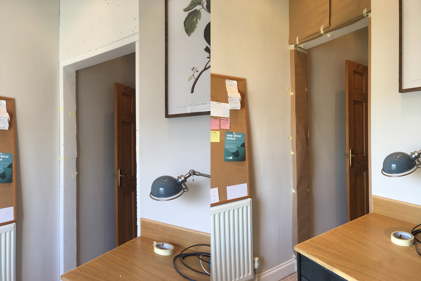
After this I tried wrapping it in brown paper just to compare lighter vs darker. I think it does add some definition, but I must say I find it a bit hard to see a bit further ahead with this one.
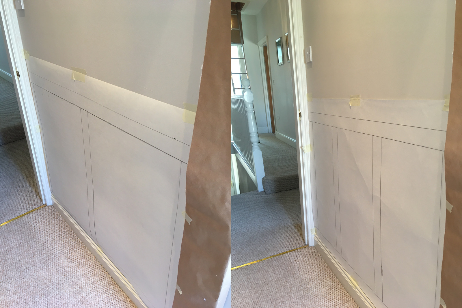
With the length of the tunnel significantly longer now, I had to revisit the panelling. Dividing in two left each panel feeling quite fat and stubby. Three panels felt much better. I think the proportions are about right, if a little on the tall and skinny side. I don’t think there’s much vertical wiggle room – that feels right where it is.
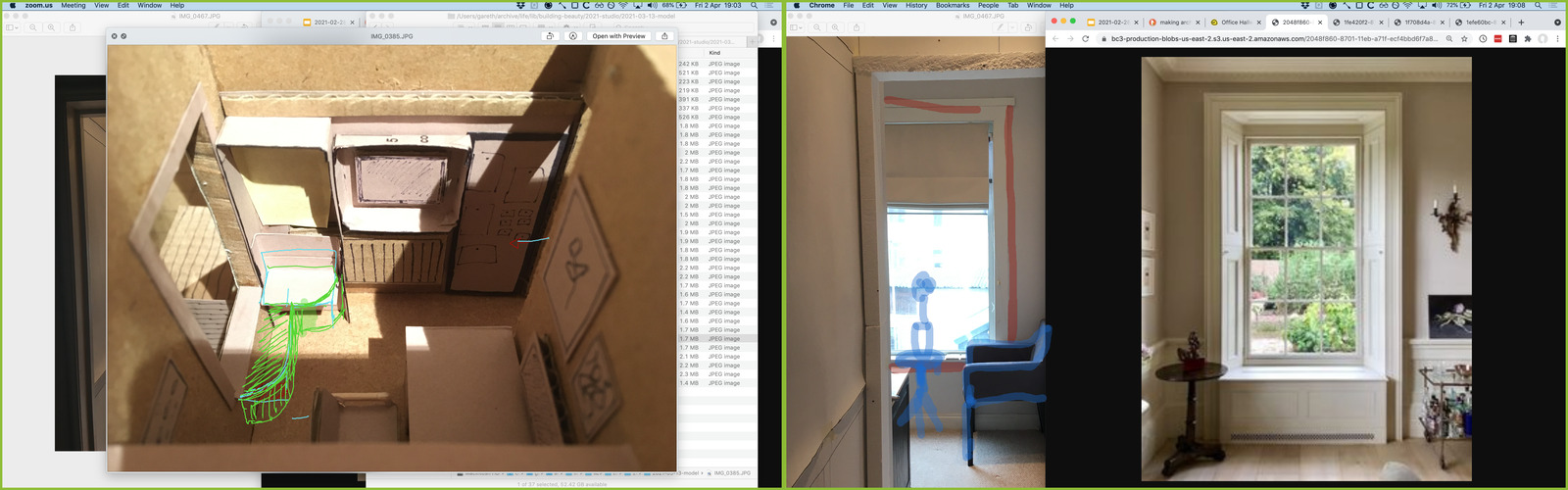
After this I was thinking about the frieze quite a lot, but couldn’t really figure out what to do without a sense of what was below it. So, I started mocking up my current idea for the window seat / standing desk area.
The drawn-on carcasses didn’t really give a good sense of depth, so I found myself making polystyrene and paper timber.
This was really annoying me while I was doing it, but I’m glad I did. I was originally thinking to make these 200mm depth, but I figured I’d try 100mm first for reasons I can’t remember. 100mm definitely feels deep enough, and more would push into the room way too much.
I gestured towards the new centre that’s been created between the top of the wall unit and the top of the archway, which gives me the rough bottom of the frieze area.
The downside to this is that 100mm is a bit too shallow for use as a bookshelf. It’s pretty close for smaller paperbacks though, so maybe some decorative cornice could add a little more depth at the top without the whole thing imposing itself in the main part of the room.
I’m thinking that the left-most vertical piece of the carcass pulls it out of balance. Maybe I’ll get rid of that and profile the whole thing a bit more? Everything is a trade off though. This might make the small bit of wall to the right of the window feel a bit “left over”, so I’ll think about if there’s anything I can do with that.
I’ll probably go back down to my 1:50 model to experiment with the frieze, since I’m really not sure what to do there. The diamonds from my original sketch seem quite nice, but once Saman and I started experimenting with them in colour it quickly ended up feeling a bit much.
Nature of Order
I’ve managed to at least start Book 4 – The Luminous Ground – but haven’t made much progress yet.
This week we were asked to complete a survey of our experience of the class. Here’s an extract of some of the answers I submitted:
Did the ‘Nature of Order’ make you question or change the picture of the world you had? (1-7)
5
Please explain why the readings and the course changed or didn’t change your view of the world
The fundamental process has been something I’ve intrinsically followed, but Alexander has articulated it with much sharper ideas and vocabulary, so I was very ready to accept his teachings. The 15 properties and field of centres has been much more new to me, and while I naturally used unfolding, these ideas have been a huge level up in understanding how to do it well and not so haphazardly.
Please write up to three things that you liked about the course
The mix of reading, listening, talking and doing that happened due to the combination of NoO and Studio. To me, the most enjoyable sessions were when we were looking at real things – doing Mirror of the Self, our collaborative unfolding.
What is a center?
- The midpoint of any geometic form
- A focused area in space
- A mode of being aware of one’s own self
- A connection to the luminous ground which is the source of all there is
2
The field of centers is:
- I don’t think I understand what it means. I just don’t see it.
- A good theory that explains how humans perceive the world
- A real phenomenon that goes to the core of how the world is constructed
- An interesting way to look at the world among many others
2
What do we mean when an object, place or event is “alive”?
- It is really qualitatively different than the ordinary - but it’s a mystery to me
- This is a metaphor that describes our own sense of feeling more alive in its presence or when we are there.
- It’s just a figure of speech for something nice
- The field of centers in and around it is so strong that it draws us into it and makes us more alive.
- The field of centers in it is so strong that it connects us to the Self, I or Void which is the substrate of the universe
4