Building Beauty: Week 24
Studio
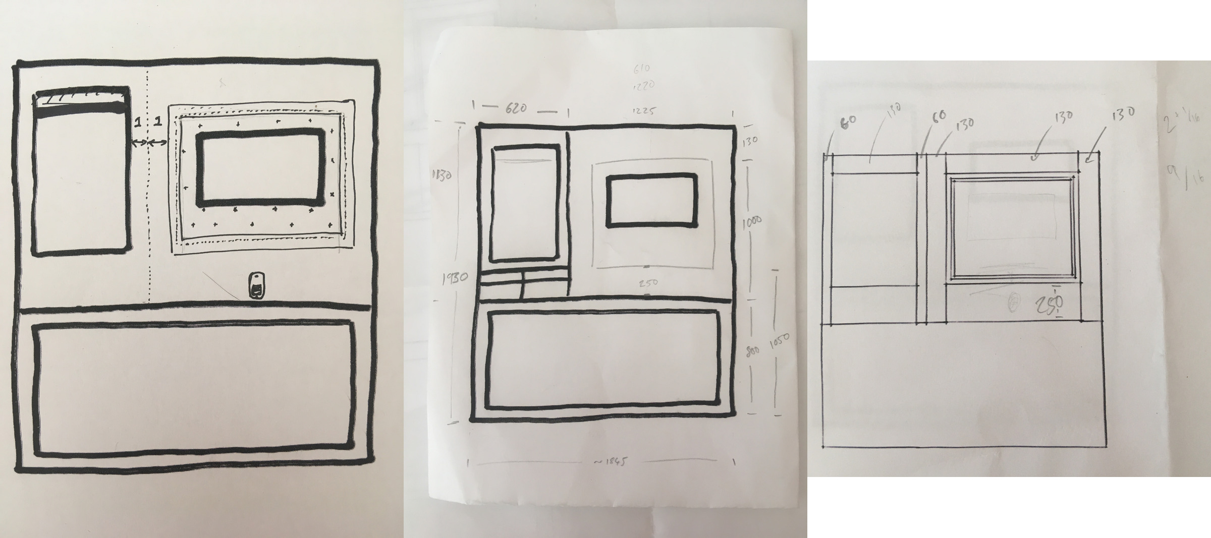
1:1 Mockups
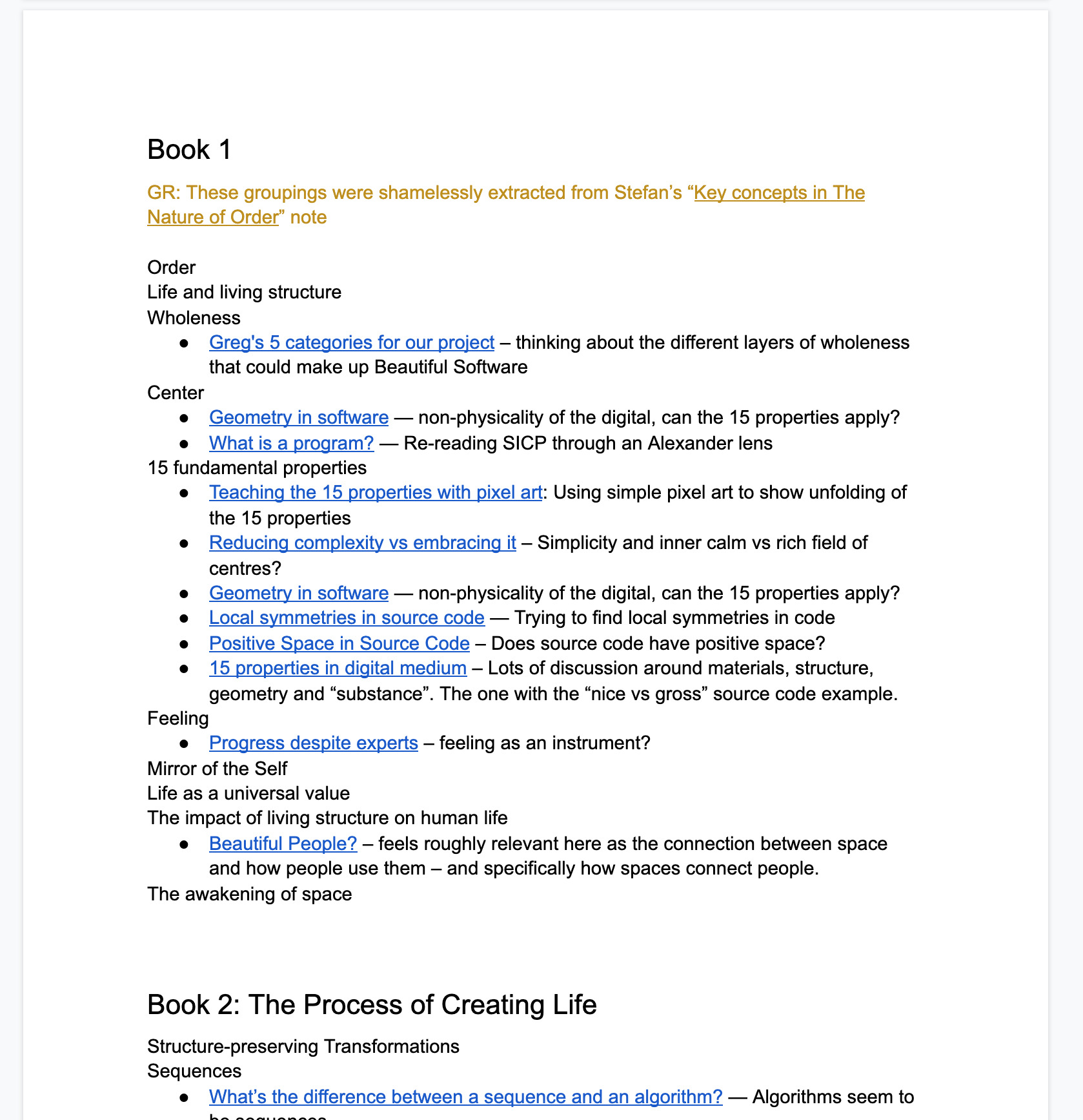
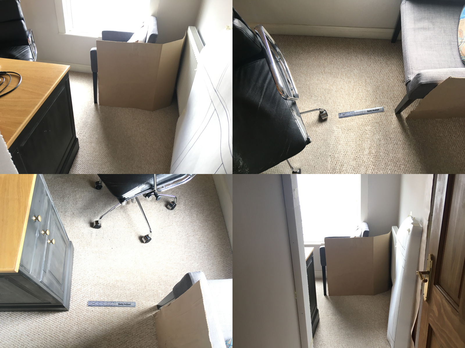
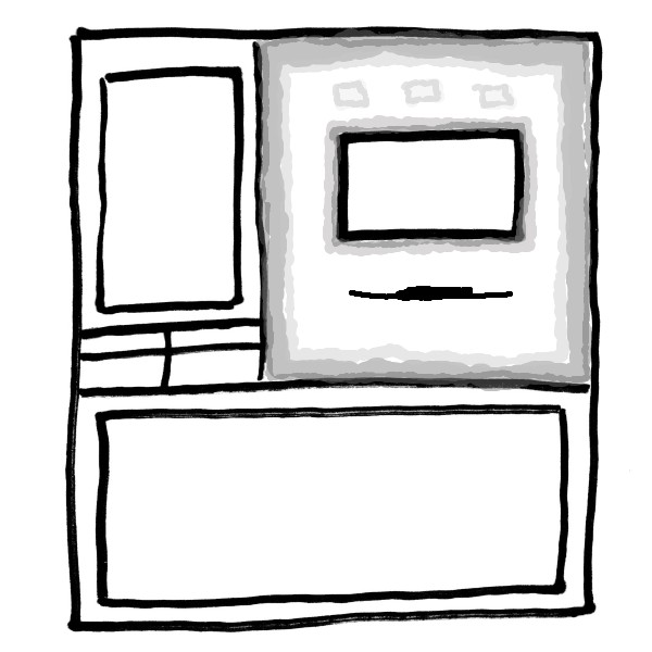
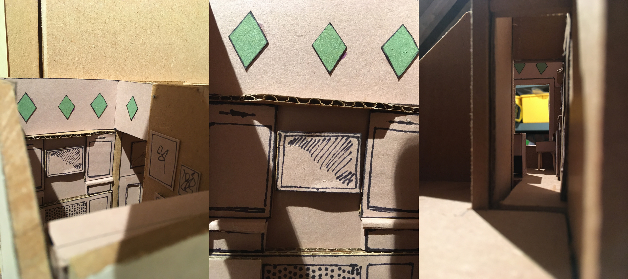
I managed to mock up the main part of the chamfered radiator cover. I just did a portion of it, since it would have been really difficult to do the full span. The main thing was to test the interaction at the borders. I really like the feeling of the chamfered edge as it connects to the archway.
The heights all feel pretty good to me. Still undecided on the “cubby” portion on top to make up the height, but there’s something about it I really like. It makes the radiator portion feel like a different area – different local symmetries – compared to just monotonously continuing the full height panelling from the hall.
Mirroring the chamfer on the left hand side is probably neither here nor there, but I’m leaning towards doing it. I guess one might say it’s not very positive space, but I think it makes it all feel a bit more balanced and less of an abrupt ending.
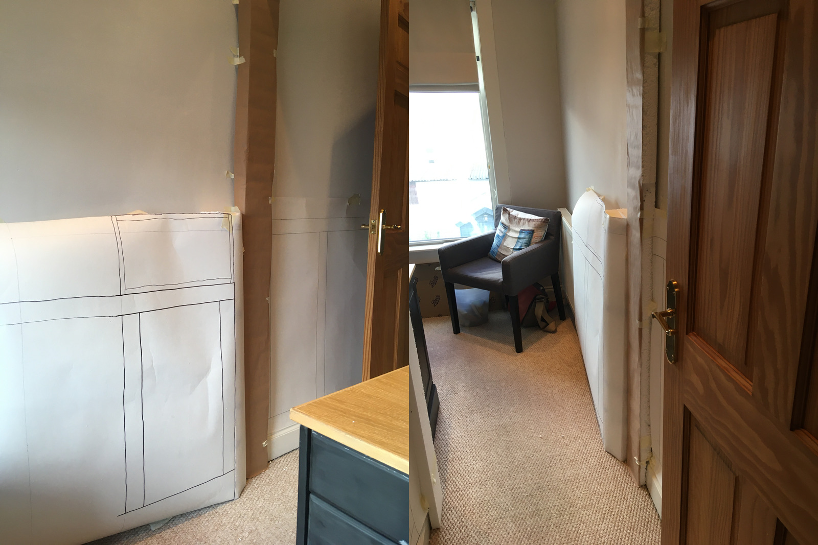
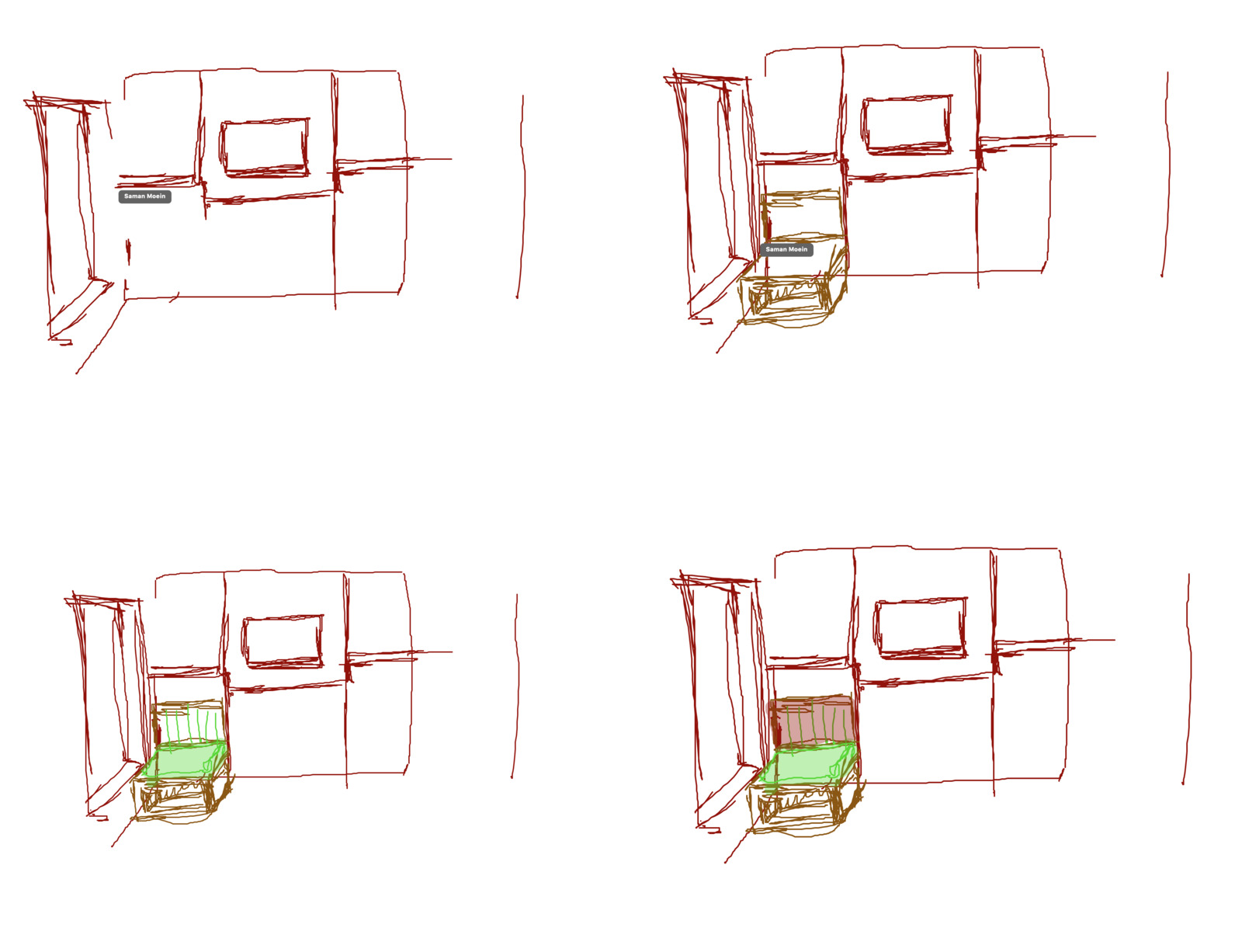
In class we discussed a few more ideas around combining the radiator cover with a window chair, and whether I could use a folding shelf for the keyboard.
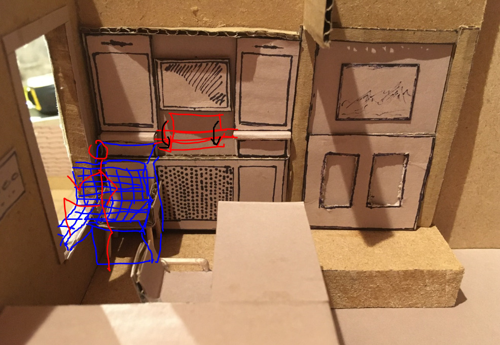
I did a quick mockup of the sketch, but I’m not sure it feels better than the freestanding chair. To me it feels like it imposes itself in the room. There’s not enough space in front or to the side of it. It also reduces the length of space for my legs in the “raised” position, so it feels a bit like being squished in a box!
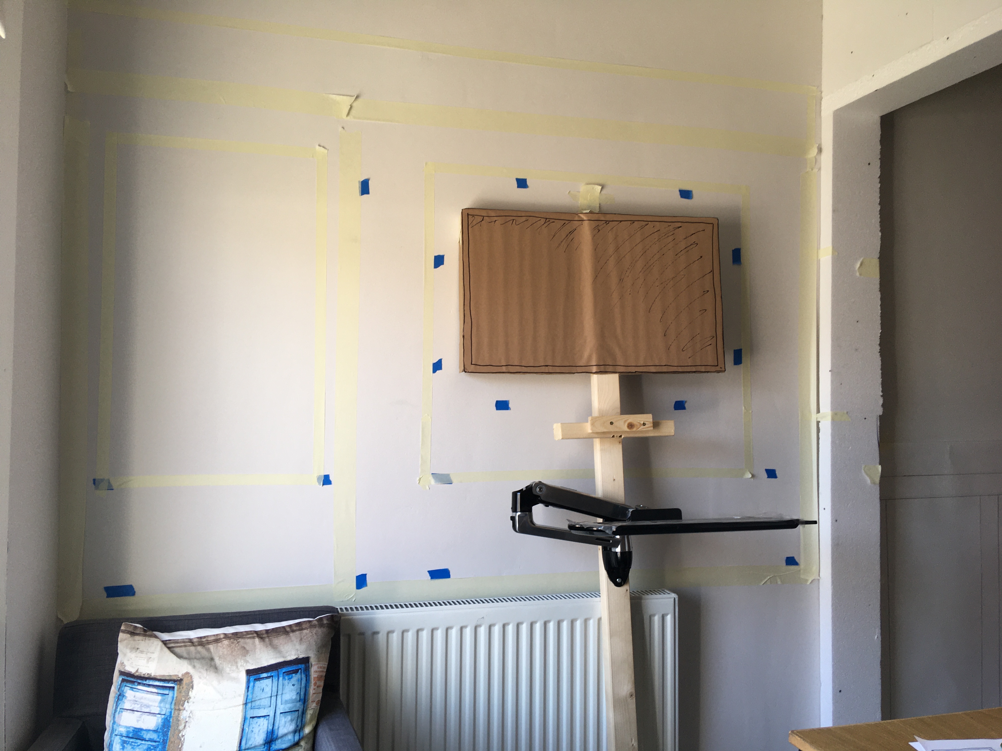
A folding keyboard tray was my first thought too – I’ve been through quite a few concepts of this prior to Building Beauty – but the problem with that is the distance between screen and face. A short shelf puts you way too close to the monitor.
I tried some variations on fold down and pull-out shelving, and even ordered some short drawer slides and made a prototype. It was ridiculously flimsy! It was like typing on a trampoline! I could of course make the shelf long enough to be the correct distance, but then that takes a load of space when folded down. I know it’s going to drive me mad unless I can use it and push it out of the way without even thinking about it.
I managed to get a used Ergotron LX keyboard arm for a reasonable price, and OMG it is so much better. It’s built like a tank. It’s super sturdy (minimal bounce while typing) and just glides as you move it. Some things are better from a production line! ;) In all seriousness, it does feel really good quality. My desk monitor is mounted on a cheaper lookalike, and the difference is night and day. It’s certainly not unique, but I do feel that at least they’ve put the effort in to making it great, rather than an image of something great.
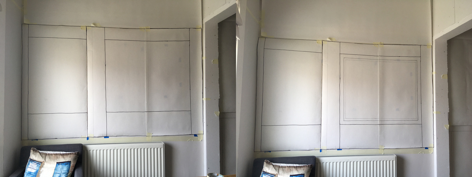
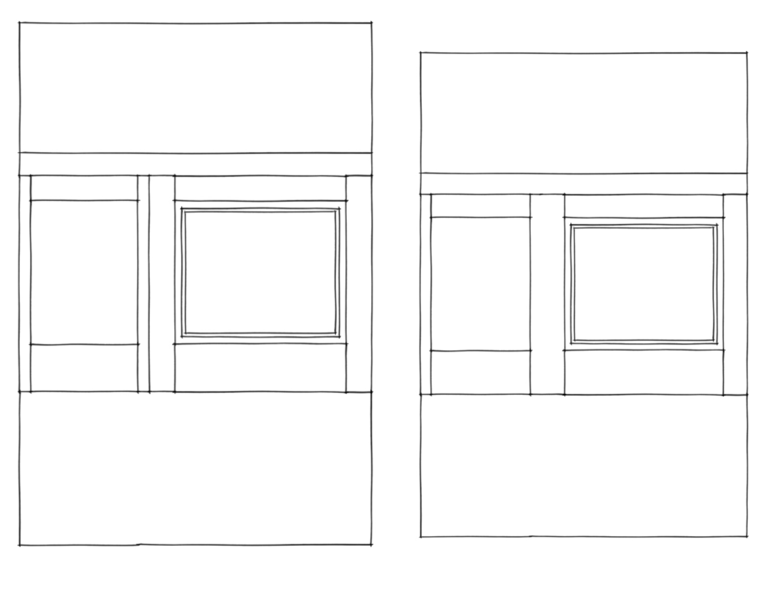
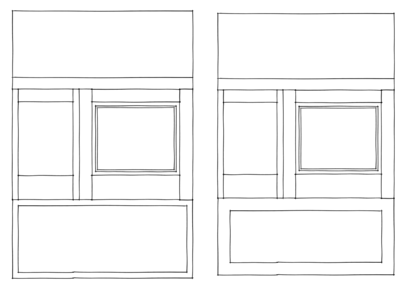
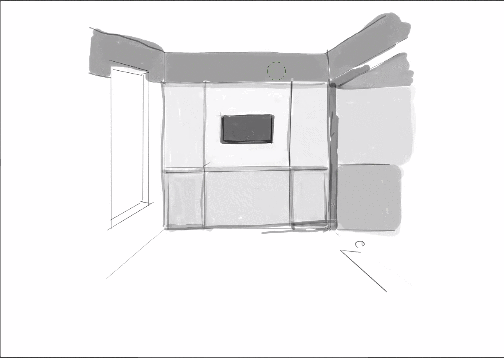
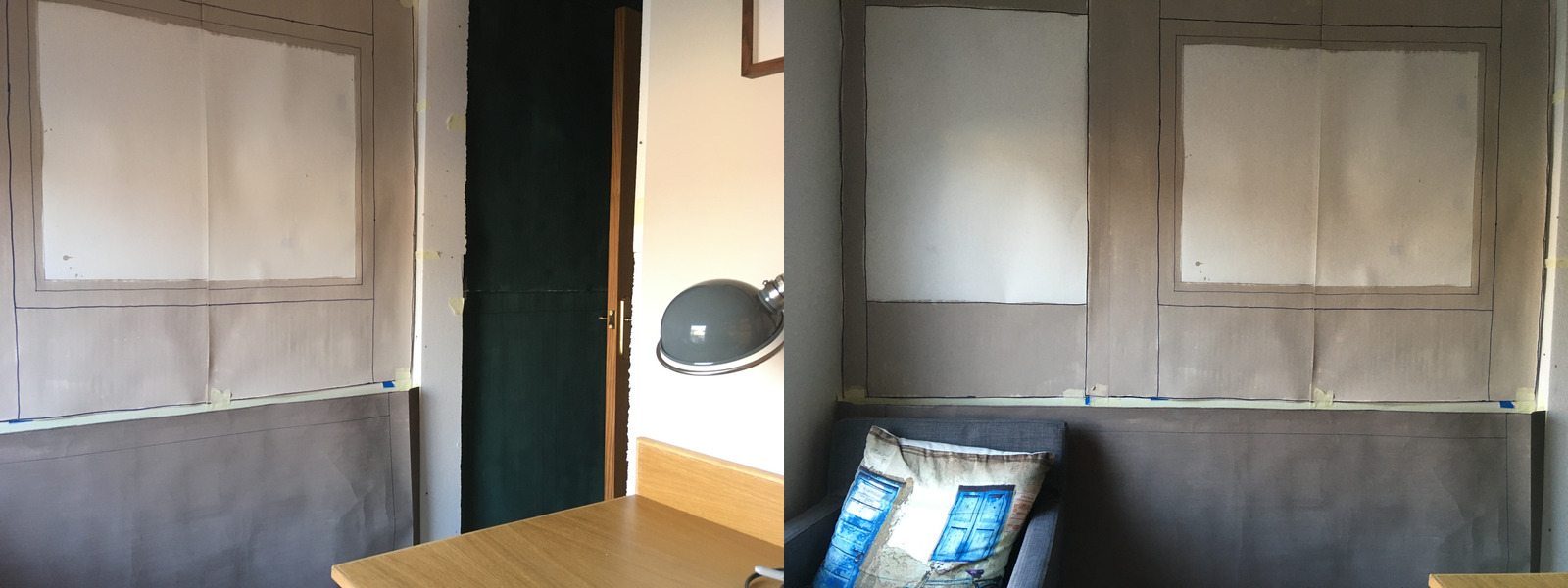
There were some comments about things feeling too “squished” with the panelling because of the symmetry, contrary to some of the previous thinking, so I tried a couple of variations.
Dropping the right-hand panel felt nice and much less cluttered but a bit sparse, so I had a play around with some structure-preserving transformations digitally.
The end result feels pretty good to me. I’m imagining the outer border as some quite wide, complex, moulding.
I think there’s opportunity to add some very fine-scale detail to the white space along the lines of a very subtly textured or ornamented wallpaper. The paper I’ve been using for my mockups is actually “lining paper”, which is paintable, so maybe I’ll use that for the backing and try to hand-paint some details. It is quite a nice, soft texture.
Saman and I had a fun tutoring session talking about the micro-adjustments that are needed to really get the feeling right. He was showing me in sketch how he makes small adjustments and then unfolds a new iteration based on the last. This felt a lot like the examples in Book 2 but at much greater complexity. This applies to the 1:1 mockups as well, of course!
Explored the window seat again 😂. A nicer iteration I think, but I’m still not convinced it adds much over a nice freestanding chair. To me the main thing that makes the feeling work here is the positioning and use, and being built-in would be a marginal gain at best. One day, I will have an office with a window seat!
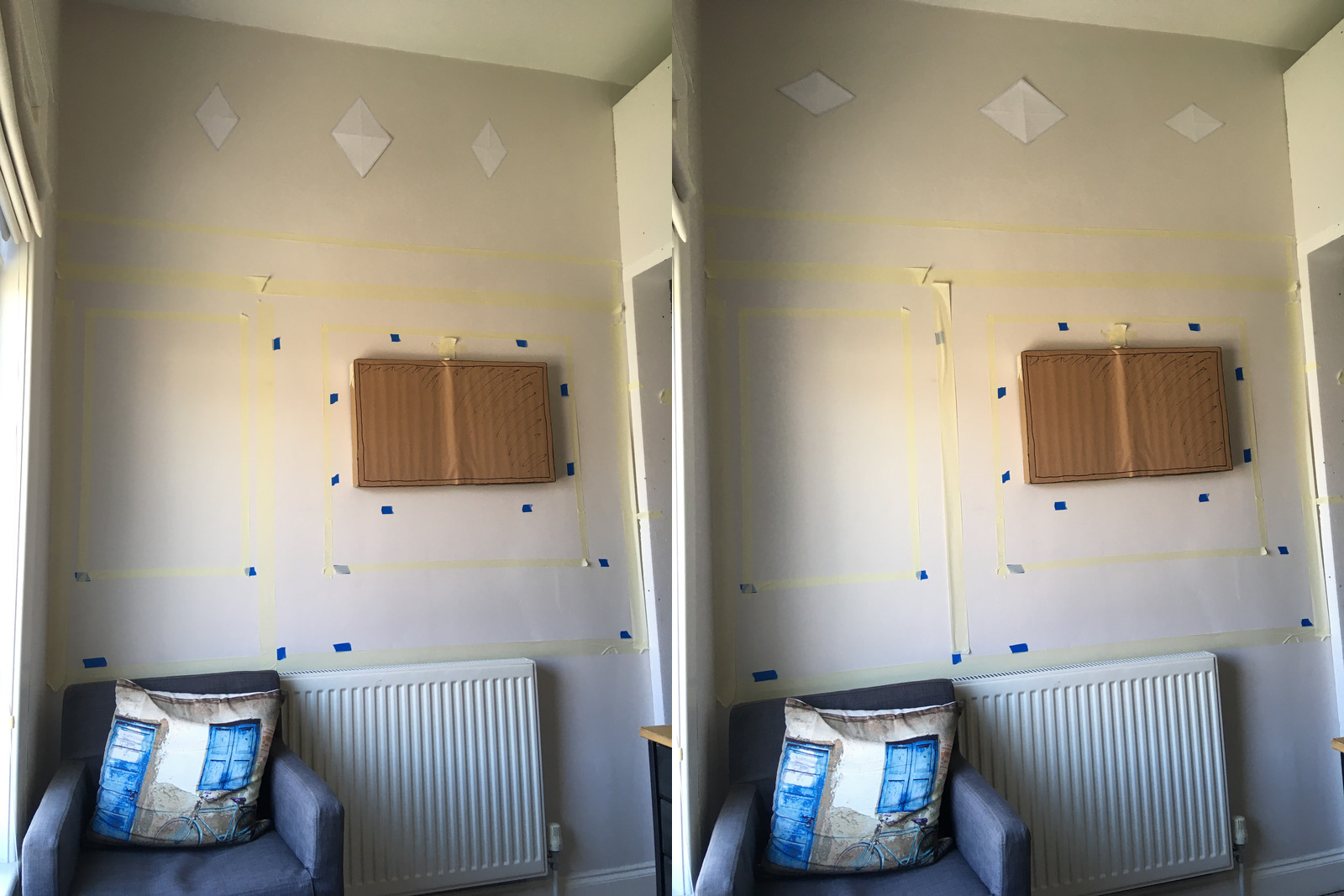
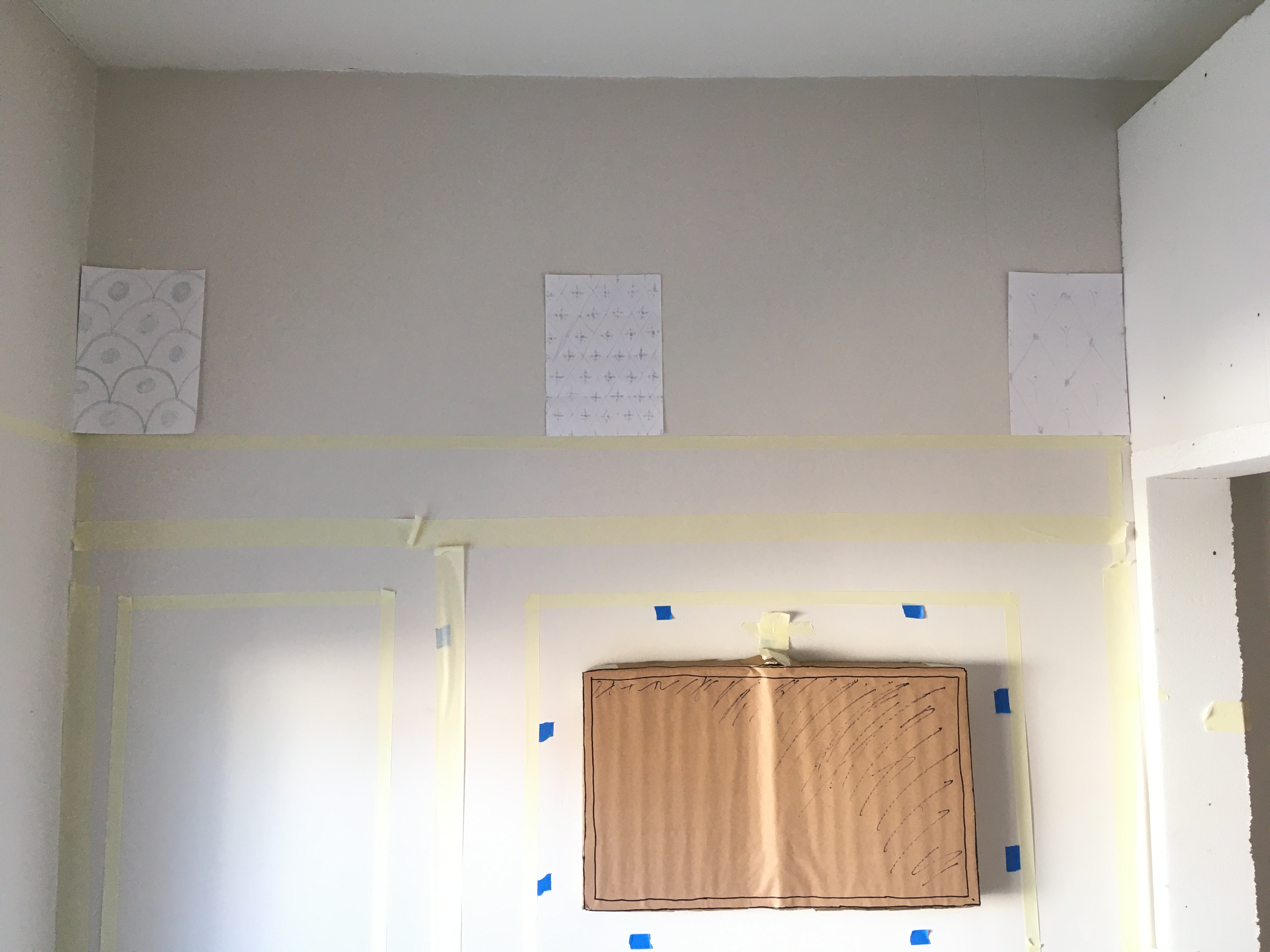
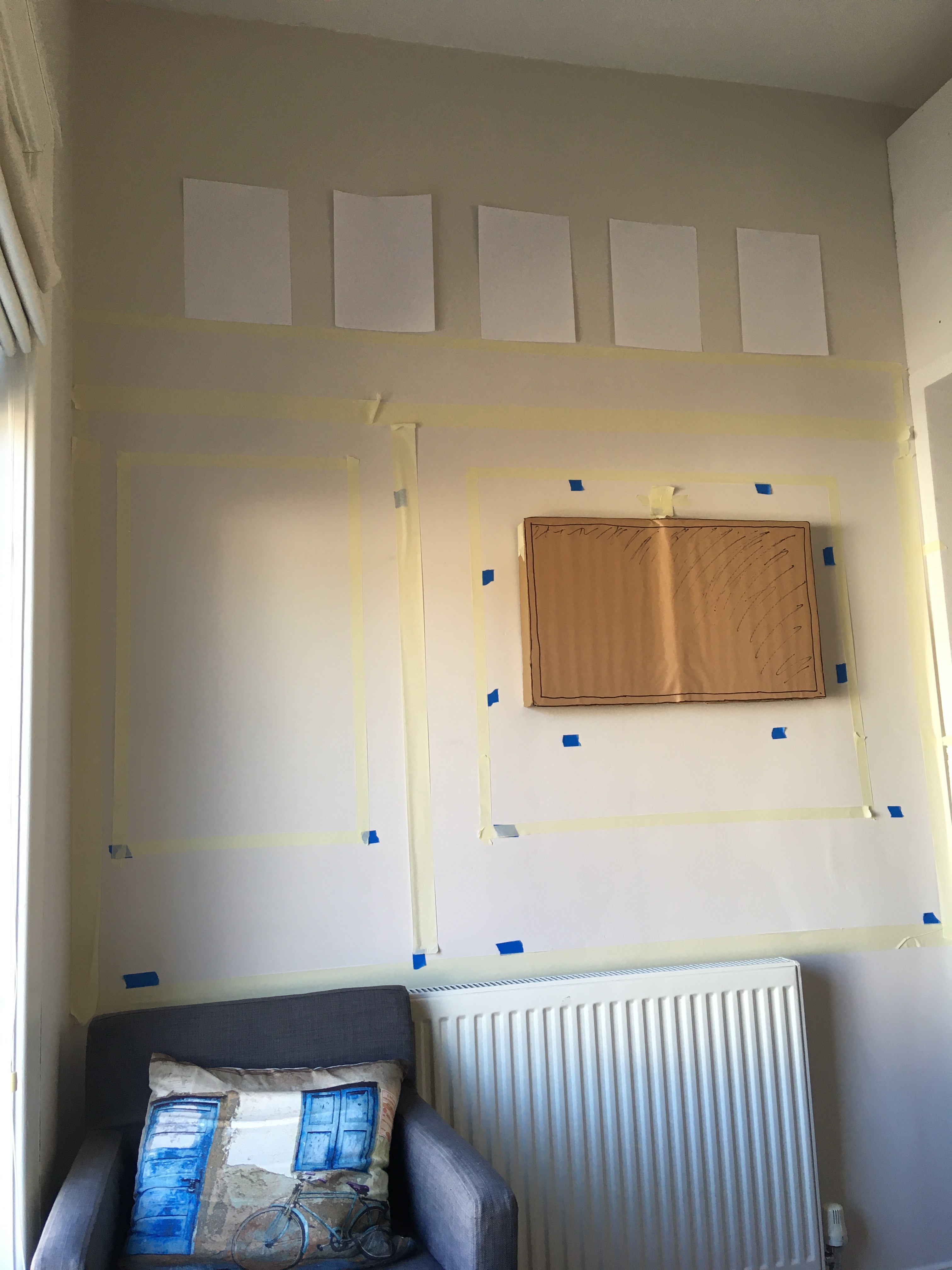
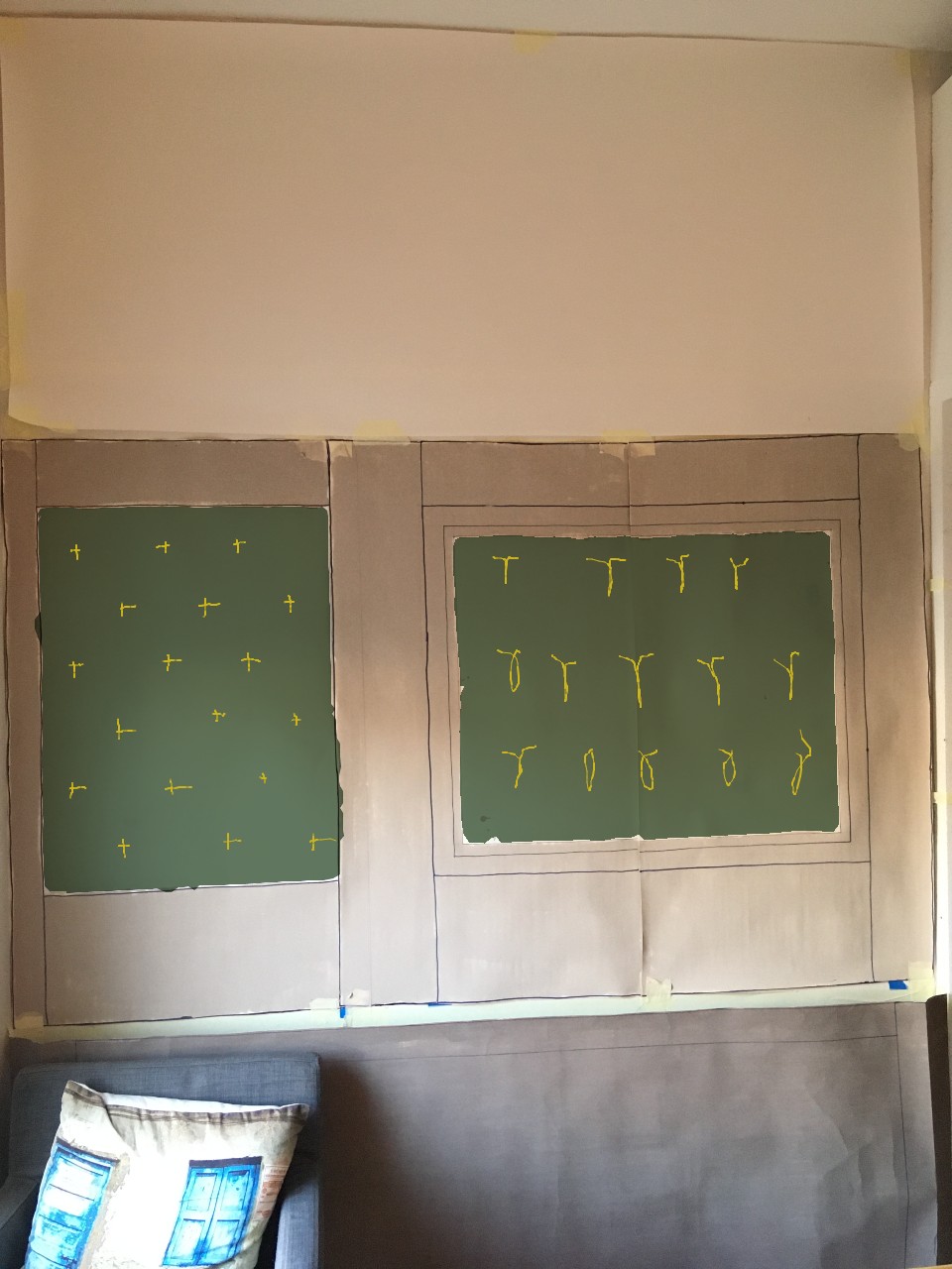
I did another round of 1:1 mockups, starting off with some masking tape to organise the space.
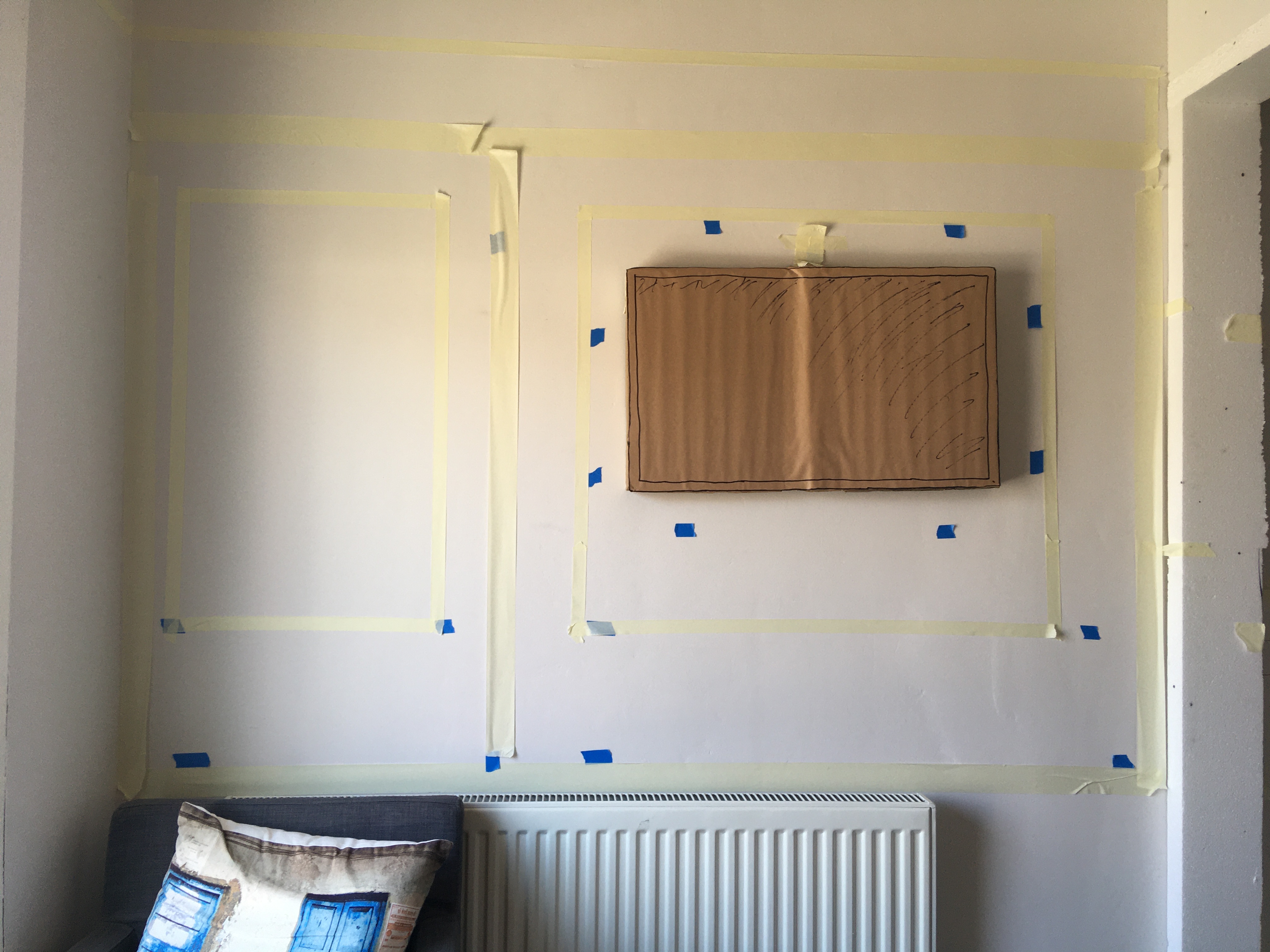
Tried out the positioning of the keyboard tray and the natural standing position. All felt good.
Then applied the lining paper with some more definite markings.
It’s hard to convey here, but there was quite a lot of micro-adjustment happening here. The left-hand panel took a couple of attempts to get the feel of the middle stile (the vertical part of the panel) to feel balanced.
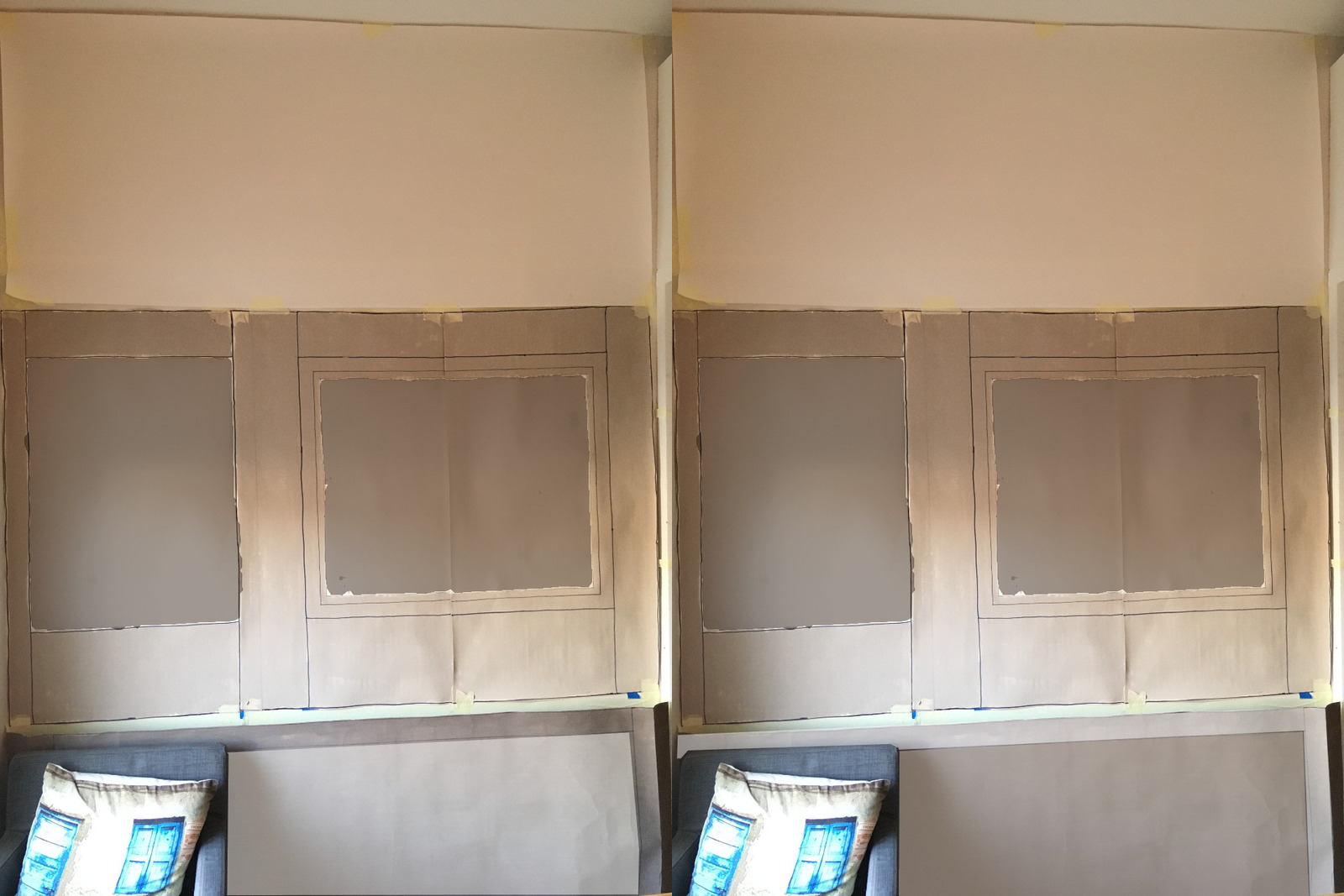
I’m feeling pretty good about it at this point. It feels like it’s hit simplicity. There are a couple of things I’m pondering, but they’re pretty minor details.
One is whether to be intentional about the two sections – maybe by adding a thin contrasting piece of wood – or just making it a single piece.
The other is the dimensions of the radiator cover. The thinner frame makes the inner section feel a bit too open, so might need to tweak that a bit.
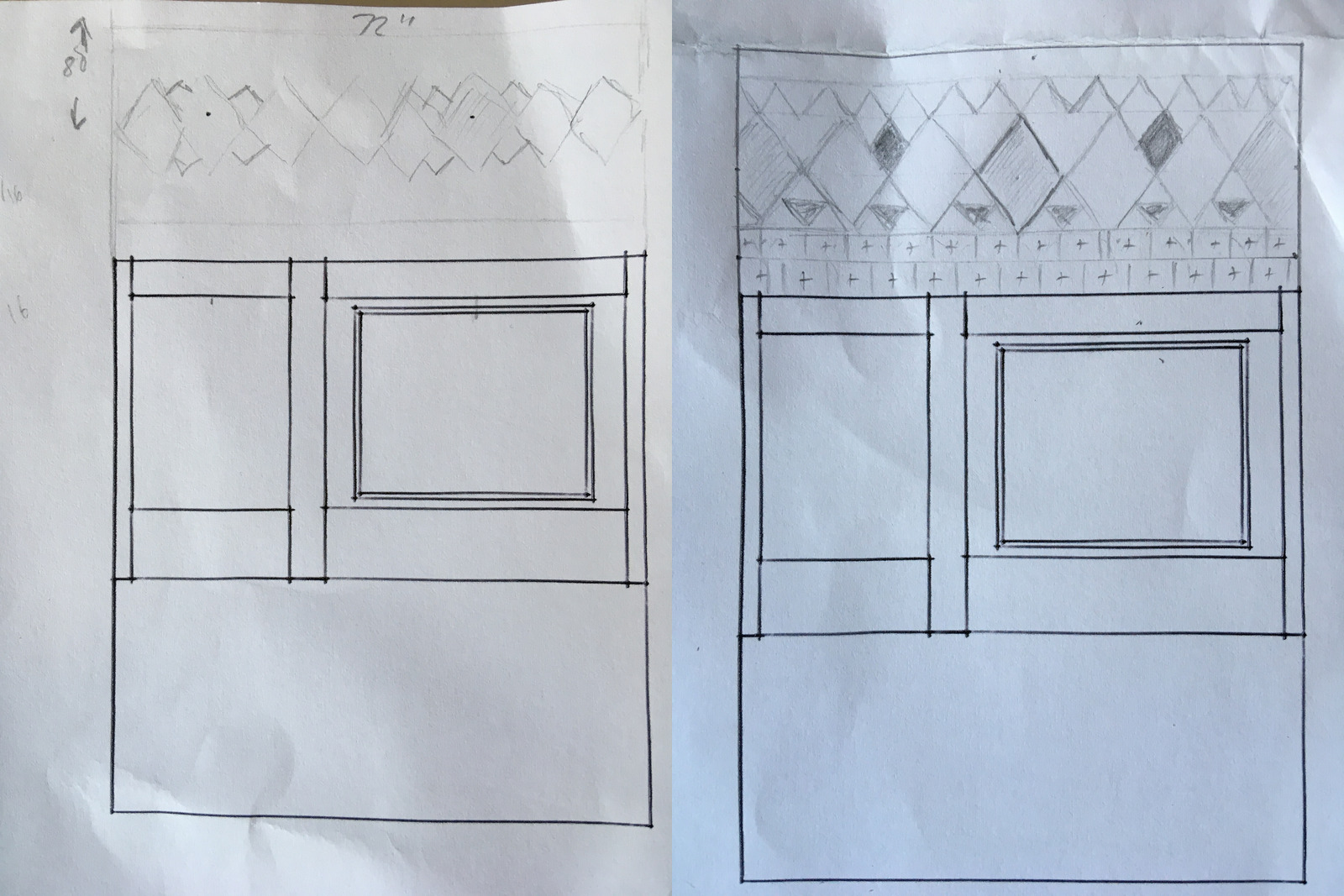
The Frieze
I had a crack at the freeze in scale mockup.
I know there’s a hard cut off to the left of the window which needs resolving. I need to have a think about how this will actually work in the real room. I can also see that there’s some more centre-strengthening needed, but I am very much not an artsy person so I struggle to know where to start.
I guess logically, thinking in latent centres, there are two:
- Inside the triangles
- Outside the triangles
Inside the triangles seems like an easier “problem” in some respects. I can imagine some nice pattern, or an ornamental shape in there. Outside… no idea. Anyway, glad I made this move. Feels quite nice, but so does everything at this scale! 🥰
In my tutoring session with Saman, we talked about the design a little. He said the most important properties to think about – and I’m sure everyone will have a different view on this – were Alternating Repetition and Levels of Scale.
In this example based on an idea Grace shared, he added alternating repetition with the blob/diamond/blob pattern, and then adjusted the diamond sizes to balance the levels of scale. He was also showing me how some quite simple shapes, when combined, can create a really nice border pattern.
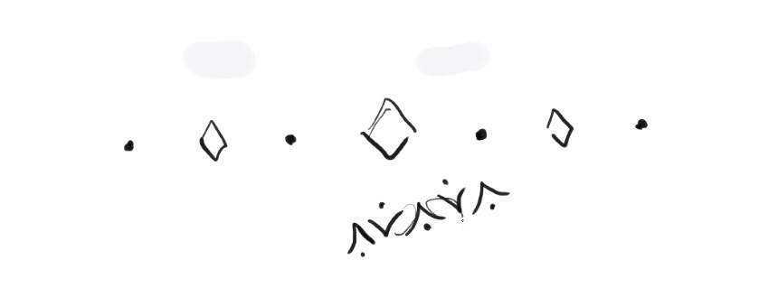
However, when it got to 1:1, it totally didn’t feel right to me.
Everything I tried looked too arts and crafts. I tried a couple of patterns, but wasn’t happy with them, so went back to some sketching.

It feels like there needs to be a subtle-textured background element, but that on its own is not enough. There should be a foreground element too. But it all looks rubbish! None of it has simplicity and inner calm.
I tried hacking a wallpaper I found online… same vibe.
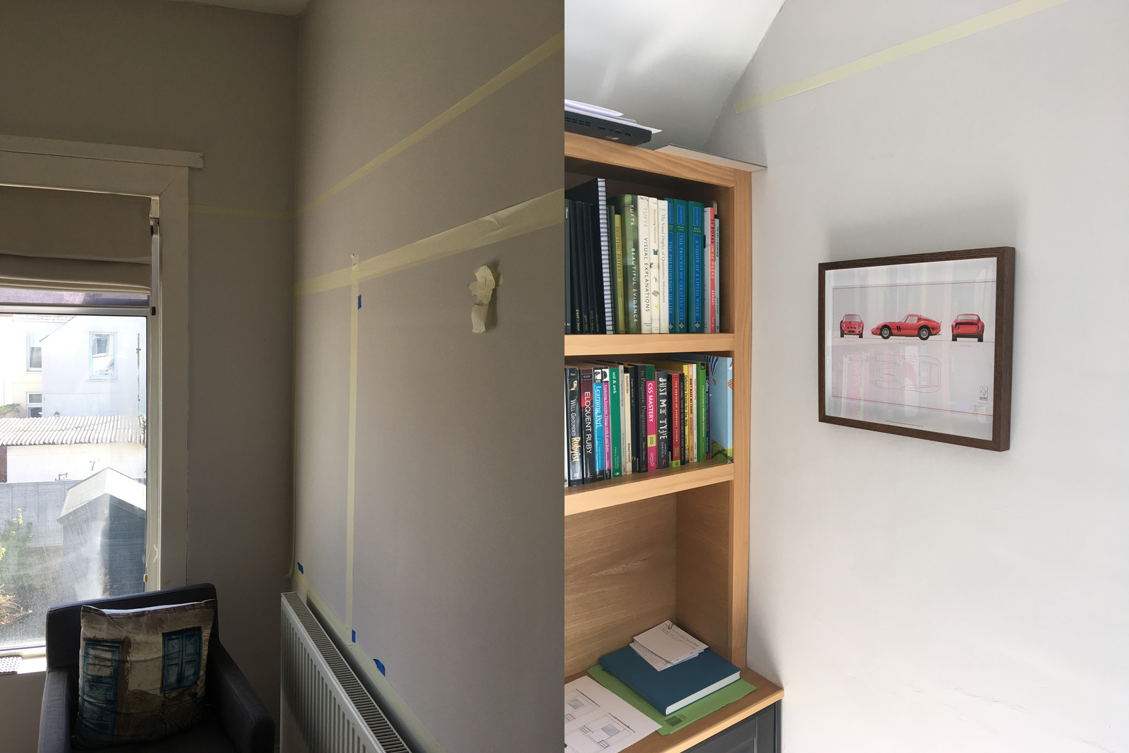
Had a go at mocking up what some framed pictures would look like sat on a picture rail. Doesn’t feel quite right either.
One option is to bring the white of the ceilings down to the top of the wall wall cabinets, which would make the off-white walls more intense, but that might feel a bit too simple
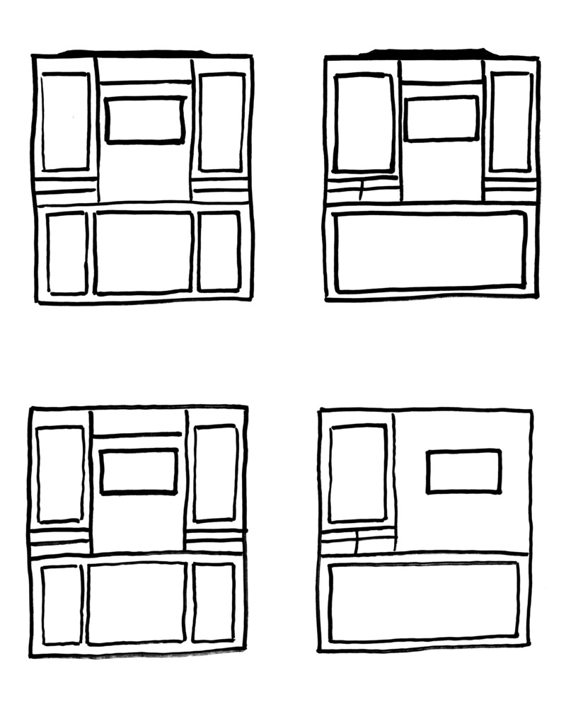
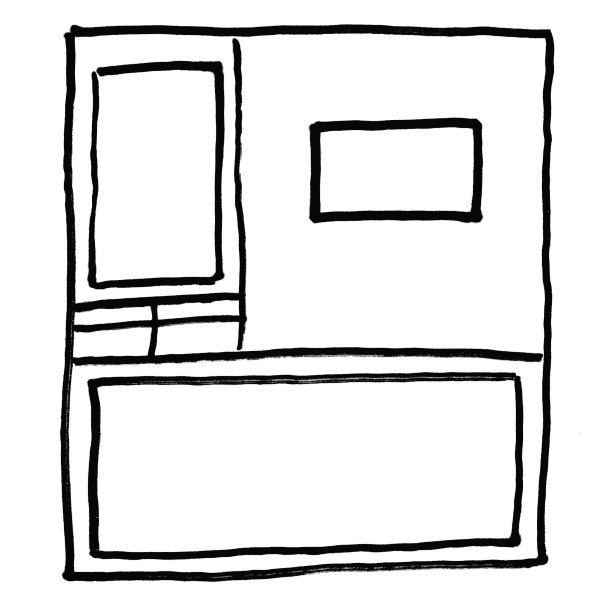
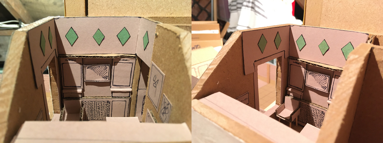
After a load of time sitting and thinking about it, and a bit of a break, I came back at sketching again. Came up with a few more iterations on the diamond pattern. This last one felt a bit more promising, so I started playing with it a bit.
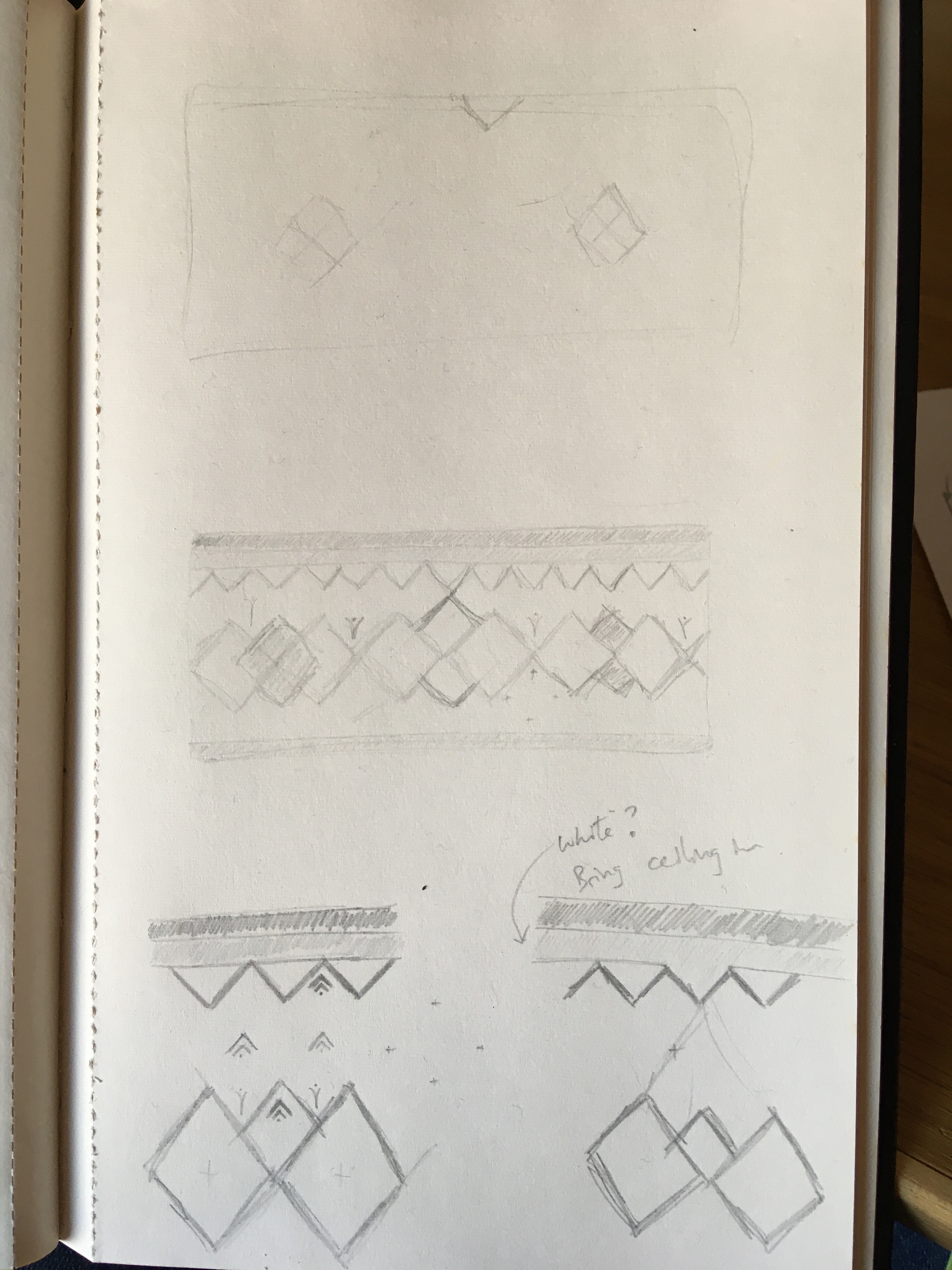
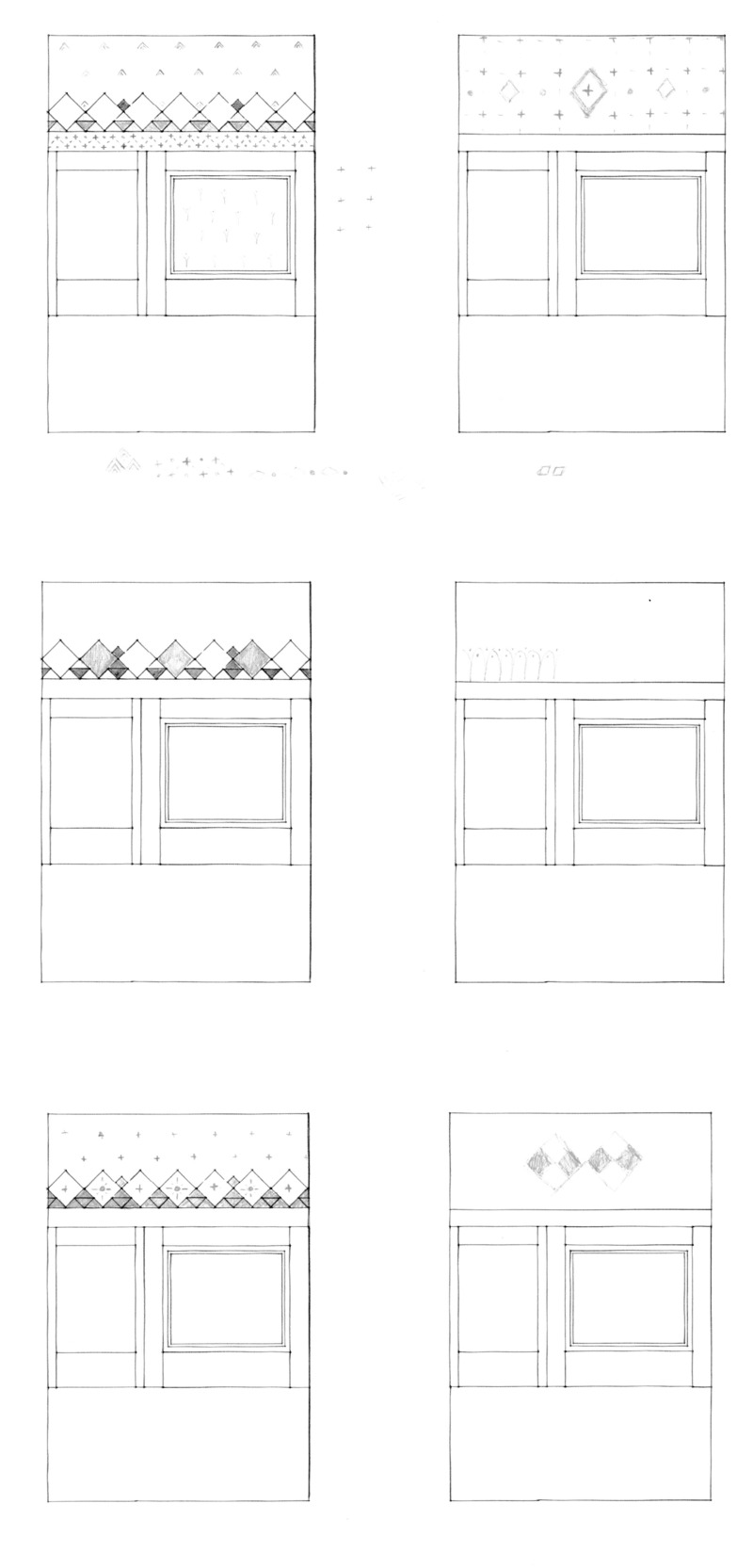
The top left idea has a bit of promise. I like that the two darkest diamonds balance the asymmetric panelling, and I like the lower border and the way the background pattern at the top is pretty light feeling. I did couple of simpler variations, but I’m not sure about the details within the diamonds (bottom left), and overall I’m still not sure I’d put it on my wall. It could quite easily come across like a kid’s bedroom.
The feedback in class was, surprisingly, to bring the white of the ceiling down to the top of a picture rail and add a subtle repeating background pattern.
Colour
Continuing on from talking about my 1:1 mockups, Saman asked how I was thinking about colour. This is something I haven’t really figured out at all, other than have a few latent ideas in my mind.
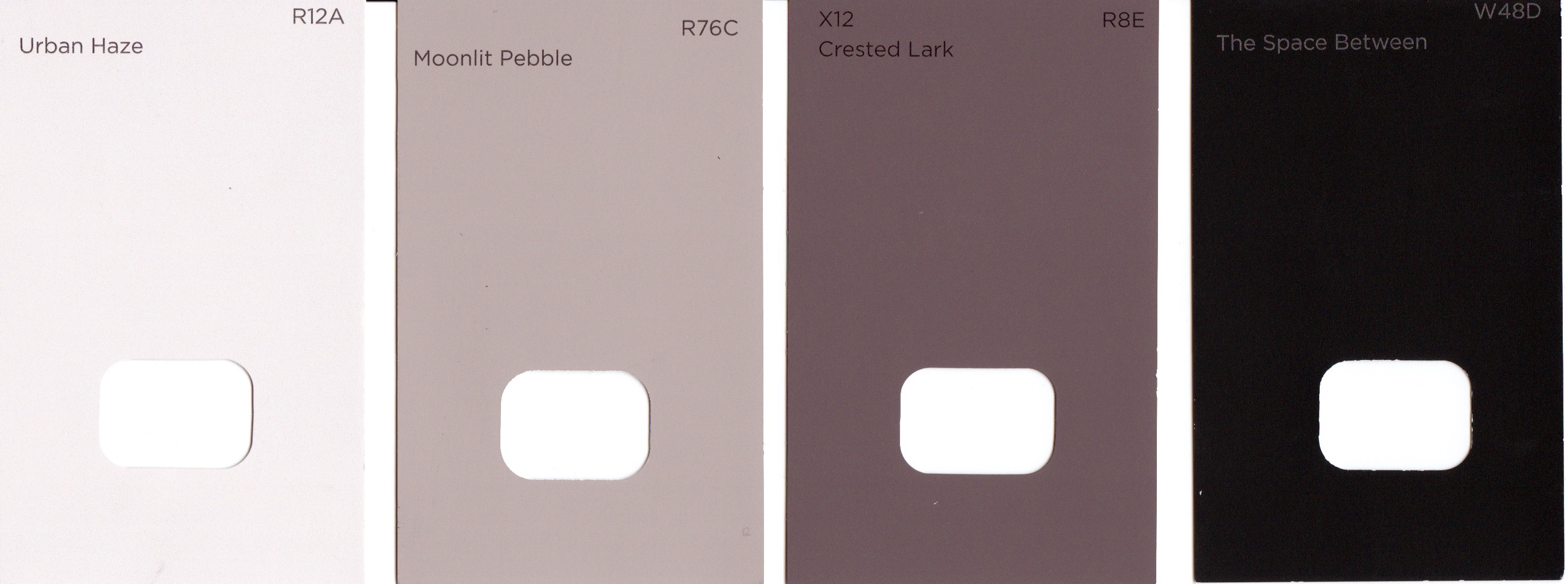
I know the hallway should be the darkest area. The ceiling needs to be very dark to imitate a lowered ceiling and aid the feeling of entrance transition. The wainscoting also feels like it should be dark to create the contrast between the two spaces. In between the wainscoting and the ceiling is what I’ll call the GALLERY. It too needs to be fairly dark, but I’m not sure if it should be quite as dark as the other two spaces. Maybe a shade or two lighter?
The radiator cover should be darker than the walls, but lighter than the hallway. It’ll also be perforated, so that might give a slightly lighter feeling than if it was solid panelling. The panelling around the standing computer should probably be slightly darker than the walls (an off-white grey/taupe), but not as dark as the radiator cover.
The standing computer should feel light and summery. I haven’t quite articulated the language in my project language for this, but you know those moments where you come in to work and you’re all like “Oh hey how was your weekend? What have you got on today? Anything I can help with?” That’s what this should be like. Not a super serious board meeting.
Yellow instantly came to mind, but I think that whole section in yellow would be way too much. It probably needs some light but muted background, with POPS OF COLOUR (a pattern from my project language) in yellow. Perhaps this could be in the form of a pattern, or perhaps some of the trim. IDK.
Anyway, Saman suggested thinking about the main contrasts first.
What’s important is figuring out the relative lightness and darkness of each space, since that can guide the colour choice. We also added in the frieze to test its impact on what we’d come up with.
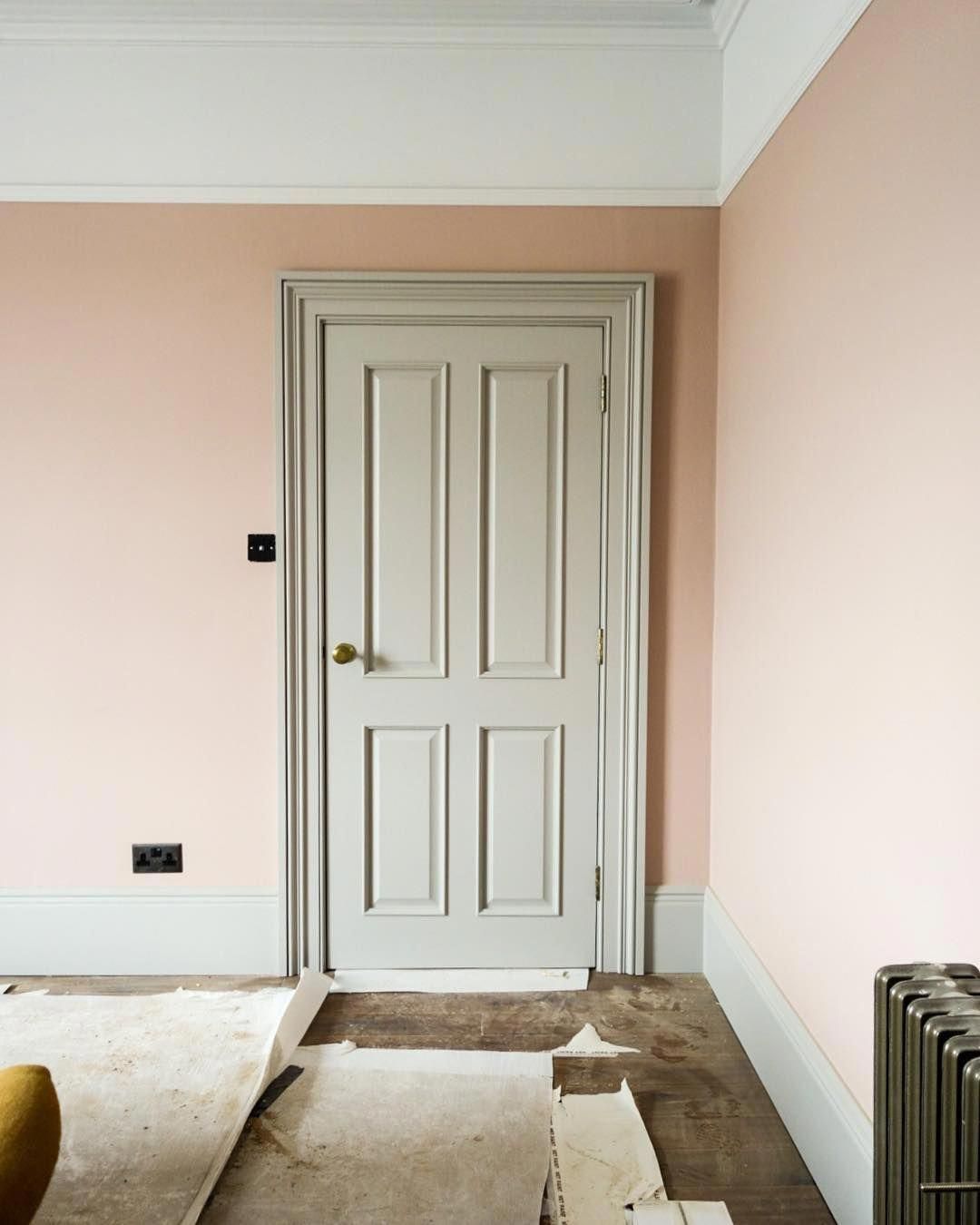
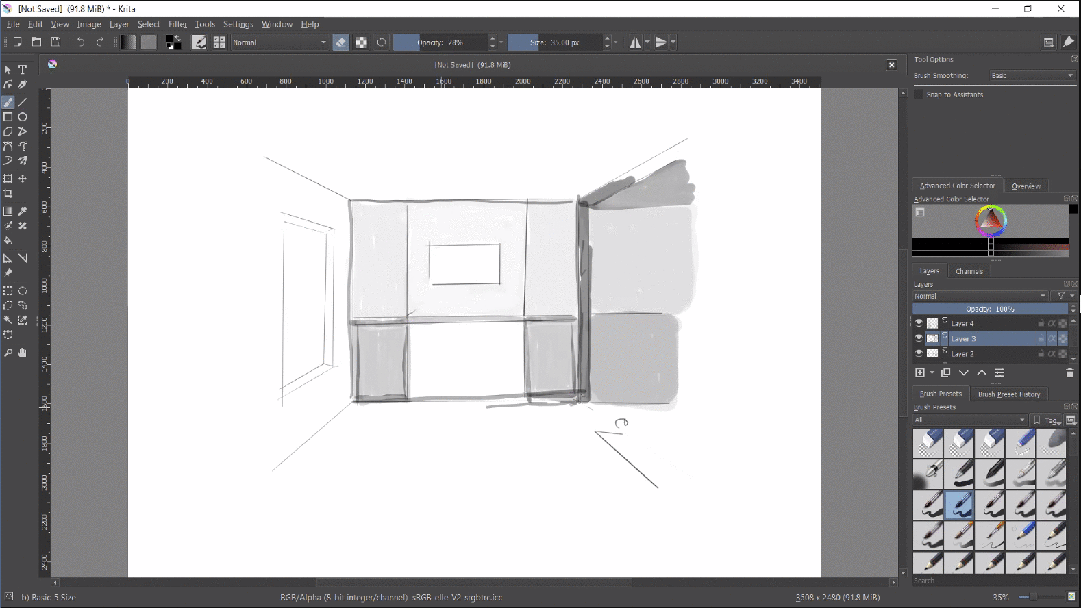
After getting my 1:1 mockups very, very close, I decided to tear them all off the wall and try out my initial colour ideas. The scan makes these look a bit more purple than they are in the room…
…but then under natural light I was like “ah, these probably aren’t going to be quite right…
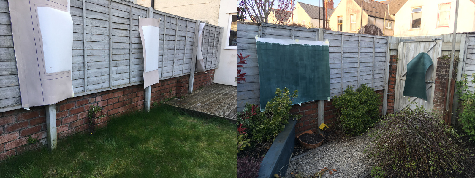
It was a nice day, so they dried pretty quickly, so I was able to get them re-hung. What a difference!
The hallway could go even darker. The colour card makes it look really dark, but at such a large scale the green hue comes out more.
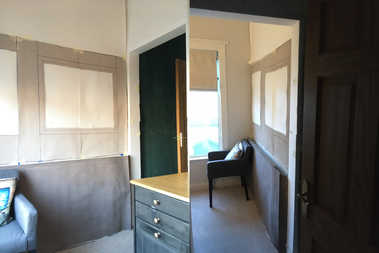
The lighter panel colour is pretty close to what I was imagining. It’s a little too mushroom-y, but it’s in the right ballpark to work with the existing walls. I didn’t paint the panels because I was thinking they should introduce more colour, but IDK what yet.
Similar to the top panelling, the darker colour on the radiator cover is not quite right, but the level of contrast was what I had in mind. That said, I think it’s too much. I think it would be better all the same colour. The lighter shade is still dark enough, and the depth and detail on the radiator cover will differentiate it enough. It feels better to keep it simpler on the large scale blocks of colour to leave more space for the details.
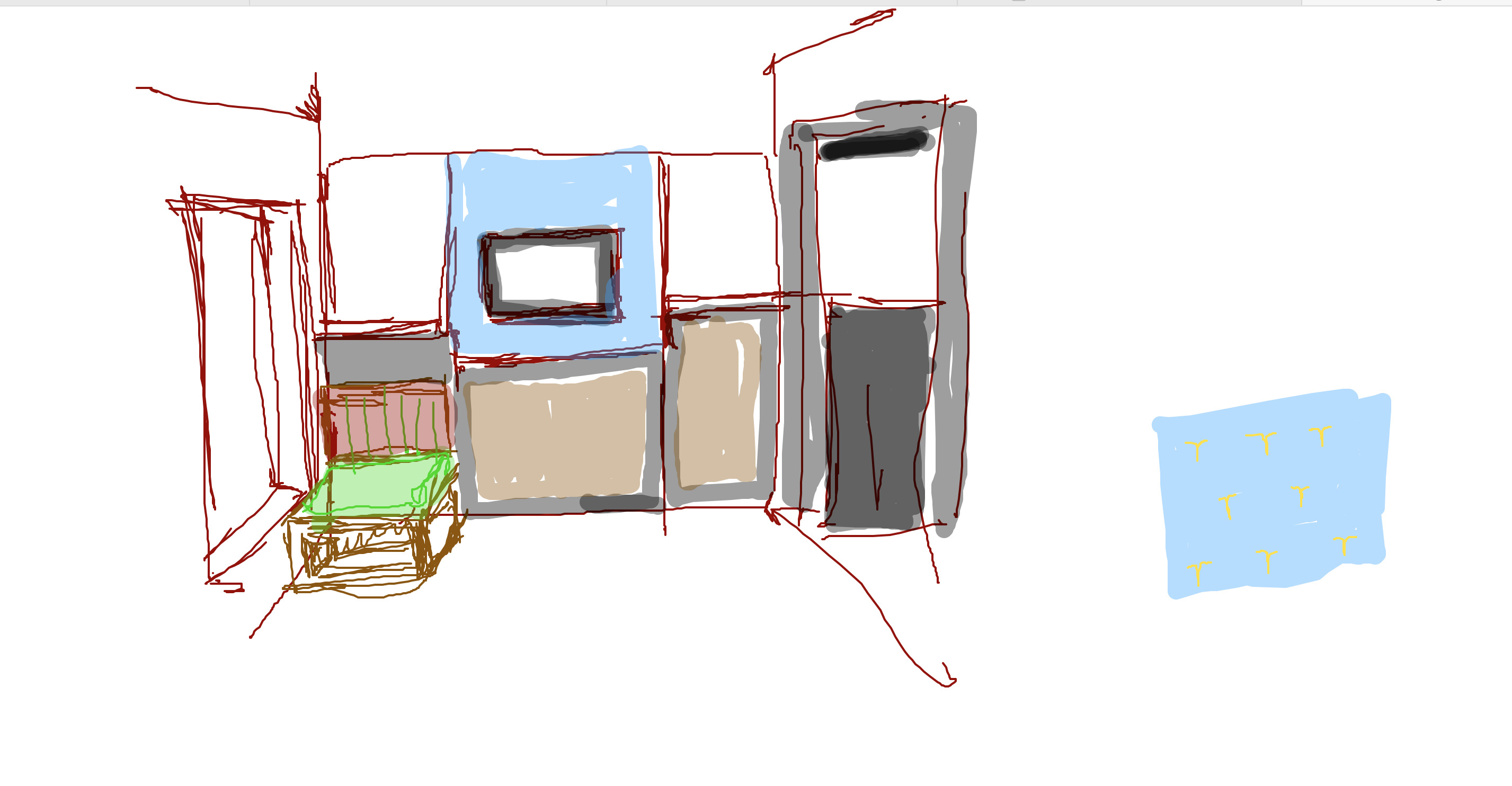
I then had a verrrry quick play around with digitally adding colour to the panels. Yellow keeps coming to mind, but it feels like it’ll be too intense as a background. Morgan suggested to go monochrome with the panels – just a bit darker than the colour of the frame. That feels pretty nice. I’ll mock this up with a wider angle picture that incorporates the desk and the hallway, since on its own it feels a bit plain.
I think the right works better, where the rail and stiles are lighter and then the panel gets darker. I think the radiator cover will look much better with some ornament. I’ll get my Sharpie out… 👨🎨
Nature of Order
Still working my way through Book 4.
Beautiful Software
We’ve been trying to map our discussion threads to the key concepts that Stefan extracted so that we have a way of framing them and better articulating the main insights of the discussions. We’ve got a few more to categorise, and many of the discussions probably touch on several areas, but i felt like a good-enough starting point.