Designing “how it works”
Breadboarding is a powerful technique for rapidly building a high level picture of how multiple components in a system integrate and work together, so that you can get a sense of how something works, without getting distracted by what it looks like.
Most people make the mistake of thinking design is what it looks like. People think it’s this veneer – that the designers are handed this box and told, ‘Make it look good!’ That’s not what we think design is. It’s not just what it looks like and feels like. Design is how it works.
– Steve Jobs
If you’re not familiar with breadboarding, here’s a quick TL;DR:
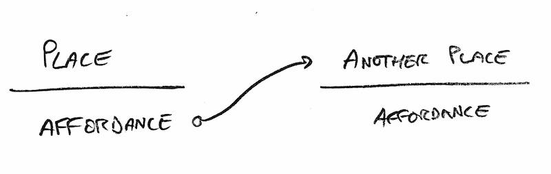
Places: These are things you can navigate to. Whether its a separate screen, modal popup, or part of an existing page doesn’t matter at this stage – we’re just showing core components.
Affordances: These are things the user can act on, like buttons and fields. We consider interface copy to be an affordance, too. Reading is an act that gives the user information for subsequent actions.
Connection lines: These show how the affordances take the user from place to place.
A breadboard won’t cover every single affordance in every place – only the ones that are important to explaining the concepts we’re trying to convey within the current scope of work.
Here’s an example from a current project. We’re building collaboration tools into Alaveteli so that Pro users can create a “project” that allows external users – Contributors – to perform certain actions on FOI requests within the project.
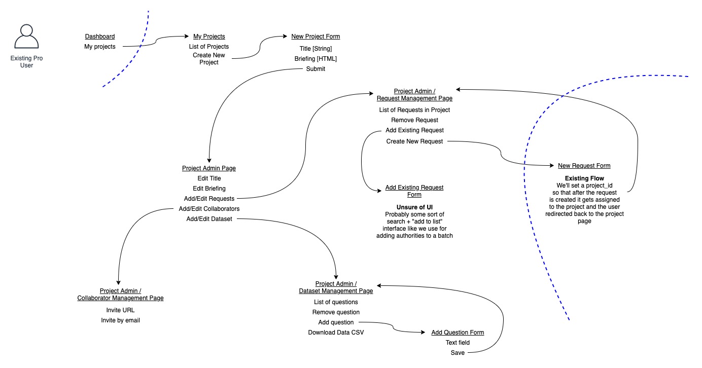
This is representing the system from a contributor’s point of view. It helps communicate…
-
Scale. To use a housing metaphor, are we adding a window, or building a whole new extension?
-
Context. How does this new stuff integrate with what’s already there (the flows behind the blue lines)? What are the boundaries between components?
-
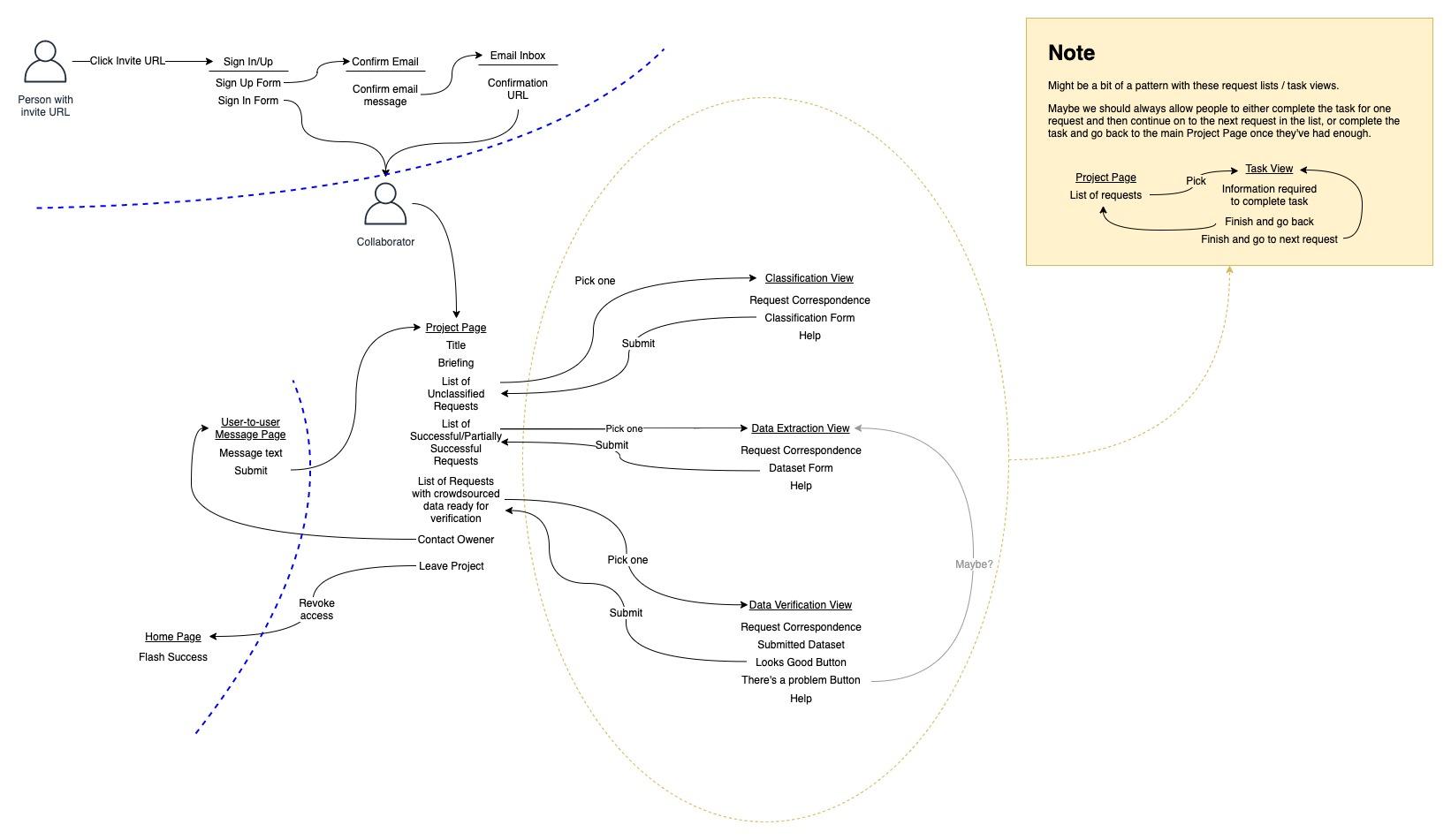
Flow. How do I navigate through the places to do what I was trying to do? Is it easy to get to other places. After reviewing this we decided that “Contact Owner” ought to be available when you’re in the context of the task views, as that’s when you’re most likely to need help.
-
Unknowns. Which areas do we need to think harder about? Which affordances aren’t explicit enough? In this case we need to explore the places within the attached note, as we don’t have existing UI for some of the affordances.
-
Knowns. Which areas can we ignore? Some places will have an obvious-to-us implementation (e.g. an edit form of a CRUD action). We can skip any sketching/prototyping and build it straight into the application, tweaking as necessary.
-
Patterns. As per the note we have 3 flows which form “task queues”. It’s likely we can use common UI elements for this to help users get familiar with what to do and also reduce implementation costs.
Notice that we don’t need to get bogged down by how each of the pages look like you might if you started with a wireframe. What we’re figuring out is whether the user can do what they came to do. Have we provided the right capabilities in each place? Which affordances don’t we understand well enough yet? Does the user journey make sense?
Once the breadboard is well-developed, you can zoom in and focus on an individual place and look at how the affordances fit together at the micro level.
The breadboard reduces the cognitive complexity of this stage as designers can fully concentrate on the spacial arrangement of the page, rather than the mechanics of how users get there, what happens when each button is clicked and what should be on the page in the first place.
Your work earlier is really helping now because I just need to make sure I’ve covered all the affordances at each stage for an MVP.
– Martin
We don’t need to deeply design all the places of the breadboard, as some of them are obvious enough that we can apply an existing pattern – for example, most of our admin screens follow the pattern of listing each record in the database, then linking to pages that allow viewing and editing the attributes of each record. We don’t usually need to think too hard about these unless there’s a really unusual workflow we’re trying to implement.
It was clear from the breadboard that we didn’t have a good mental model of how the data extraction part of the system was going to work. When your focus is on a narrower portion of the system, sometimes it can be easier to think in a more visual way, so Martin sketched out some ideas for us to get a better sense of how that task could work.
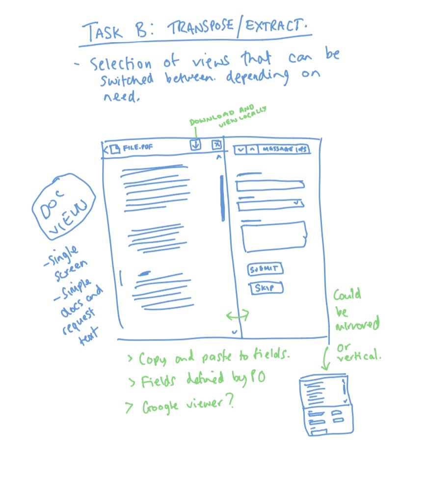
We can then pull the affordances back in to the breadboard and test our thinking that when put in context of the other parts of the system, they all flow from one place to another and provide the capabilities that the user would expect at each point.
By using this approach we can often skip the process of wireframing – primarily a tool to make progress on “what it looks like” – and get straight to building out the pages directly into the software. In many cases a cheap sketch will be enough to provide the initial visual layout concept, and the breadboard will give programmers a good idea of how to wire the interfaces together in the backend.
Aside from the reduction in cost from avoiding the more expensive wireframing and high-fidelity mockup processes, I think this process adds an incredible amount of value by making sure that we’re designing the right thing very early on. Its easy to get sucked in to what something looks like without really testing yourself on whether the thing your building is going to help the user do what they came to do. Breadboarding is a cheap technique that forces you to do that.
Further reading
- Shape Up: Breadboarding (2019)
- A Shorthand for Designing UI Flows – The original concept (2009)
- My reading notes from Notes on the Synthesis of Form – more on Form and Context
- My reading notes from The Oregon Experiment – more on Patterns
- My reading notes from The Design of Everyday Things – more on Affordances