Building Beauty: Week 25
And that’s it! The course is over! We’ll have some wrap up next week, but this week was the final week of “class” and the culmination of our individual projects.
Studio
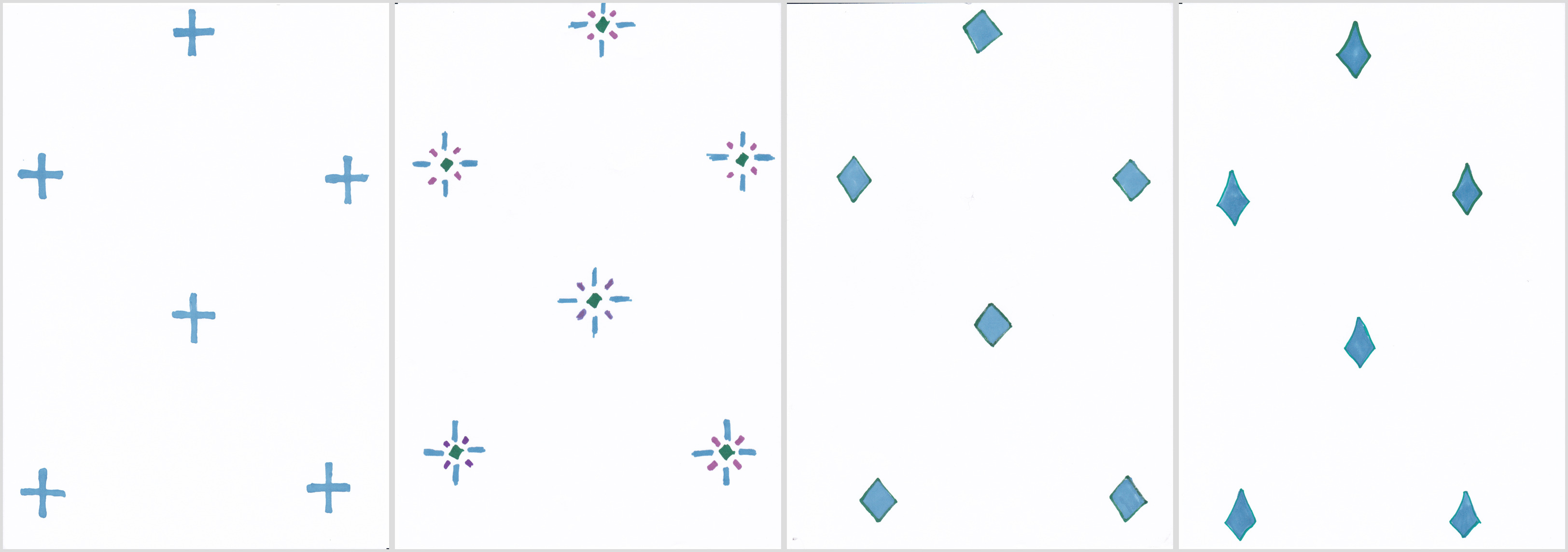
I tried a few pattern variations of the frieze, but they ended up all being too small and just looking like polka dots.
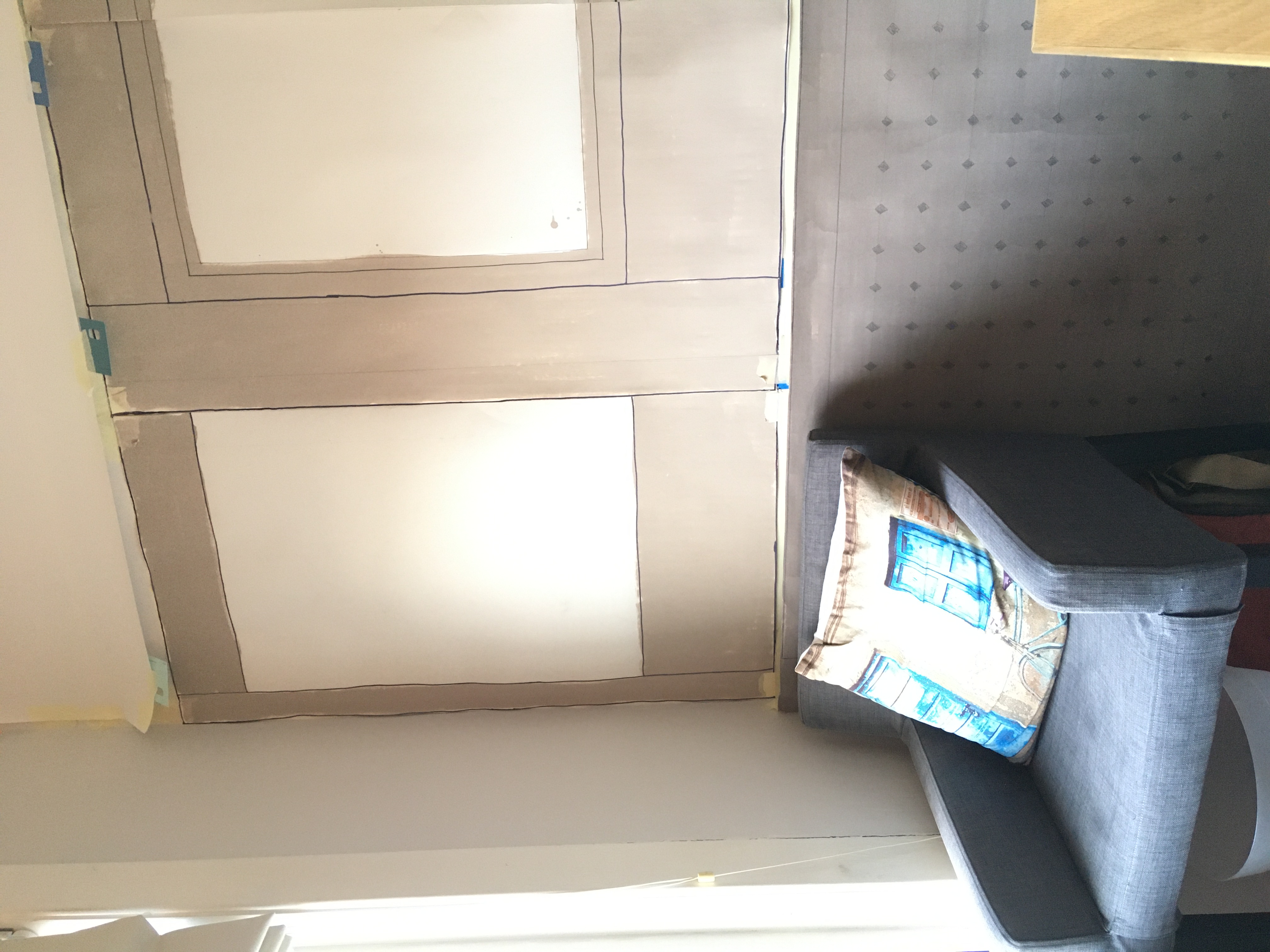
I added some pattern to the radiator cover (with a grey Sharpie!) and that really helps differentiate the large panel section.
I’m not feeling the monotone panel experiments. They feel a little soulless. Maybe the inverted colours would work better – dark border with lighter inner – but even then I still think something is missing. That area is meant to have pops of colour and feel like a nice warm summer’s day.
I considered what yellow would look like with some cane for the radiator panel using a digital mockup.
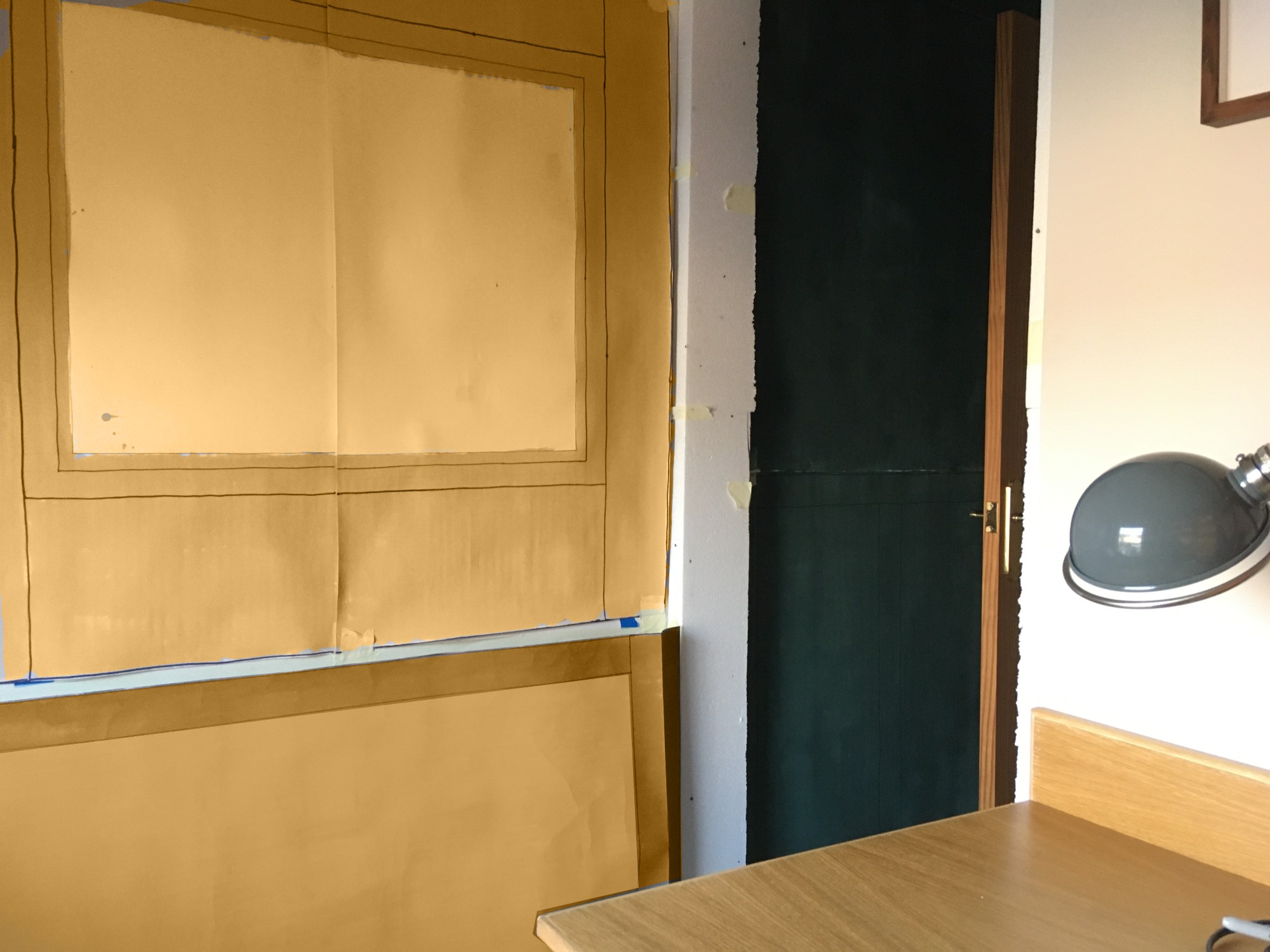
It’s pretty close to the desk, which is good, but it might be a bit too muchthough. I think the white frieze with blue pattern could help, but even so I think I’d need something to break it up a bit without losing the feel and also avoiding looking like a lollipop. I tried a couple of variations on this.
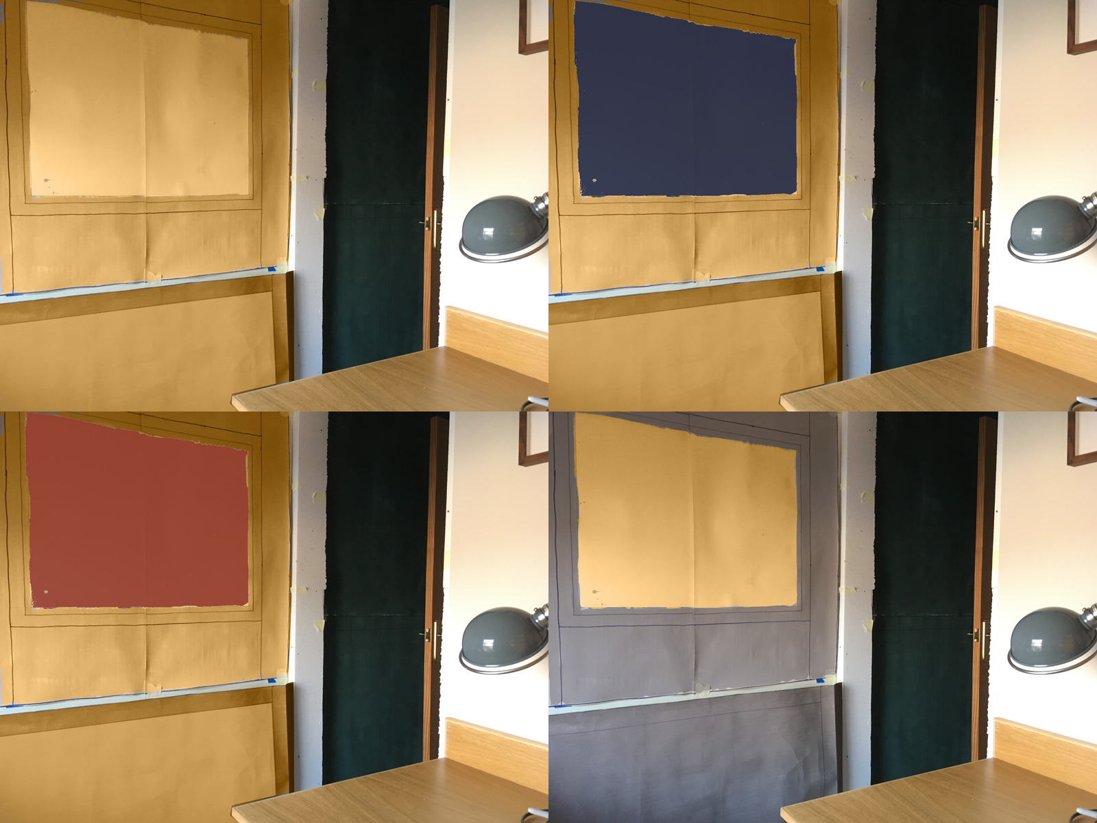
After sleeping on it, I thought the full yellow would be way too intense.
I do think the yellow has a great feeling though, so how to incorporate it? Well, I think I’m not far off with my original mockup colour. Incorporating quite a deep yellow into it seems like it will work, and the monitor will help keep it in balance.
Using a lighter radiator cover (both in the framework being the same as the top panelling colour, and a cane “panel”) helps too.
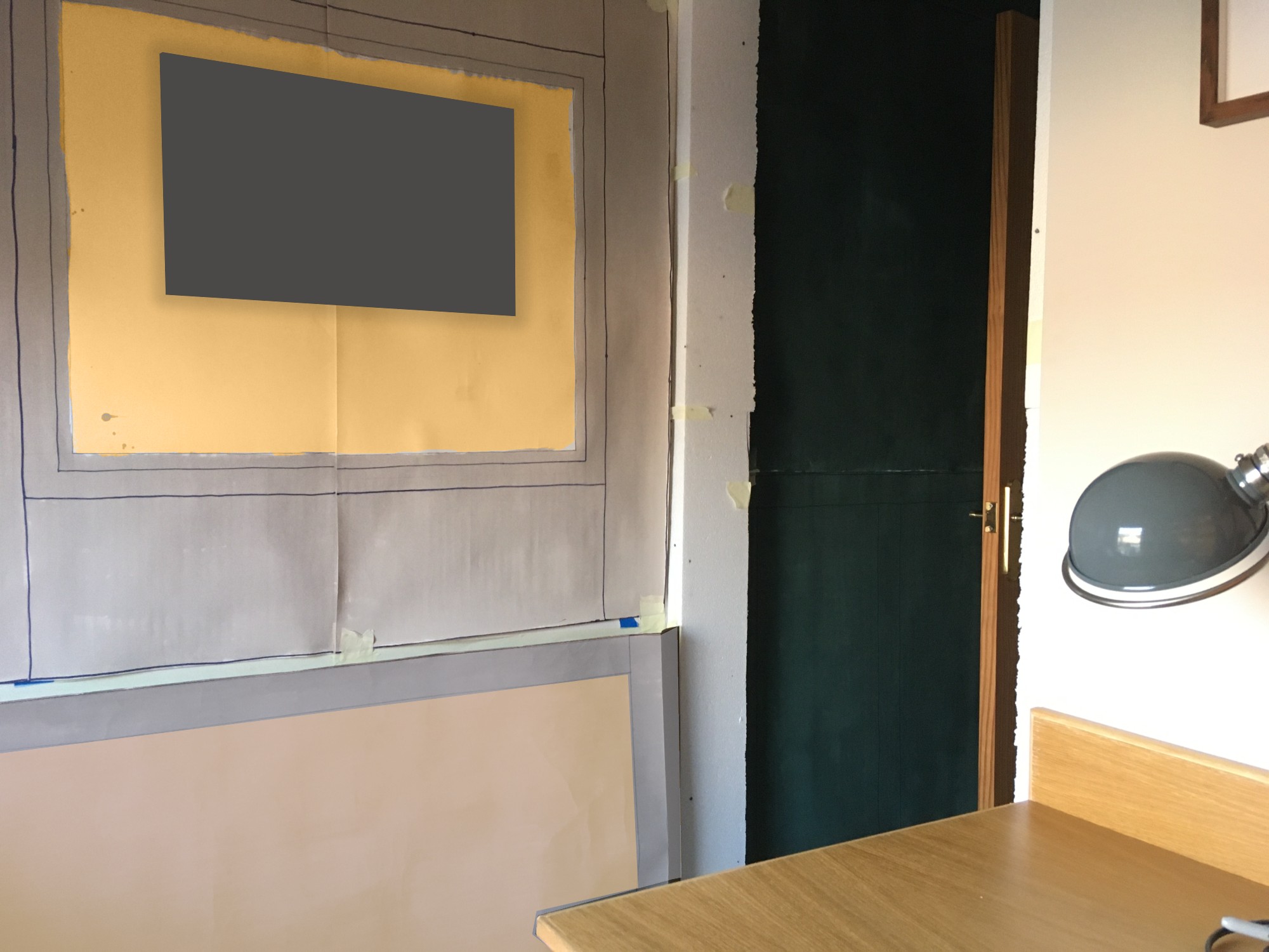
I also tried the simpler frieze of plain white – to better connect the top portion of the wall with the white ceiling – and picture rail. This had the added benefit of creating a better connection to the window frame.
Individual Project Presentation

Hey everyone, I’m Gareth…
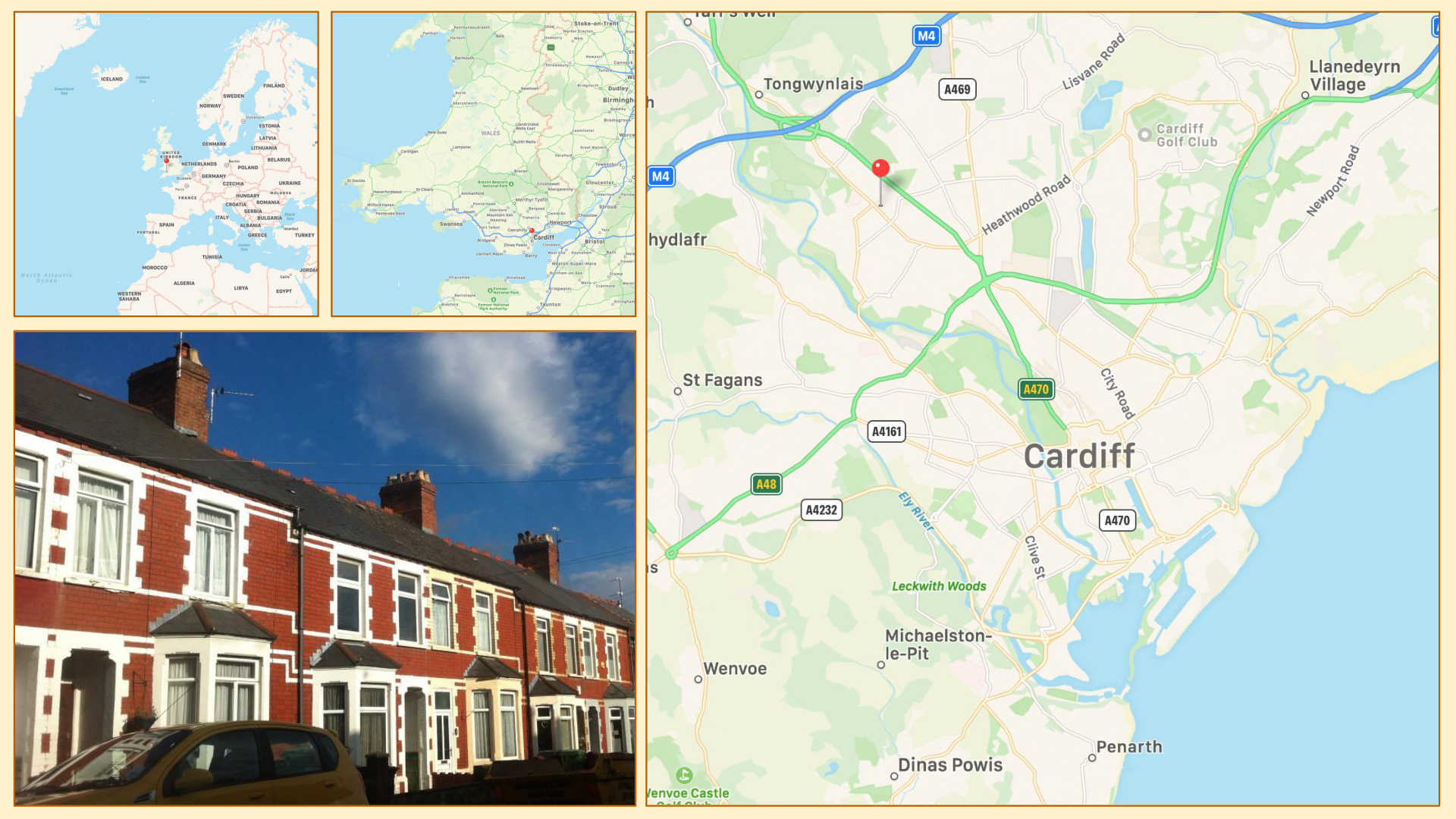
…and I live in a little terraced house in Cardiff, which is in South Wales in the UK. Cardiff is the capital city, but it’s still pretty small, so it’s a really lovely place to live.
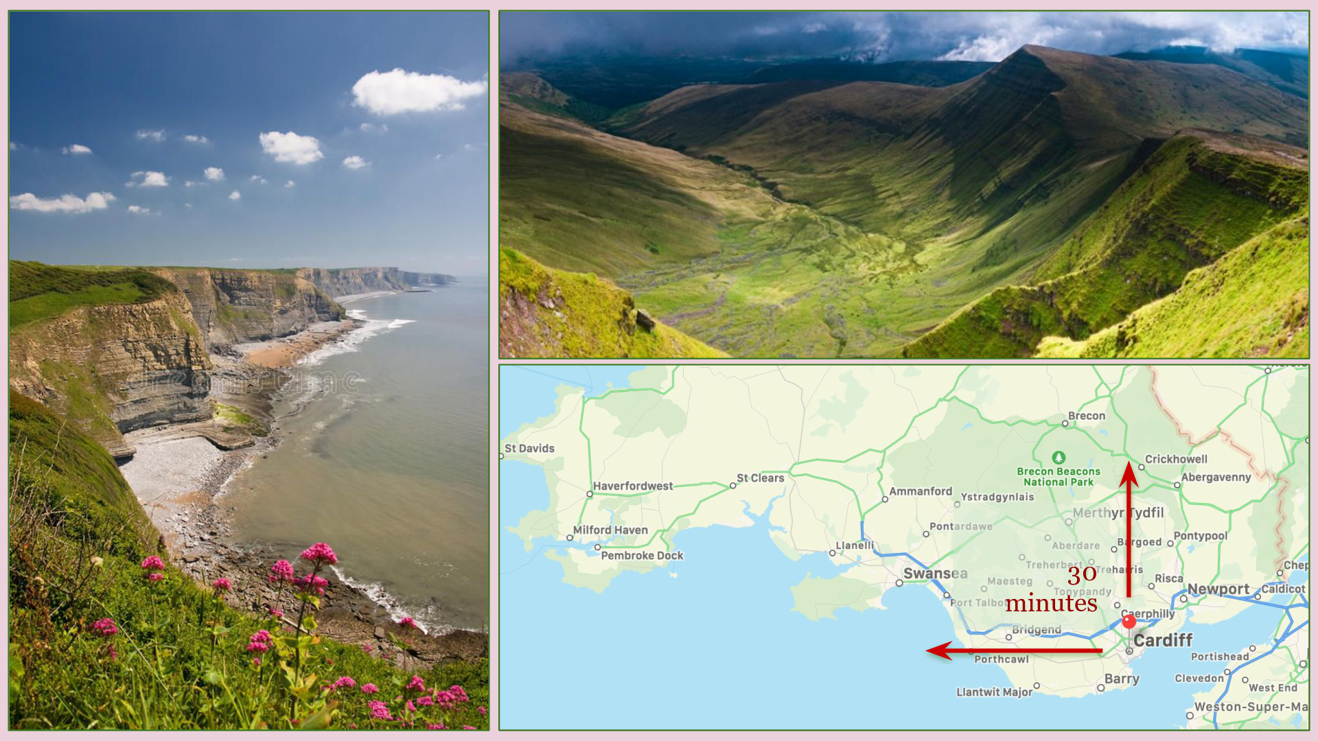
30 minutes north we’ve got beautiful mountains
30 minutes west we’ve got some amazing coastline
And being small, the city itself is is really walkable

I’m a computer programmer by day, and I work on software that helps people be active citizens and engage with democractic processes.

I’ve been working from home for over 7 years now and I love it.
I love the flexibility of life it affords, and in particular the ability to mould your environment and feel comfortable at work
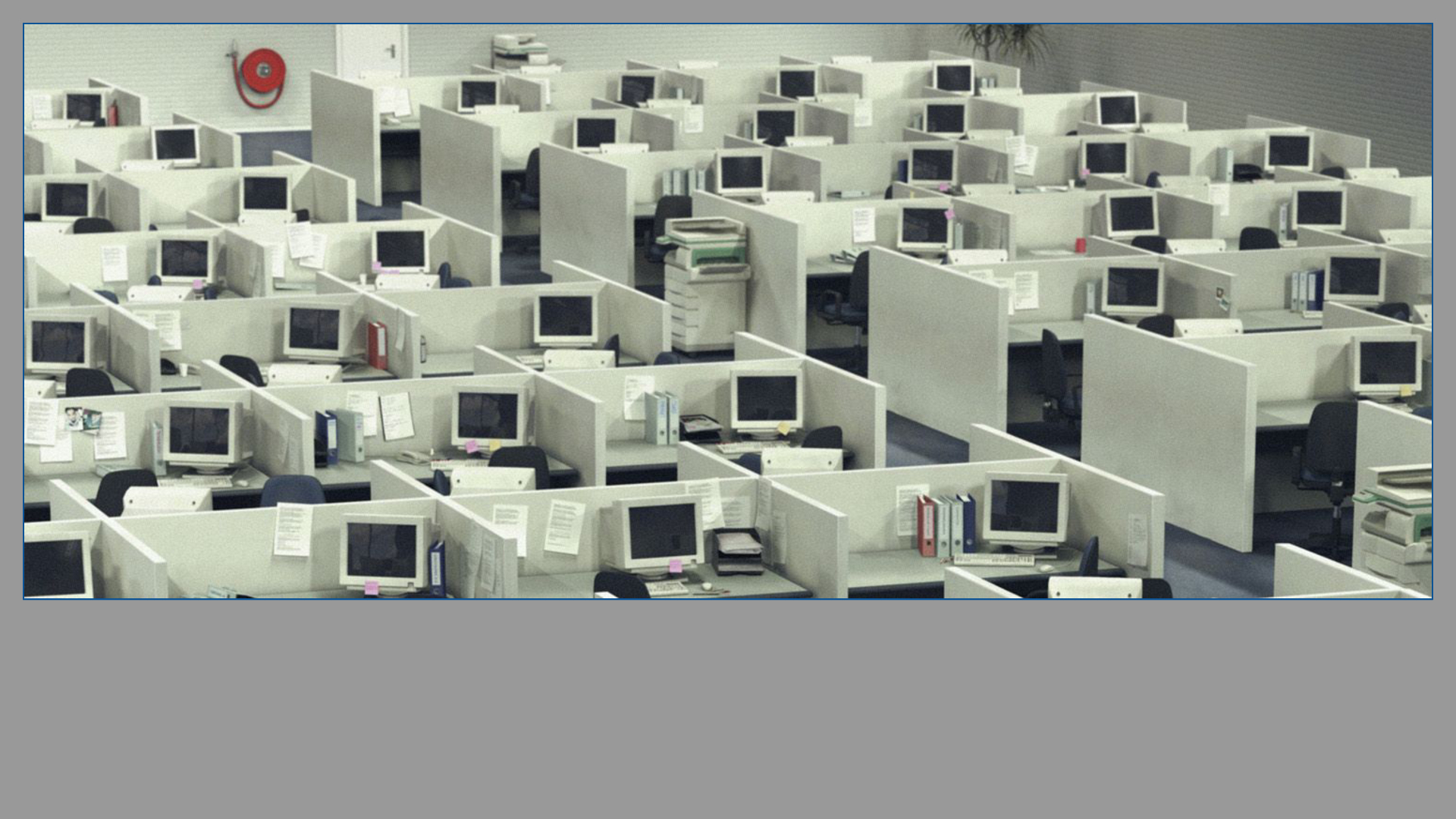
Most people don’t get that choice.
Corporations look to reduce costs with soul-destroying cube farms, and in doing so create an absence of humanity in what should be a creative, fulfilling and thriving part of our existence.
We are deeply connected to the spaces we occupy.
When we’re in spaces with life we feel more connected to them and feel whole. When we feel whole we create things with more life and that are more whole.

I don’t want to make light of the hardship that the pandemic has brought on billions of people in the world, but like any catastrophic situation, for some, there is opportunity.
More people are working from home, and after the initial upheaval, are now beginning to adjust to this new way of life for the longer term, and many don’t want to go back to the office.
We now have so much more direct control over the spaces we work in.
But how do we make them beautiful?

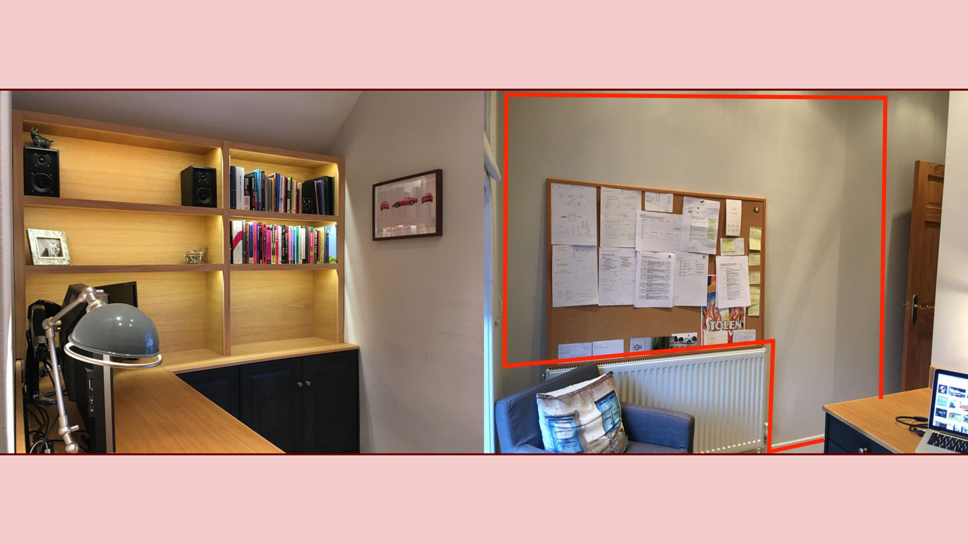
My home office is based in a small back bedroom.
The main workspace of the office is well established, but the short entrance hallway and opposing wall is pretty sparse and lifeless.
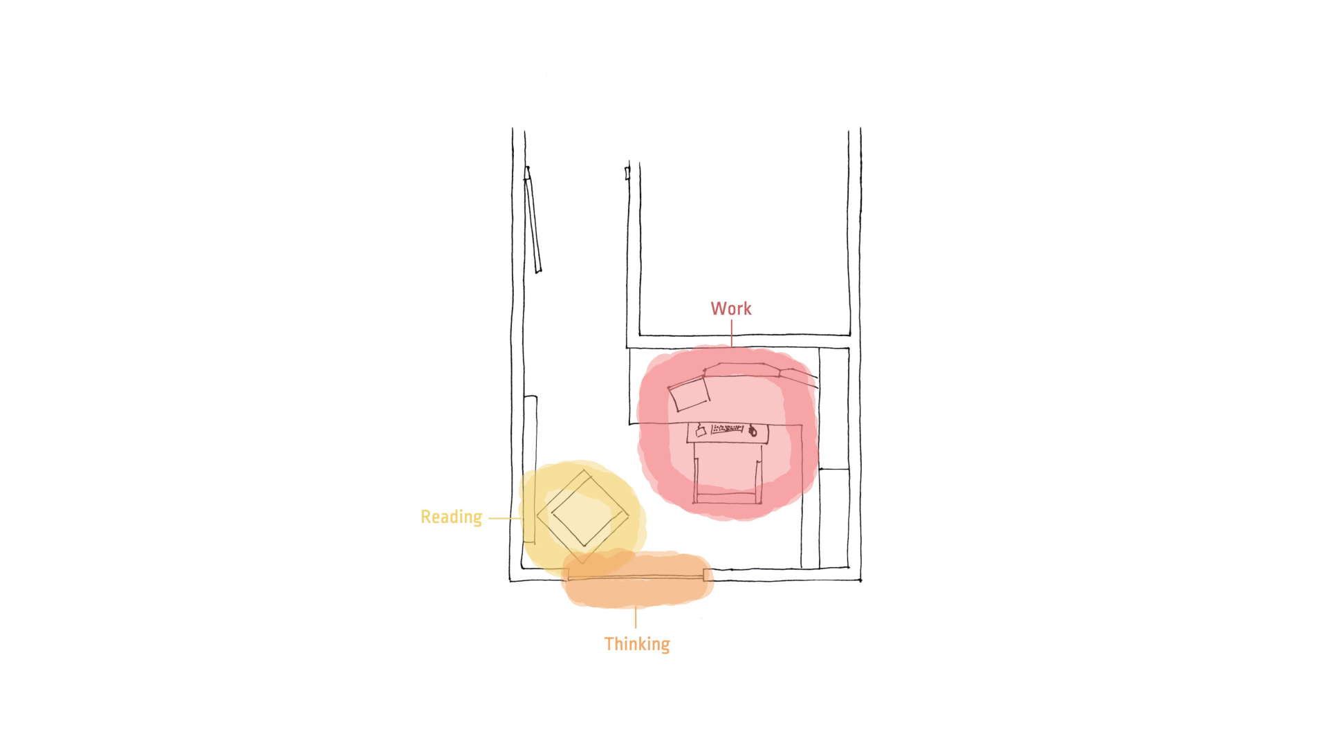
But more than that, through understanding centres, I’ve realised the actual use of the space is quite monotonous.
I read in the chair, work at the desk, and occasionally look out of the window to rest my eyes and think.
In this project I set out to heal this small piece of space, but also gain a deep understanding of what makes a home workspace that’s filled with life, so that I can share what I’ve learned to help others do the same.
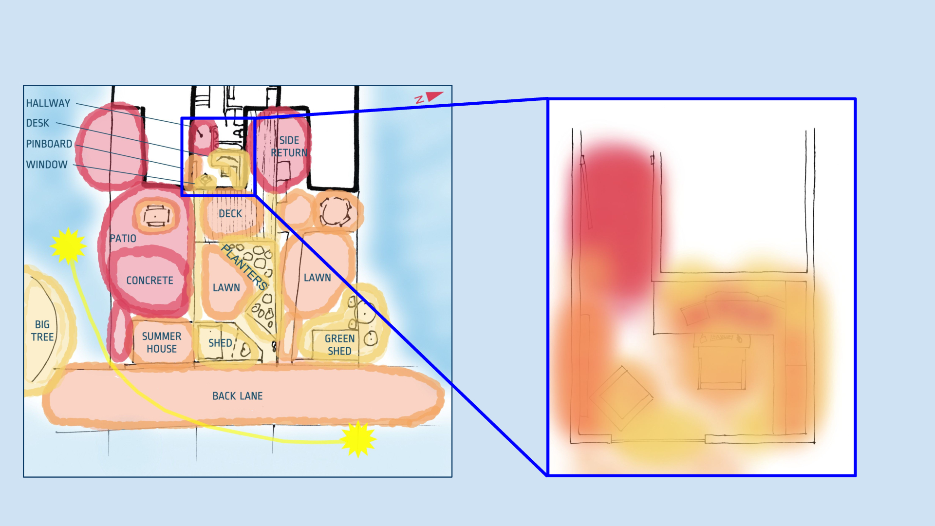
Of course, it’s important to understand the wider context of a space as well as the site itself, so I created feeling maps to better understand my surroundings and what felt good (in yellow) and what felt bad (in red).
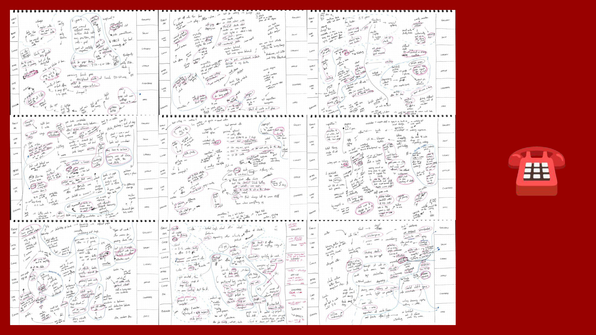
I also interviewed 10 friends and colleagues about their home workspaces, to try to uncover key feelings and patterns to apply to my project.
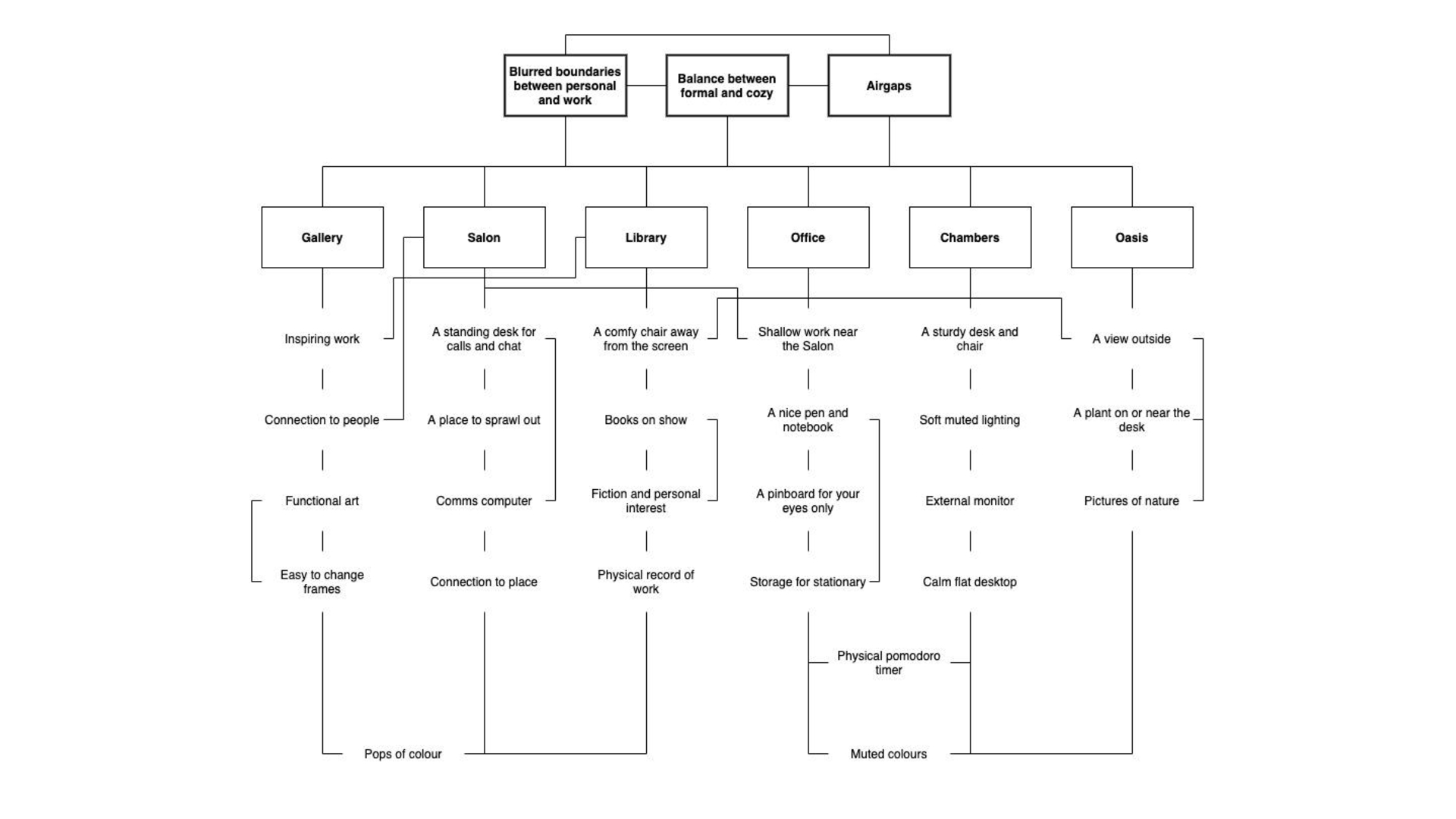
From these interviews and some research I produced a fairly extensive set of nascent patterns.
And for this project, I focused on a few that I thought would best heal the weakest parts of my site.
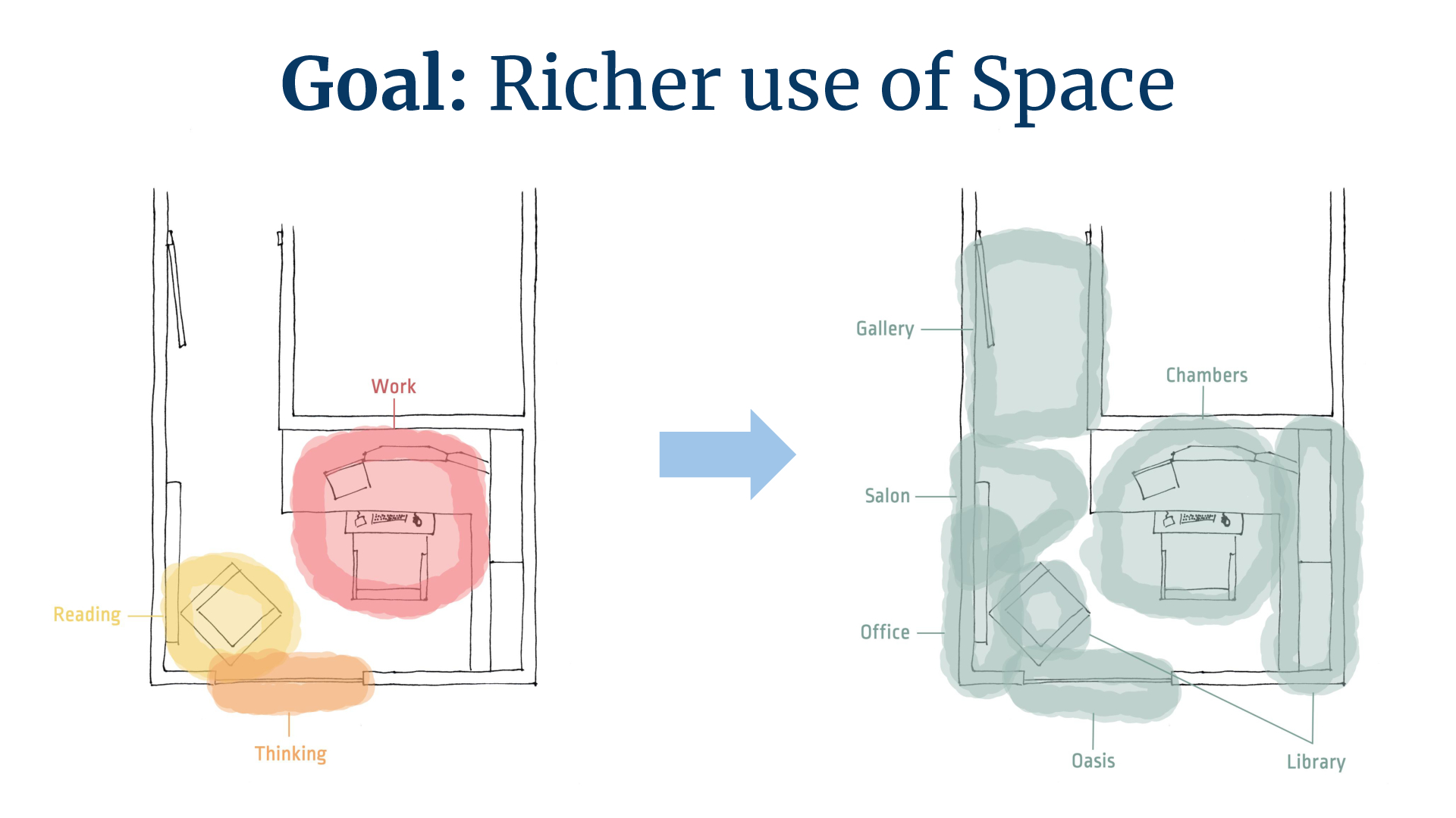
Overall, I wanted to create a much richer use of the space available to me, with a particular focus on improving the entrance hallway and left hand side of room.
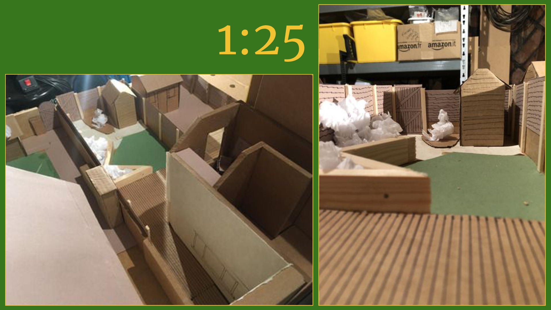
To help my design process I made a scale model of the area I considered in my feeling map.
That includes the immediate exterior of the house…
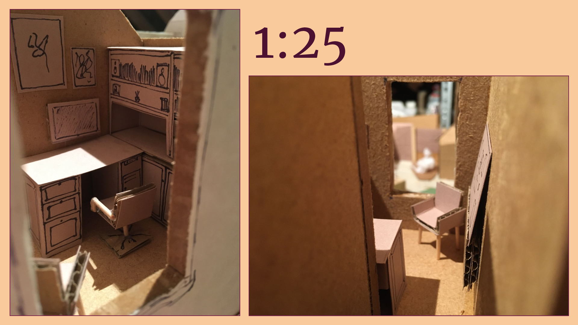
…and the interior of the current office.
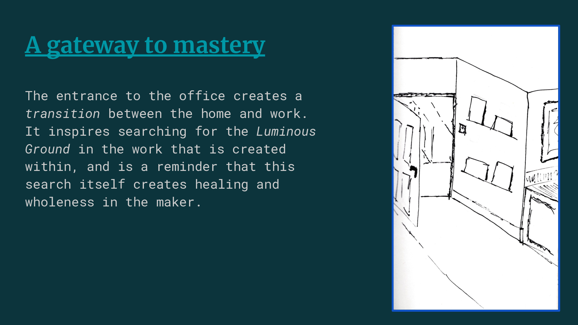
One of the key patterns I wanted to add was a transition space between the home and the office.
A home office shouldn’t be too formal, but it’s good to be reminded that you’re now in a space to work and create beauty.
It should give you a feeling that you’re continuing your journey towards mastery, and that every day you should push a bit harder to get there.
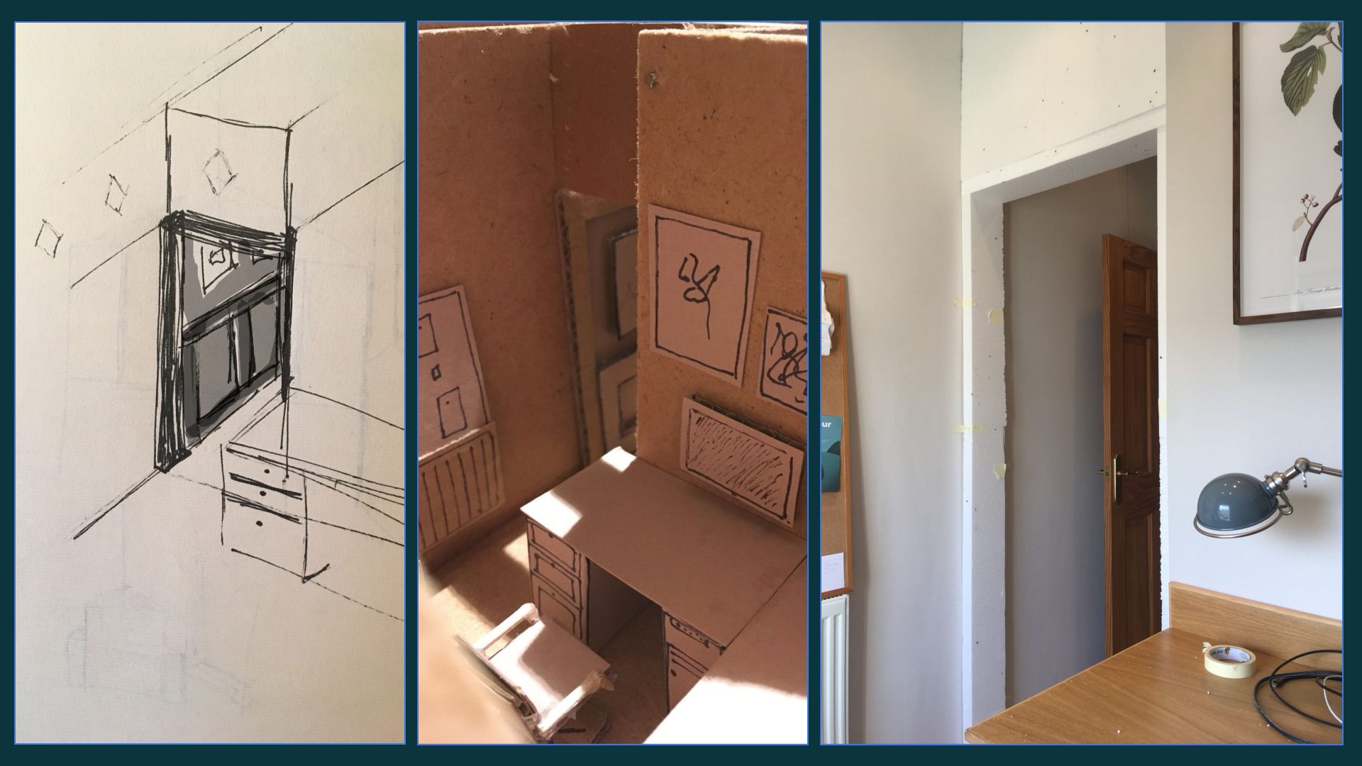
Even from the early sketches, to me it was clear that it was going to work.
But this took lots of fine-scale adjustments to inch the archway back and forth to create the right feeling in the room.
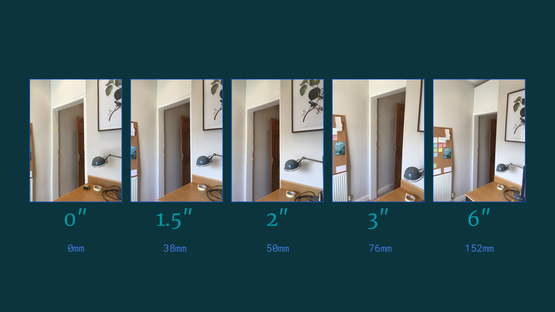
In my first iteration I’d set it back way too far.
Flush with the desk wall much too crude, but at some point it started feeling absent.
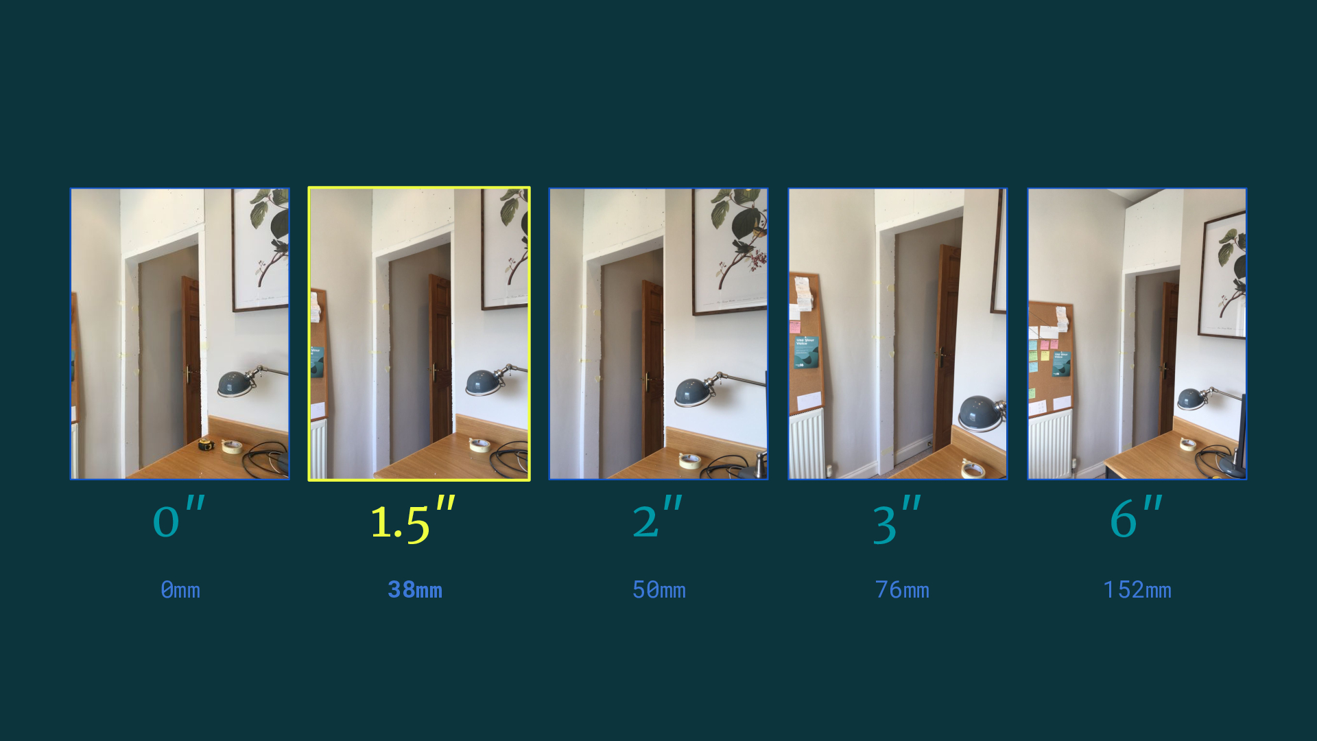
The detail that mattered was was having the frame set back enough so that you can still just see each side of the frame from the main desk chair.
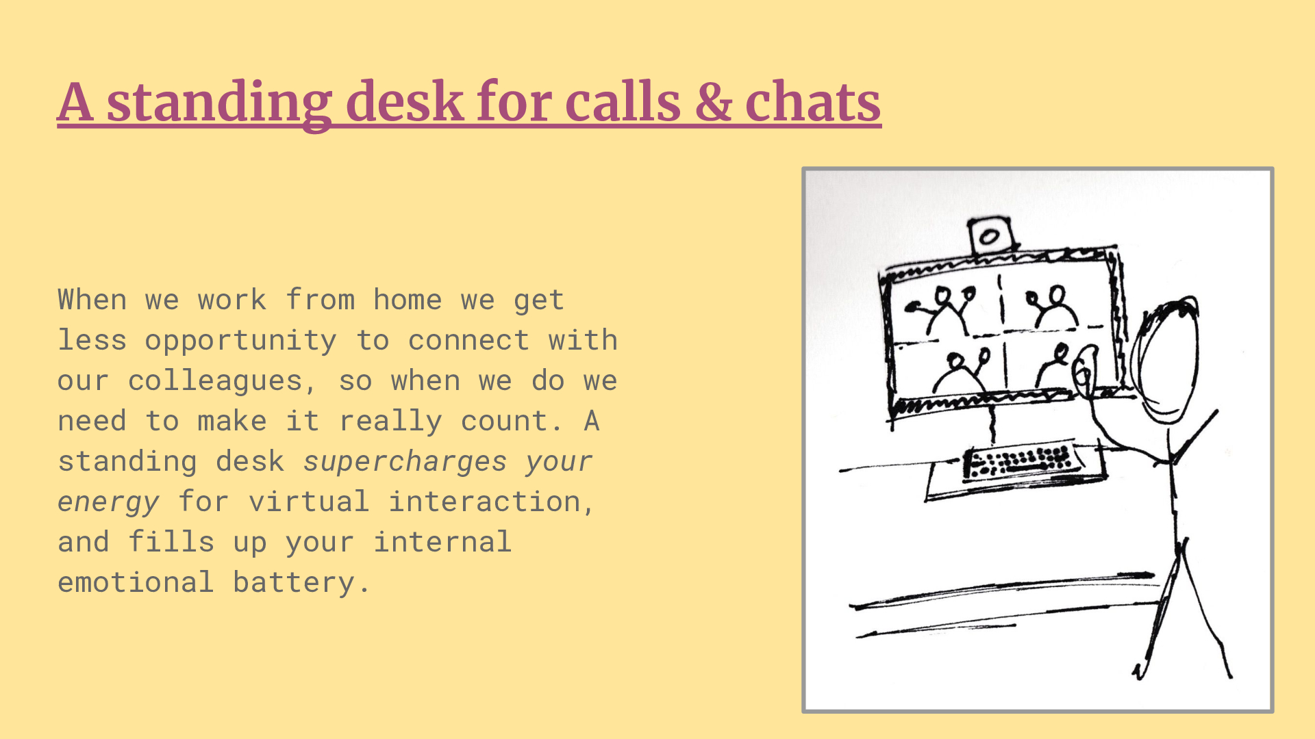
I need to work on the language of this pattern, but for me this was the main thing driving the project.
When you work remotely, communications software always fights for your attention against the deep creative tasks that need long stretches of uninterrupted concentration.
Of course, it’s not good to work completely alone, so you do need to communicate, but sometimes it can feel like it’s at the expense of making.
Separating these activities into two distinct spaces will not only help with the more practical question of focused vs shallow work, it also gives the opportunity to fine-tune the feeling of the spaces for these very different modes of work.
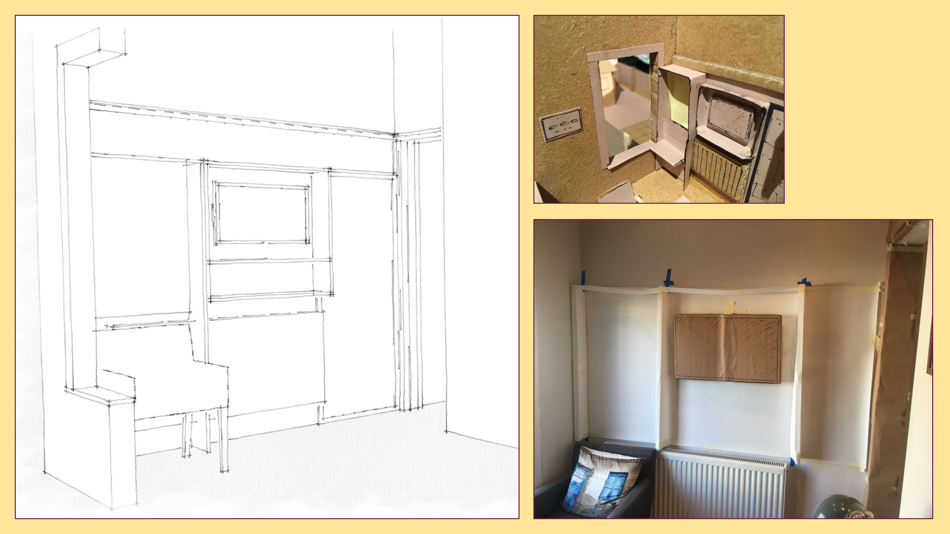
My first iteration was way too mechanical.
In retrospect it’s fairly obvious, but it was what made sense to me at the time.
The scale model also showed its flaws, but I assumed that was my modelling skills.
As soon as the mockup was in full scale it was obvious that what I’d initially pictured wouldn’t work.
In the 1:1 mockup the vertical framework is only half the depth of the drawing and still feels too deep into the room.
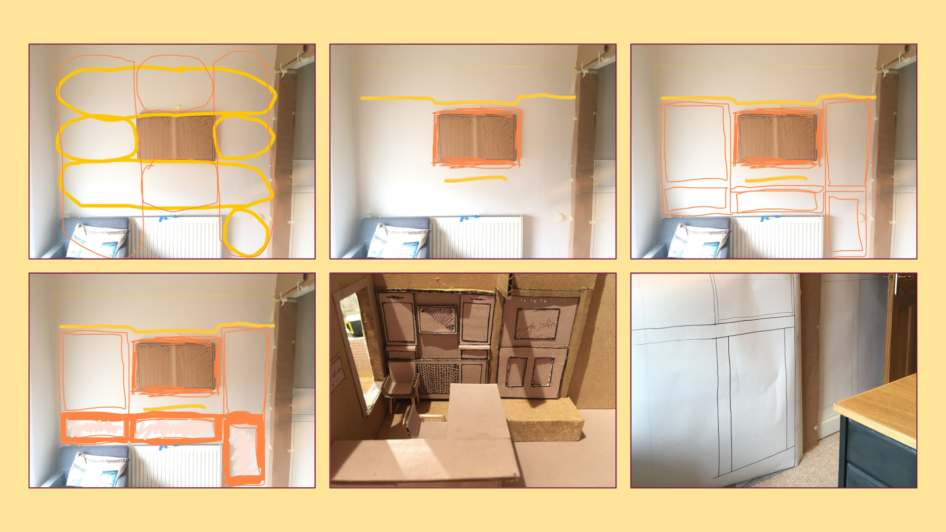
In another iteration I started with the main functional centre – the computer monitor – and tried to understand what latent centres it created.
From there, I added structure-preserving transformations, which lead me towards a much more balanced design.
Again, I went through a process of back-and-forth through sketch, model and mockup to get information about important details and feeling.
One example was pulling out the lower section to become a radiator cover and chamfering the corners to create a nicer connection between it and the archway.
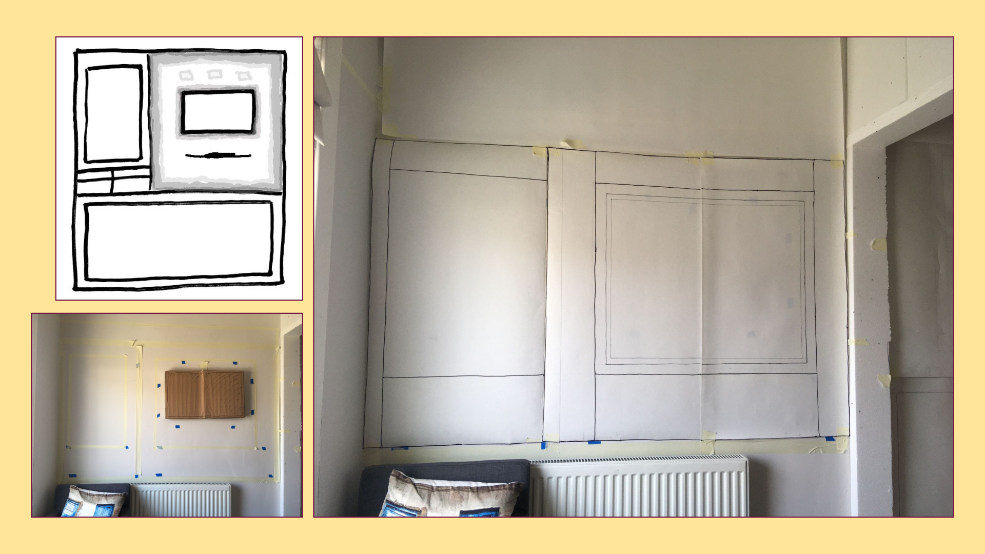
I still continued to iterate, and went through the clearing out process of the void that’s needed to find simplicity and inner calm.
The final layout feels like it really works in the space without trying to jam too much in.
Part of doing great work is learning from those who have gone before you, and it’s always more effective to get away from the screen to do this.
Reading a real book puts you in an exploratory frame of mind compared to the production mindset at your main workspace.
At the start of the project, I wasn’t expecting to spend so much time on this, so I don’t have any articulated language around it.
This pattern became important through its connection to the standing workstation.
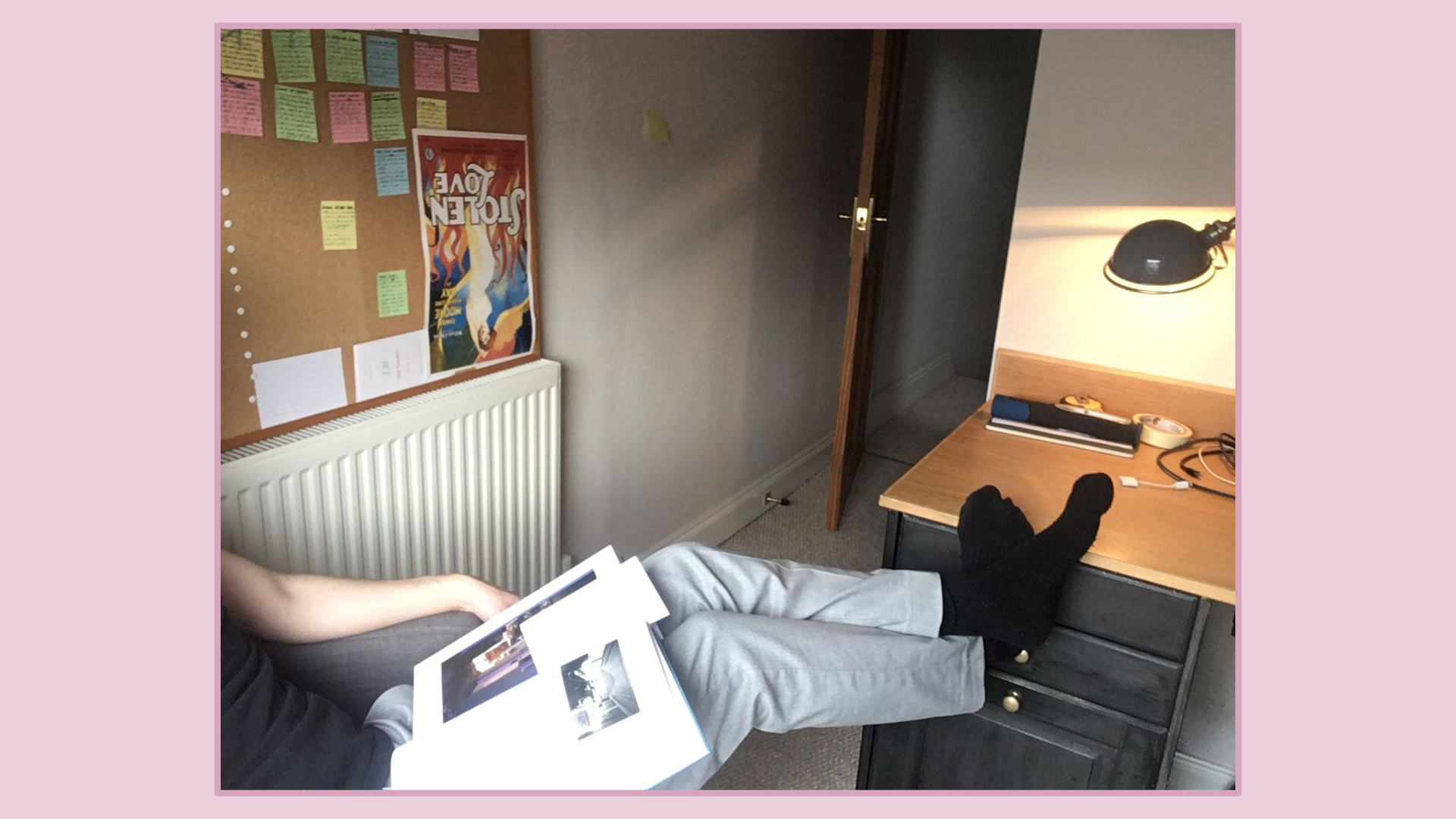
Throughout the course of Building Beauty I’ve been using the side chair much more than usual.
In the mornings I’ll get up early before work, make my morning coffee and place it on the window ledge and read a few more pages of The Nature of Order.
I hadn’t really considered the connection between this space and the wider context of the gardens.
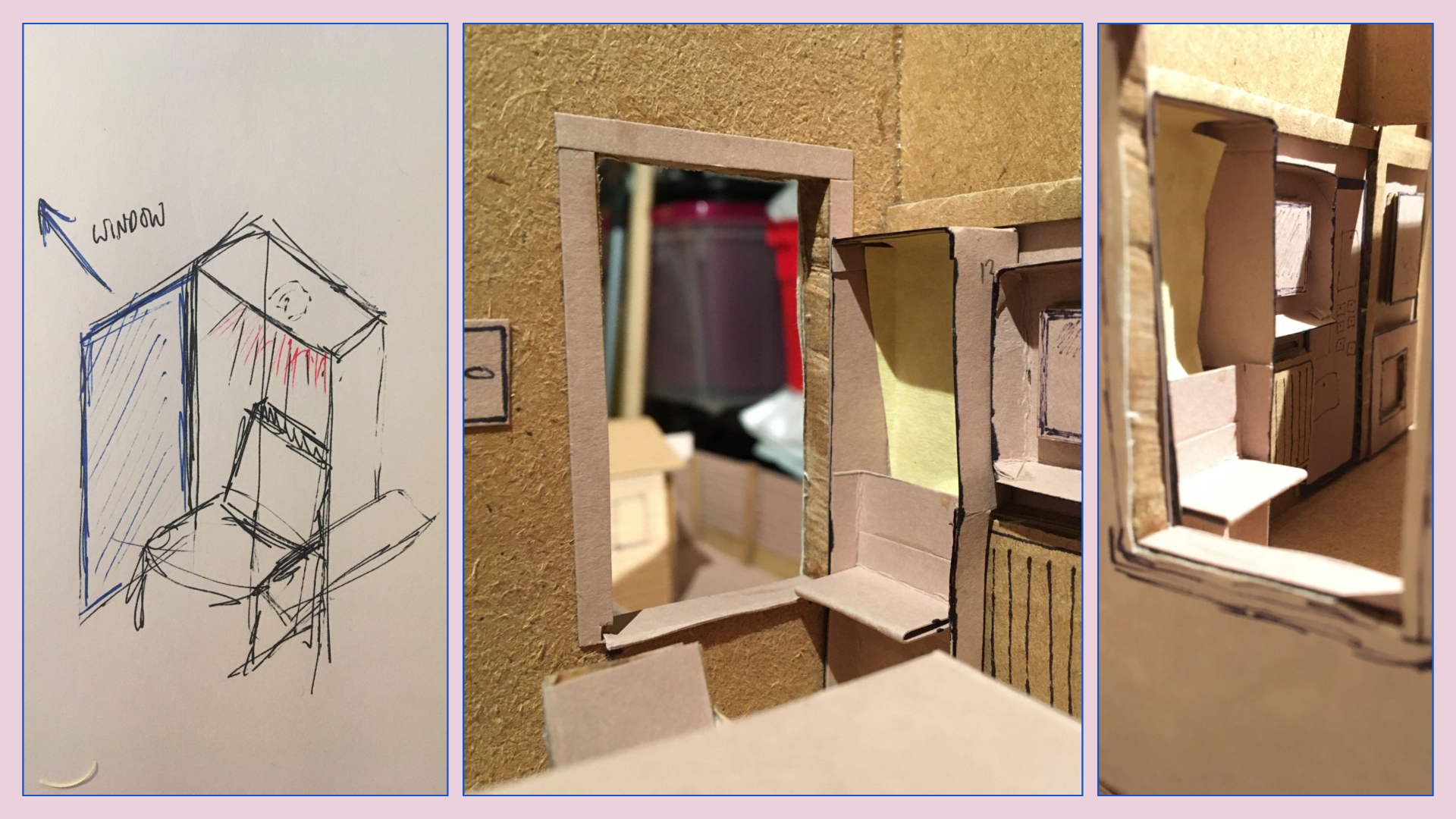
I did like the idea of creating a cozy little alcove for the reading space.
I knew I didn’t have much depth, but even a small boundary with some clever lighting felt like it could have made that space feel more special.
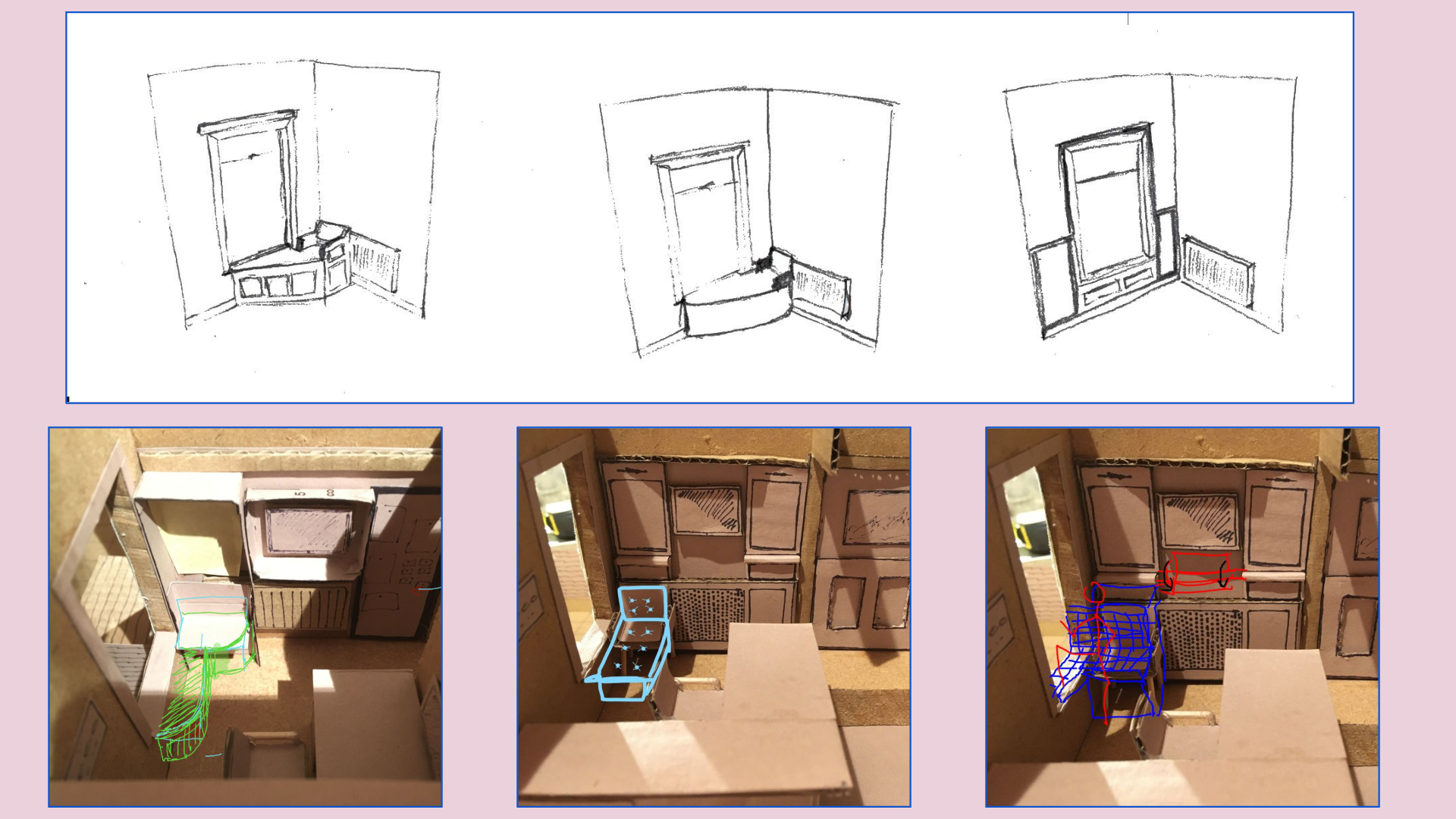
We tried endless variations, but each of them caused problems given the positioning of the window and the limited amount of space in the room.
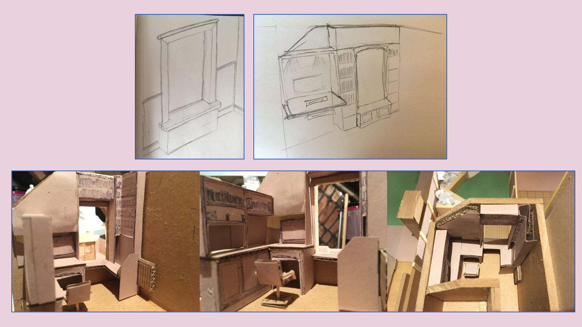
I even tried rearranging the whole office to try to better connect both the inside and the outside, but, it just didn’t end up working.
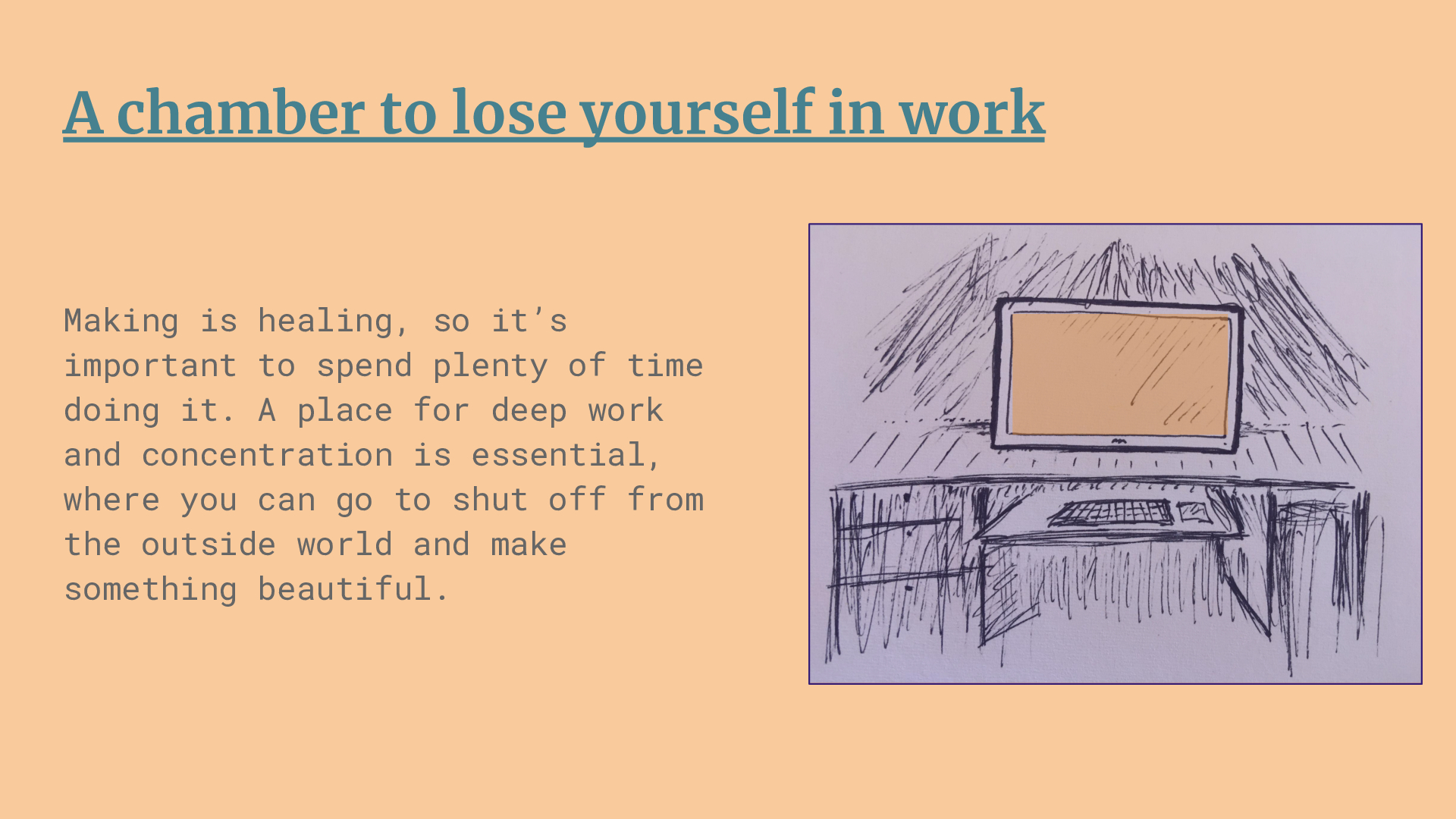
This pattern is somewhat already in the room, but it’s the most important to me.
The whole reason for everything else in this project is to create a workspace where I can try to produce the best work I’m capable of.
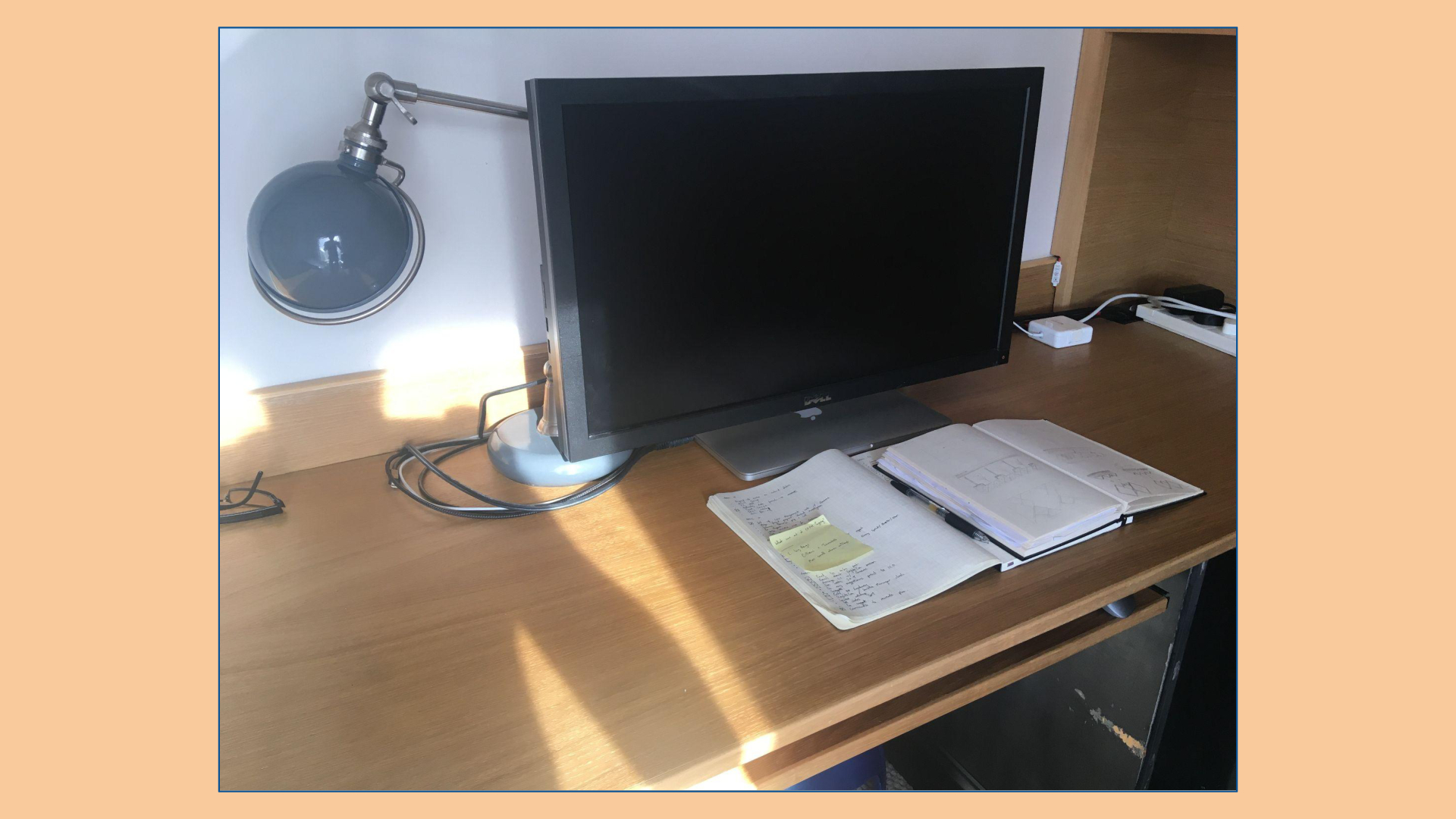
Separating out some of the activities that happen at the main desk to the standing computer reduced the need for so much screen real estate on the desk computer.
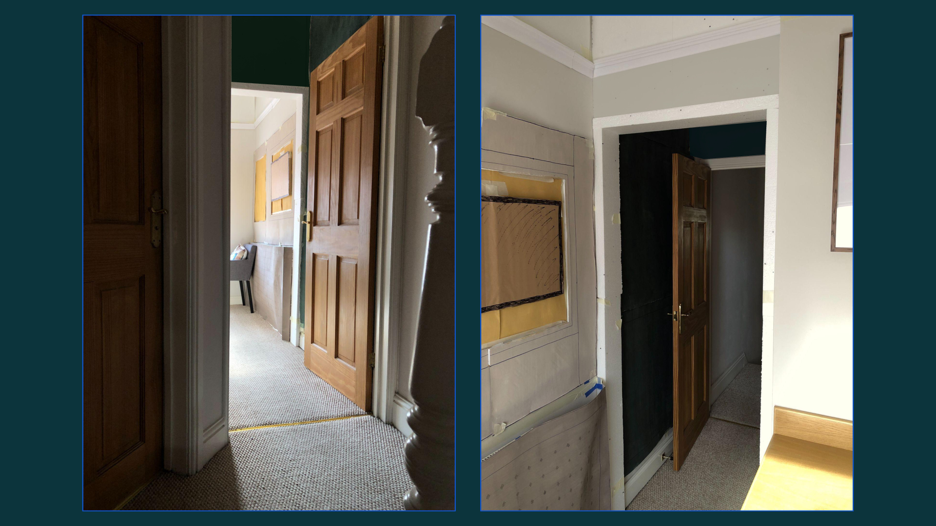
The hallway transition created the biggest feeling change in the space.
The room feels totally barren without it.
It’s difficult to see from the photographs, but the dark panelling in the hallway feels quite special.
The green could go even deeper and darker, but I love the direction. I didn’t get chance to paint the archway frame, but I know that will create even more of an impact through learning from a previous mockup.
I’m looking forward to filling it with inspirational artwork.
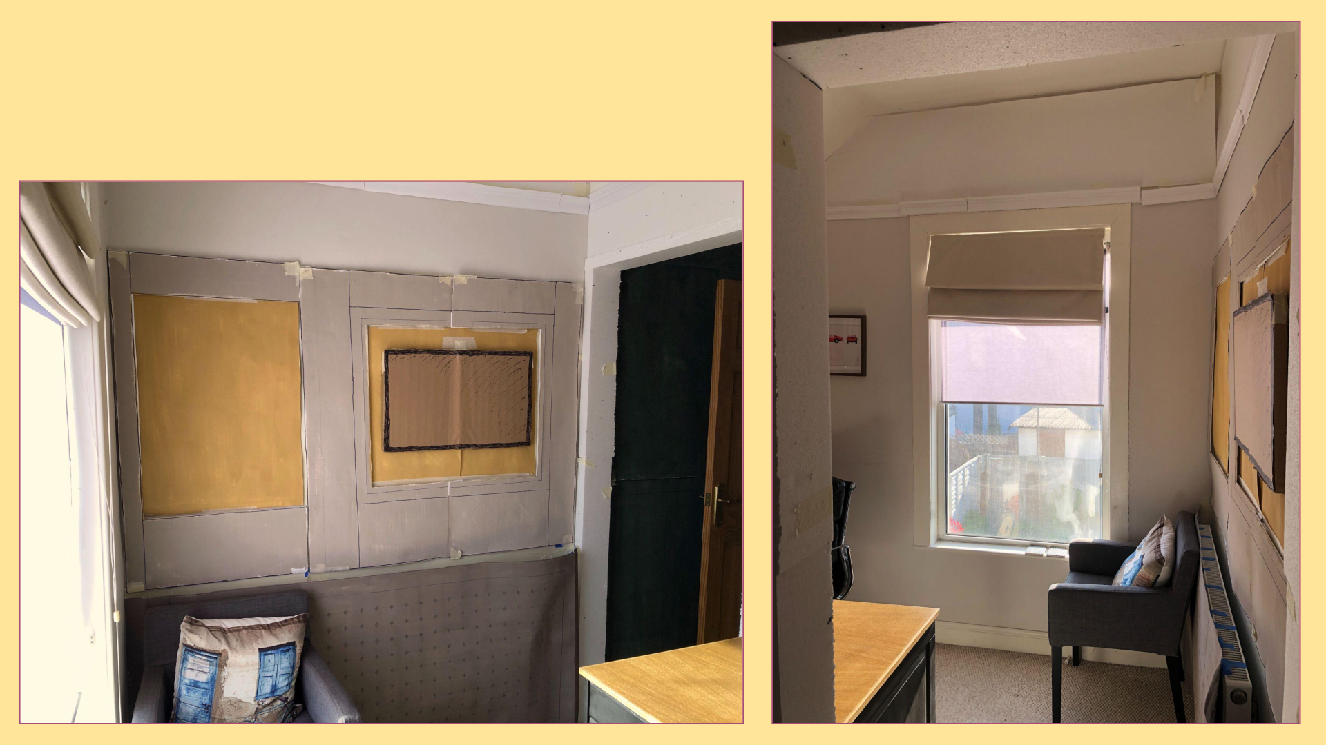
The standing workstation created the biggest activity change in the space.
I wanted it to feel like meeting your friends in a sunny day in the park, and I feel like I’m pretty close.
The left hand panel will be a pinboard for notes and reminders, and I’m thinking the space between the panelling and the picture rail can be used for some small photographs of friends and family to better connect me with the people I care about.
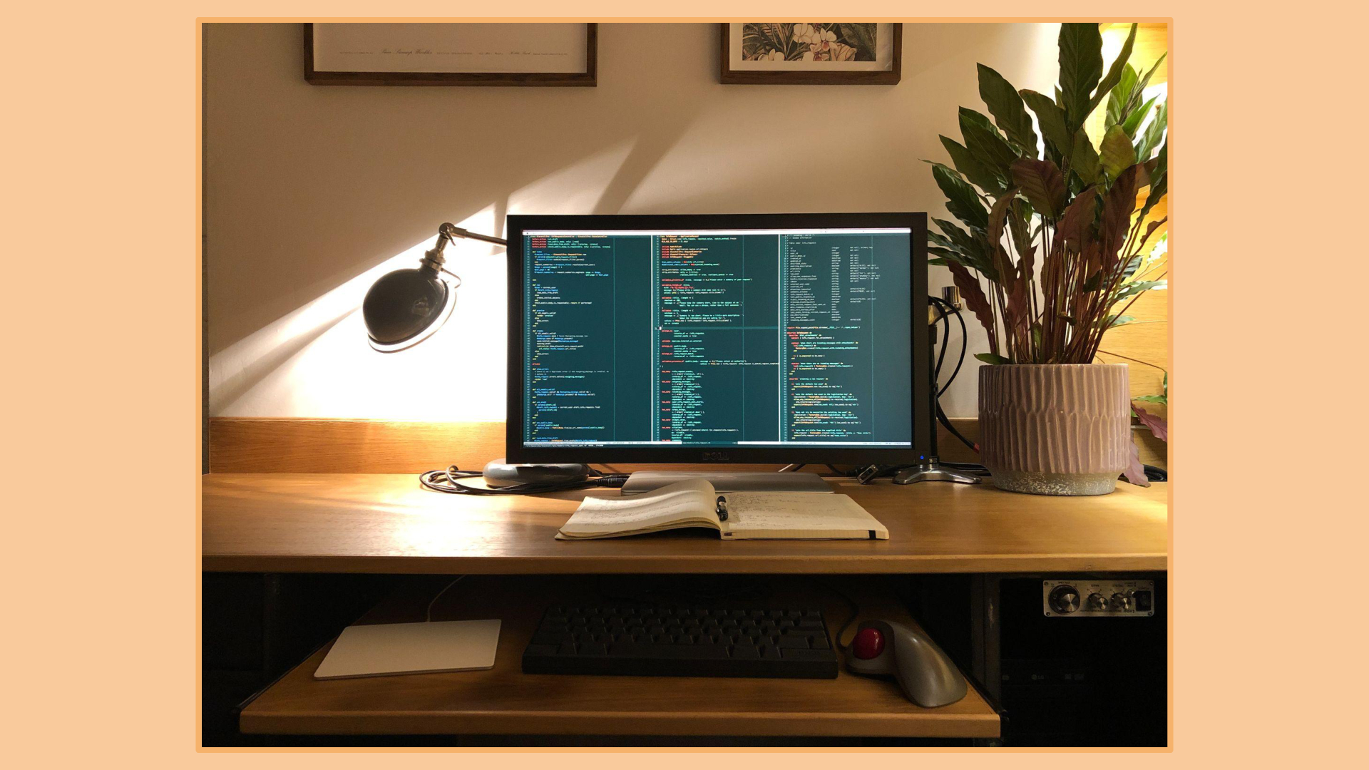
Adding a plant to the desk, and without all the screens, the space feels instantly calmer.
Sometimes the simplest thing is the next right thing to do.
I was surprised just how much difference a nice plant makes.
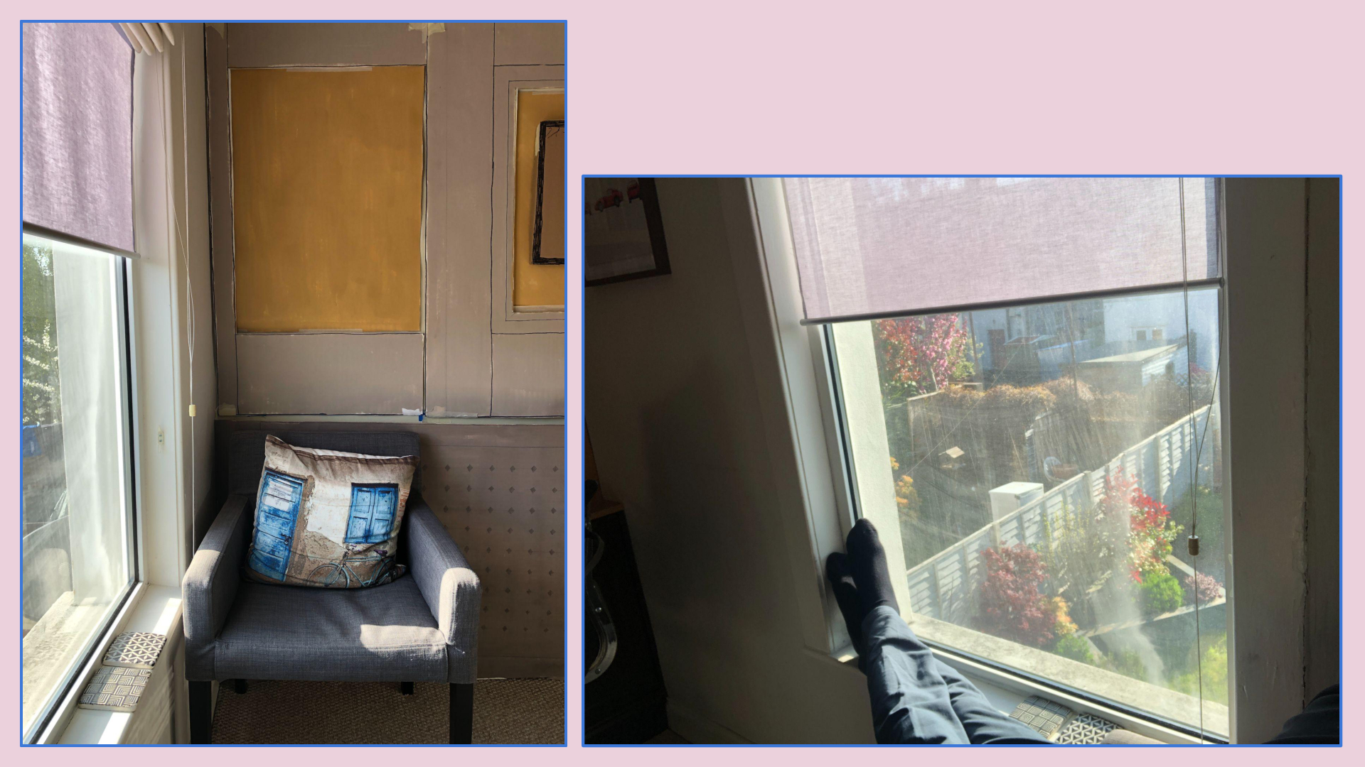
The new chair position at least makes use of best areas of the window view.
I’ll be on the lookout for a nicer freestanding chair.
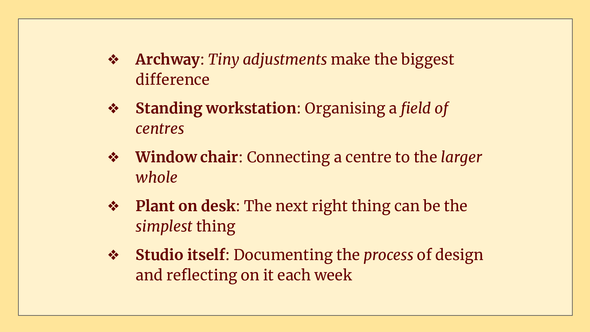
Even though it’s been a huge amount of work, in some ways I don’t feel like I’ve achieved much other than painting some paper and taping it to the wall.
But on reflection I do feel like I’ve at least had a taste of some of the most important lessons from The Nature of Order.
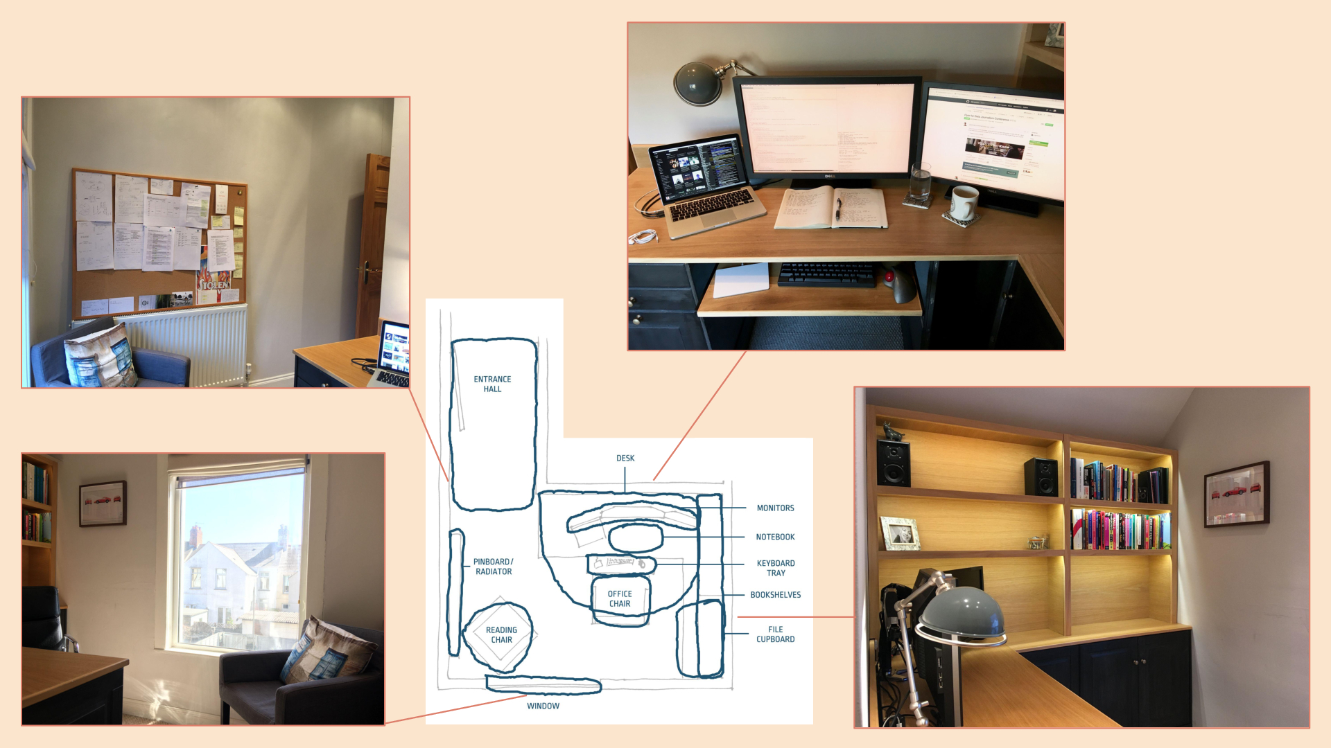
Here’s a reminder of the before…
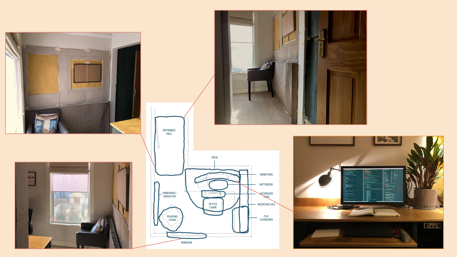
And here’s where I ended up.
I know there are still some details to resolve. I’ve been working on some vertical alignment issues, a pattern for the frieze area, and the fine-scale centres of the radiator cover.
Still, I can’t wait to build this soon.
Thanks.
I had some nice feedback about the result and the process. The main thing that I should keep working on is the boundary transition between each space. At the moment they still feel independent and not coalescing into a whole.
