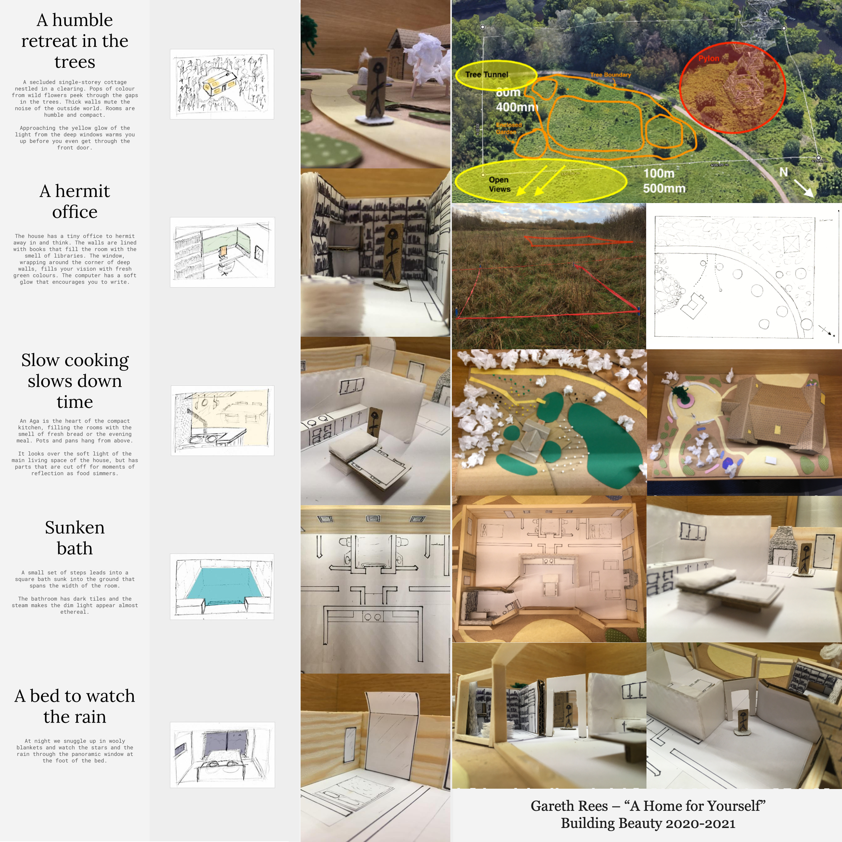
Building Beauty: Week 23
Studio
Continuing from my 1:1 mockups last week, I had some feedback from classmates.
The vertical elements of the window seat area seem not to be working. Have you thought of going horizontal?
Maybe if the (vertical elements) could only cut at regular distances
Both were good points, but I had a couple of constraints:
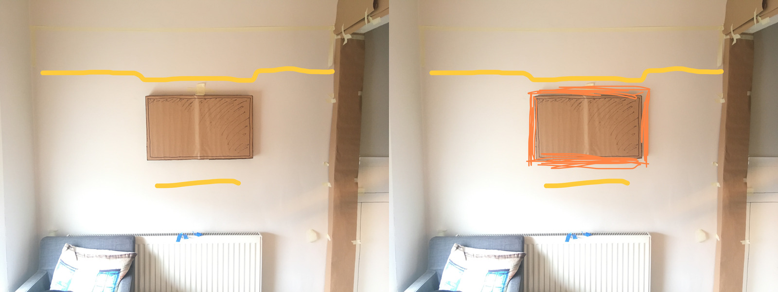
- I want the standing desk setup on this wall – it’s the best place for it in the current room configuration. That means a monitor at eye level. There’s a bit of wiggle room horizontally, but not so much vertically.
- I don’t want to come out too far from the wall, especially past the radiator near the archway. This intrudes on the walkway into the room. A shelf above the monitor would be in prime smashing-me-in-the-face position! 🤕
- I also don’t want to smash my head on a shelf when I’m sitting in the chair, so don’t want anything too low on the left side. Of course, if there was a full-height bookshelf, say, then that would make up part of the wall and be okay.
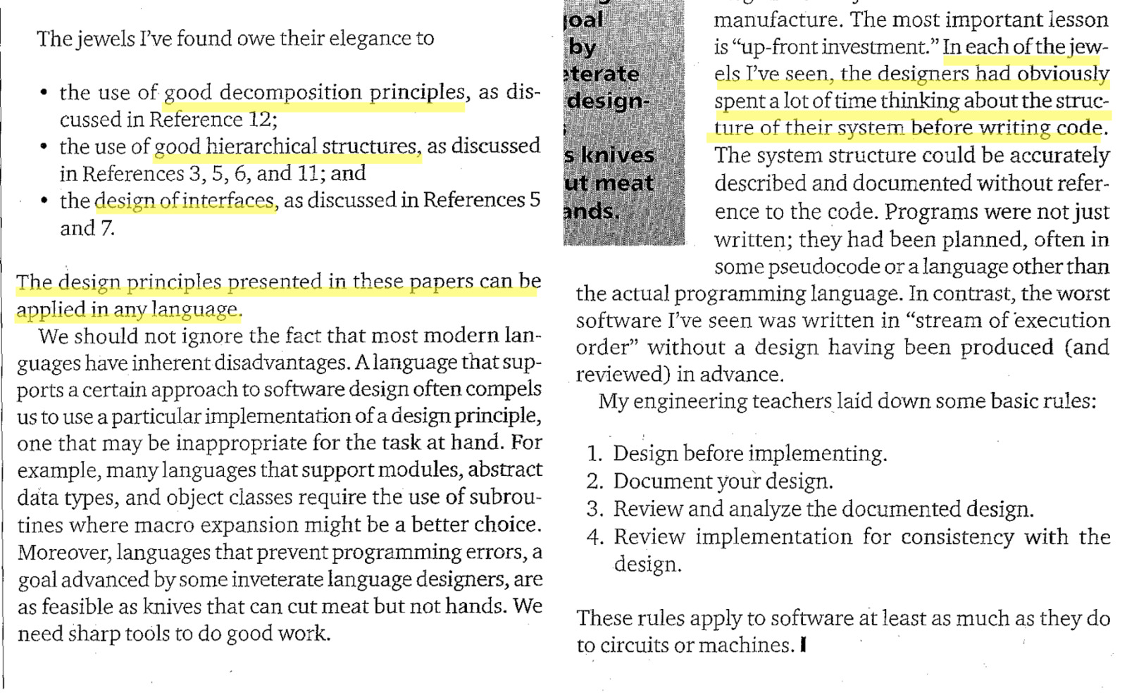
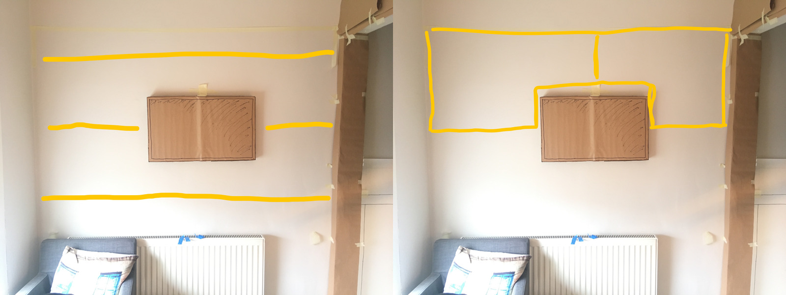
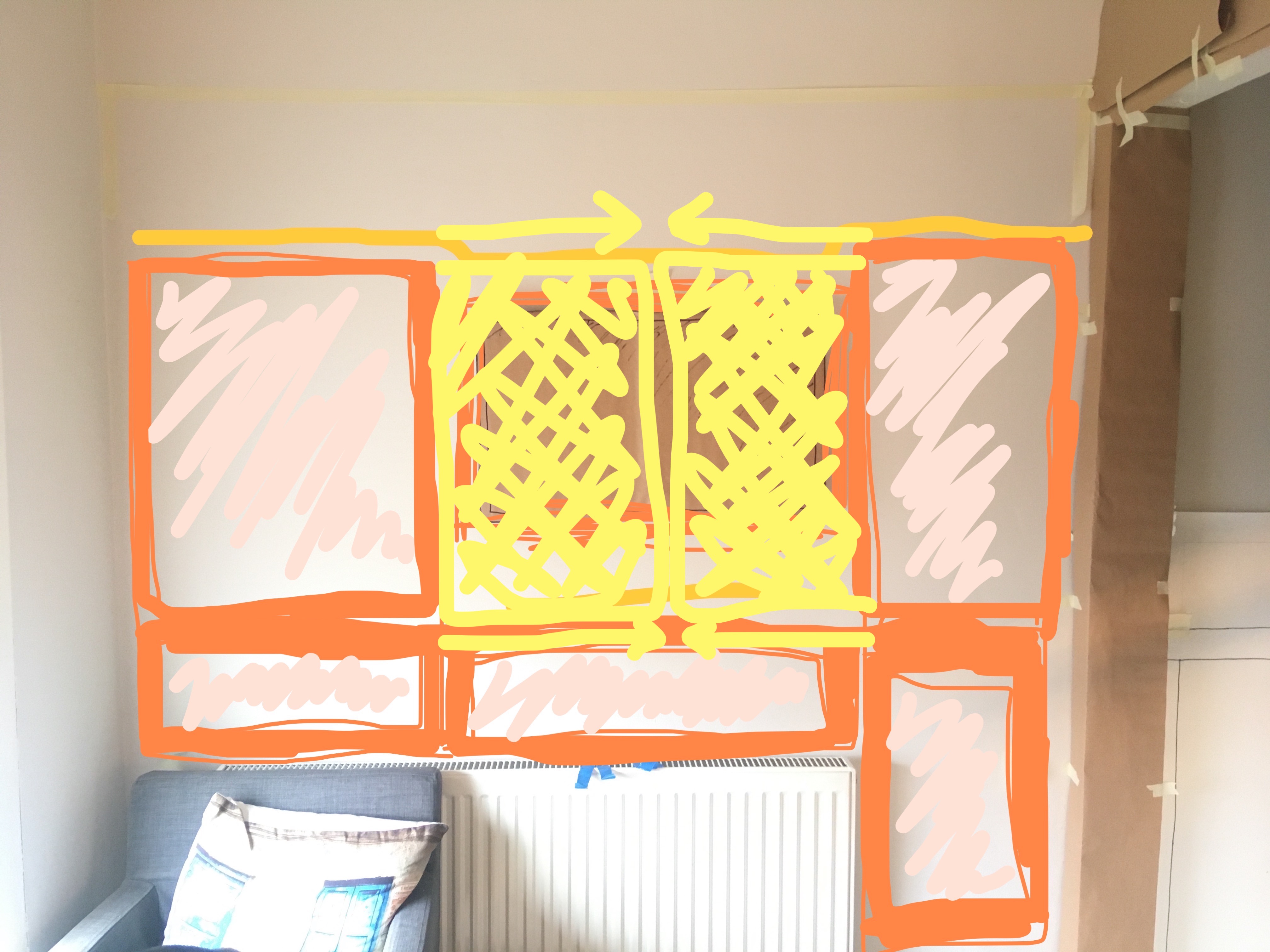
So with that in mind, what are the latent centres created by the monitor?
It does indeed feel that the horizontal centres are stronger.
I guess there’s a possibility of “splitting” these centres:
…but I’m not totally convinced here. This feels like just drawing shapes.
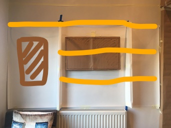
I liked my profiled shelf sketch, so let’s try that, with the keyboard tray underneath the monitor. That felt okay. Maybe I just need some sort of strong border tight around the monitor…
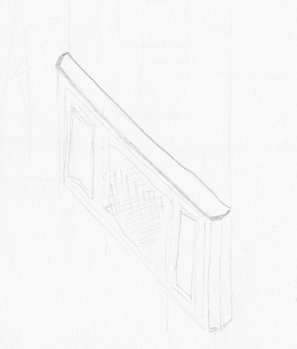
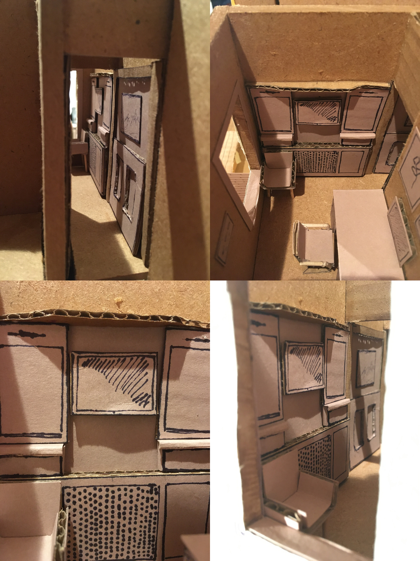
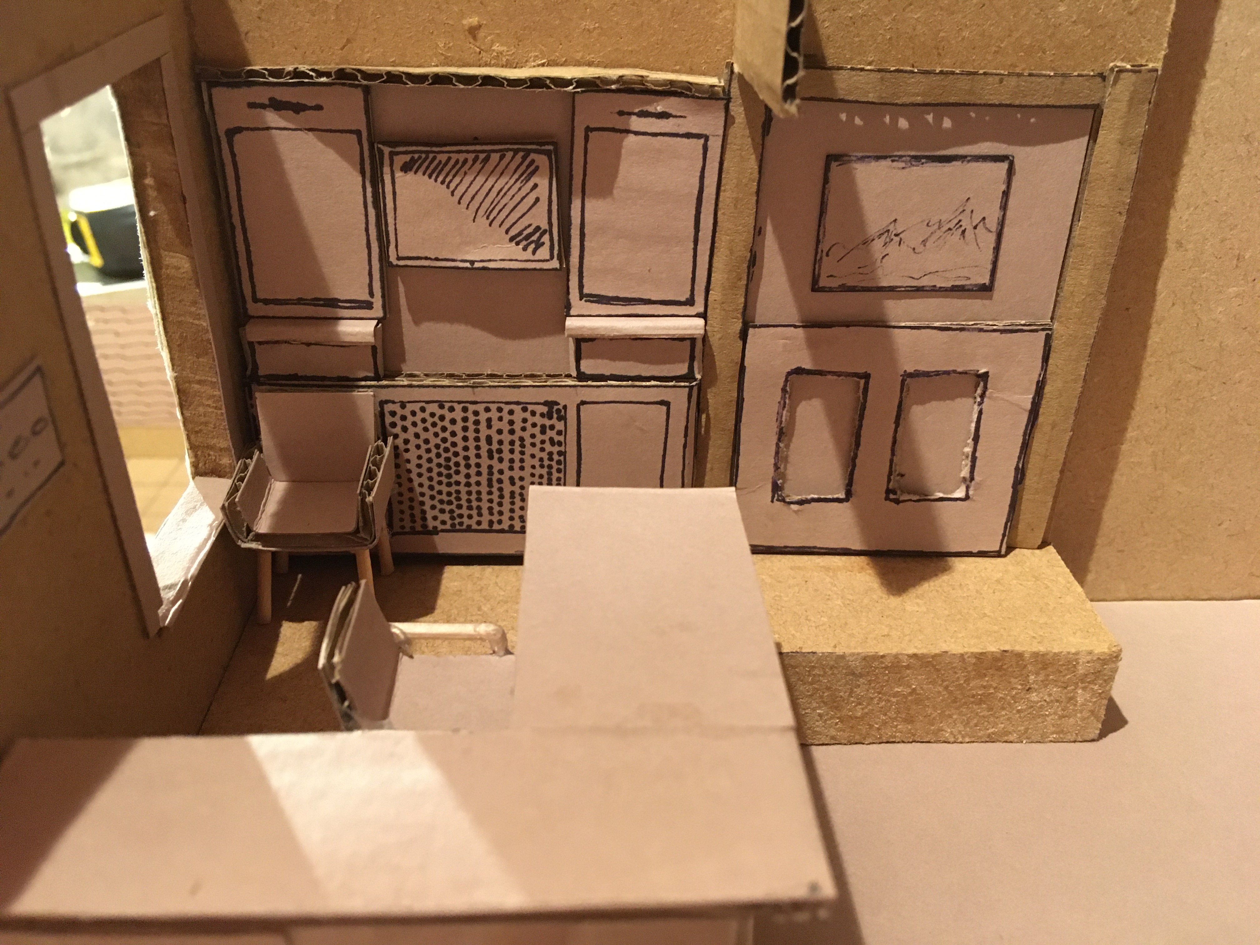
Something that was bugging me before that I didn’t notice until I’d done the mockups was where the wainscoting ends and how the radiator wall mockup works in relation to that. Maybe I need to continue it onto the radiator wall?
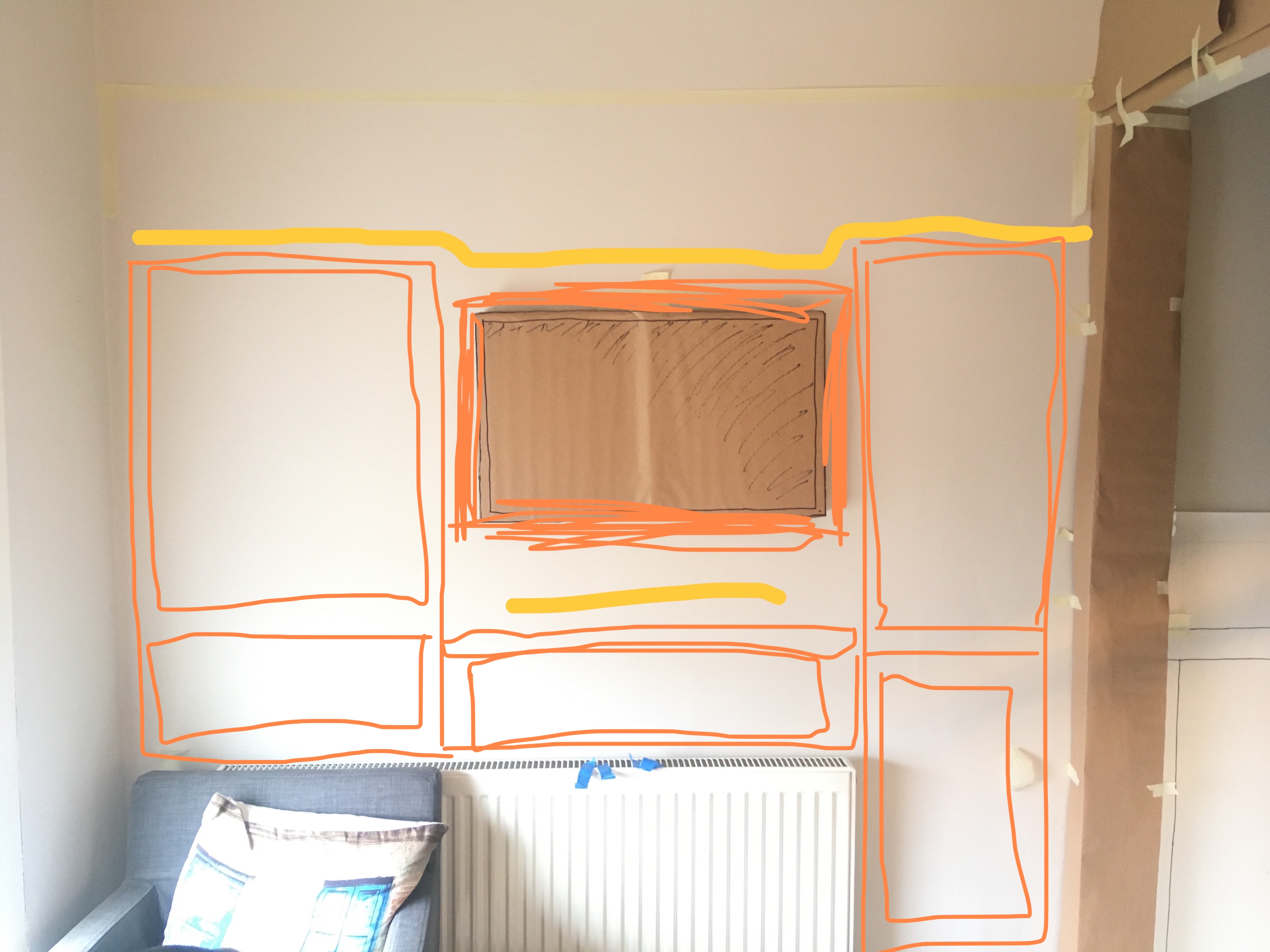
This is starting to feel pretty good? It’s not that different, but I’m thinking instead of the protruding dividers, maybe it’s just more panelling that’s needed to better define each space.
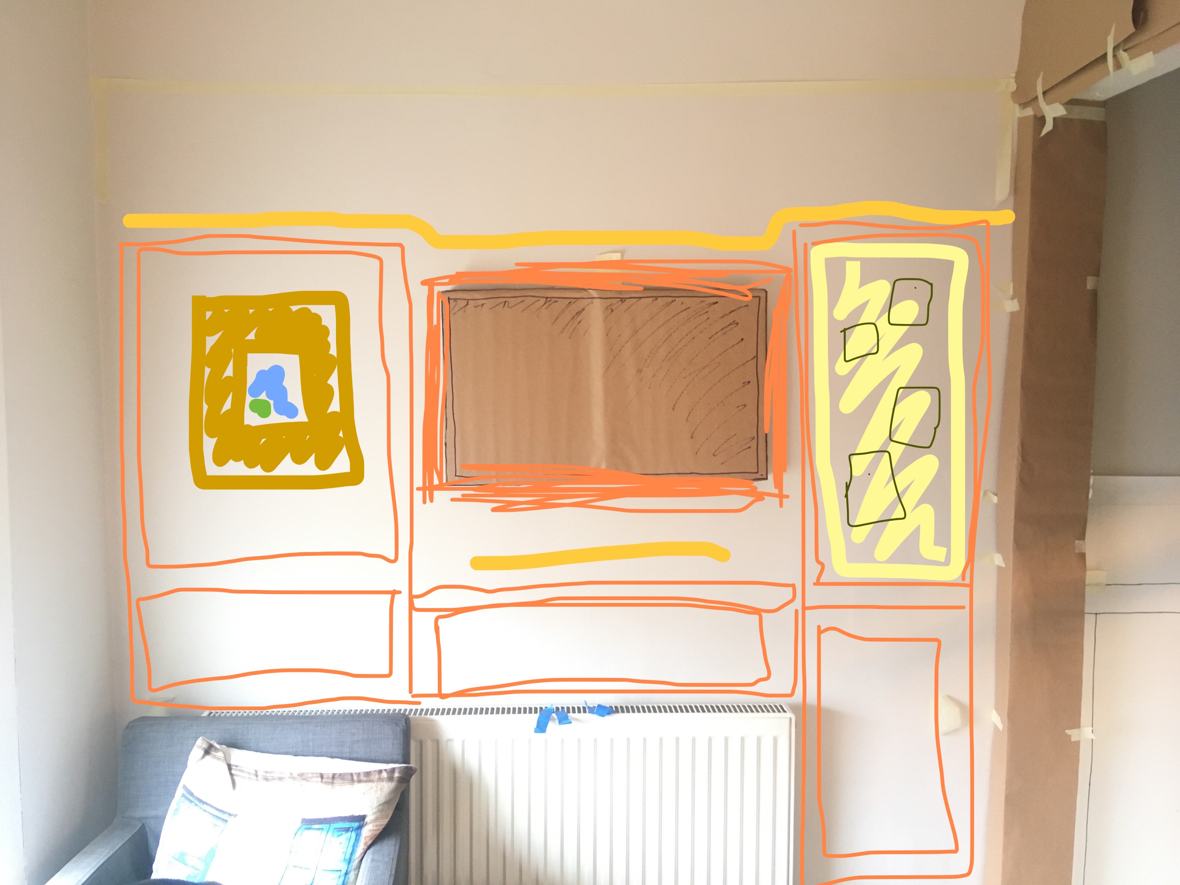
I can still integrate a pinboard into the right-hand side, and maybe a framed picture on the left.
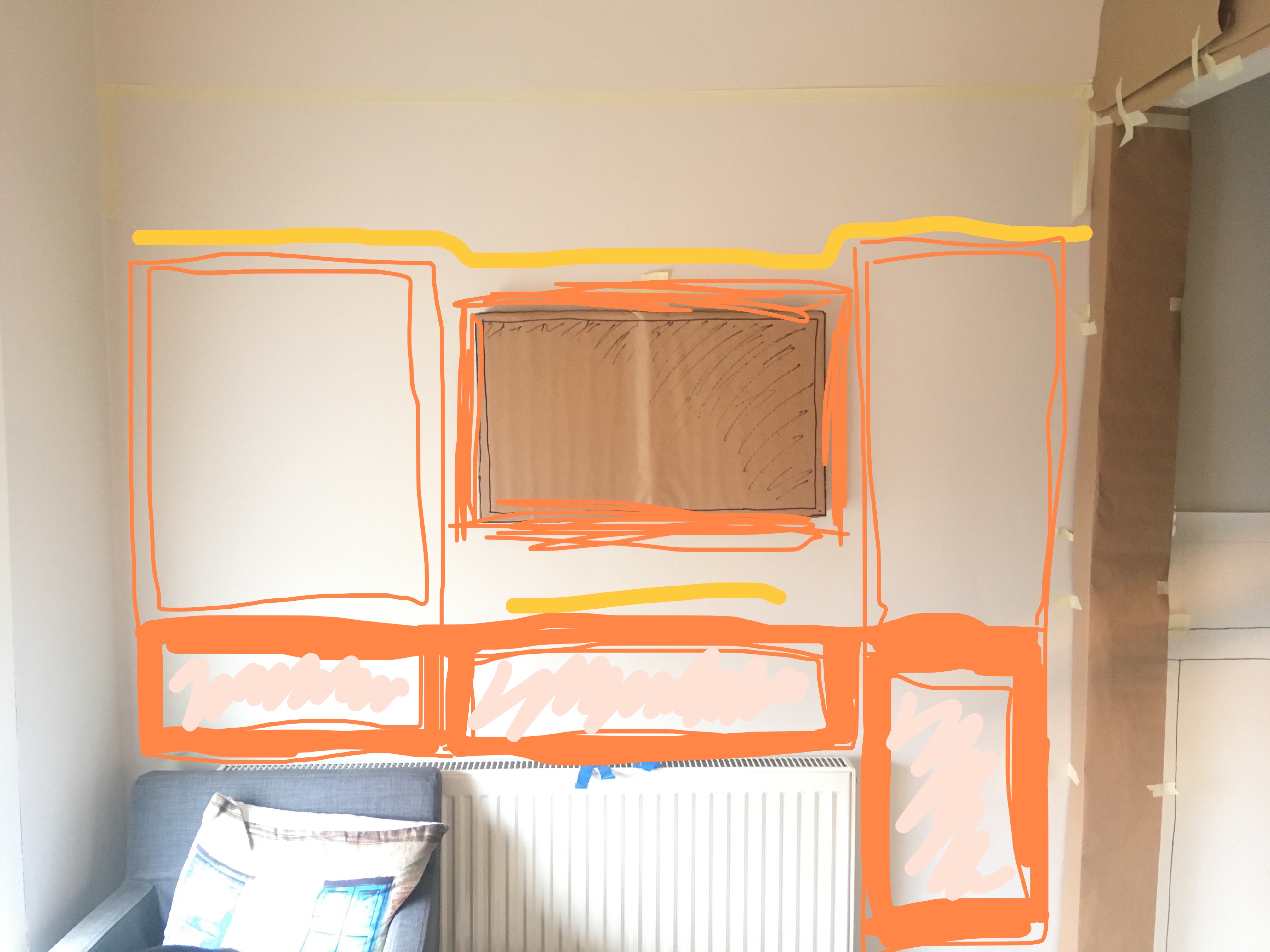
What I might try is making the bottom of the panelling protrude out as far as the archway frame. This feels like it would add a bit more depth to the wall, as well as bring the whole “bottom” in harmony with the existing protrusion of the radiator. This would give a nice “ledge” at the height of the wainscotting for putting small items like pens, pencils and a cup of coffee.
Or, if I’m really clever, maybe the whole wall could protrude out 100mm, and I could build in some sliding screens to mask off the standing desk when it’s time for focus…
Whether I’ve got the skills for this is another question, and on a practical level I don’t know how I’d make this work around the depth of the monitor and the keyboard arm.
Why you not center the monitor in the wall regardless of the radiator?
This was a good question. Couple of reasons came to mind:
- I didn’t want the standing place to be too close to the chair. I know we’re only talking inches here, but it does make a difference.
- When I was thinking of the reading alcove, the monitor needed to be further right due to the width of the chair.
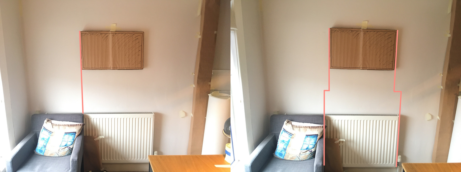
- It felt like it would make sense for the right of the monitor “place” to line up with the line created by the right hand side of the radiator.
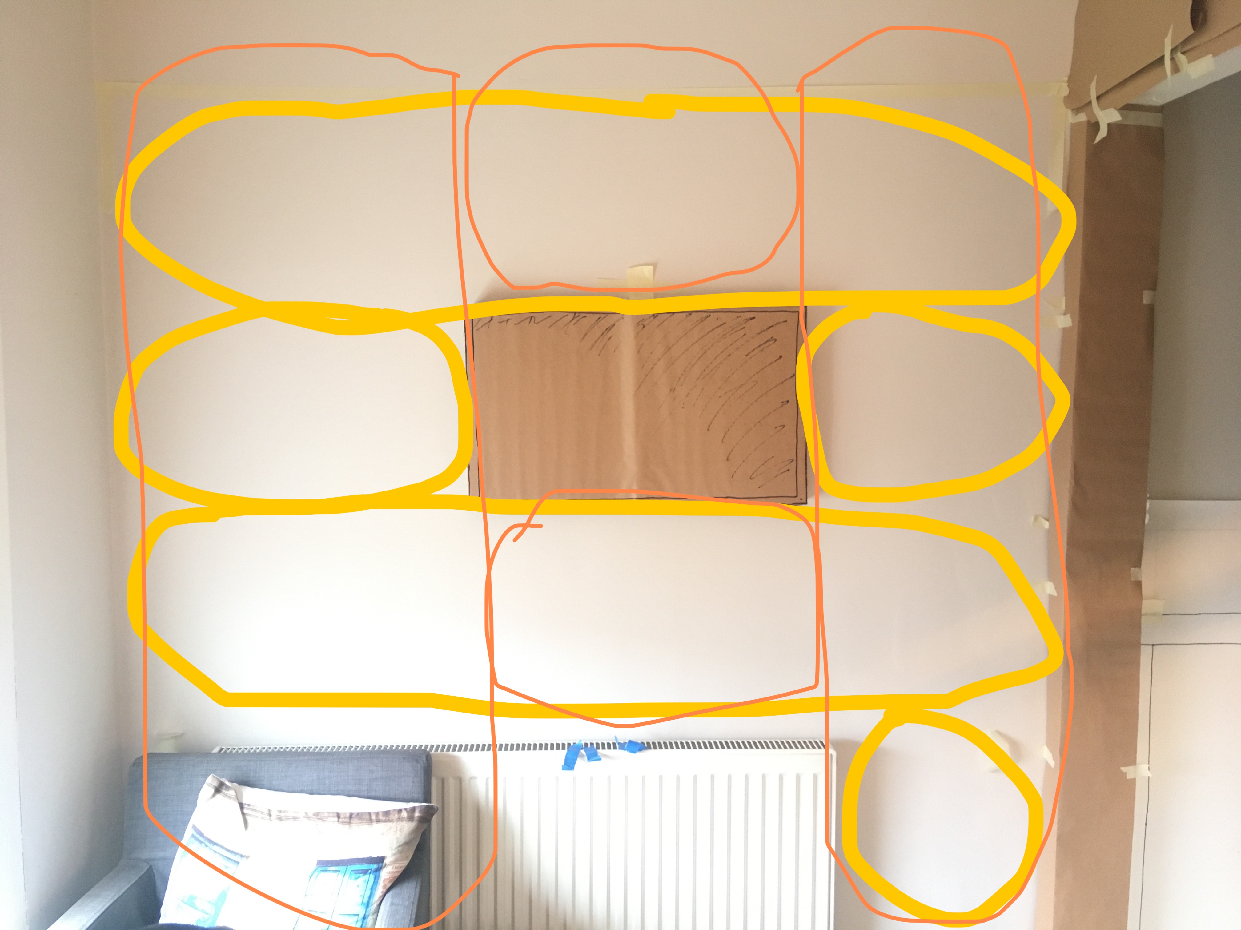
Anyway, I tried it. It actually looks okay, and I think the standing position isn’t too affected by being a bit nearer the chair.
Weirdly, the left hand side of the monitor now lines up directly with the right hand side of the chair, which feels a little off because there’s not that straight line down to the right of the radiator, so it might need to come an inch or two to the right…
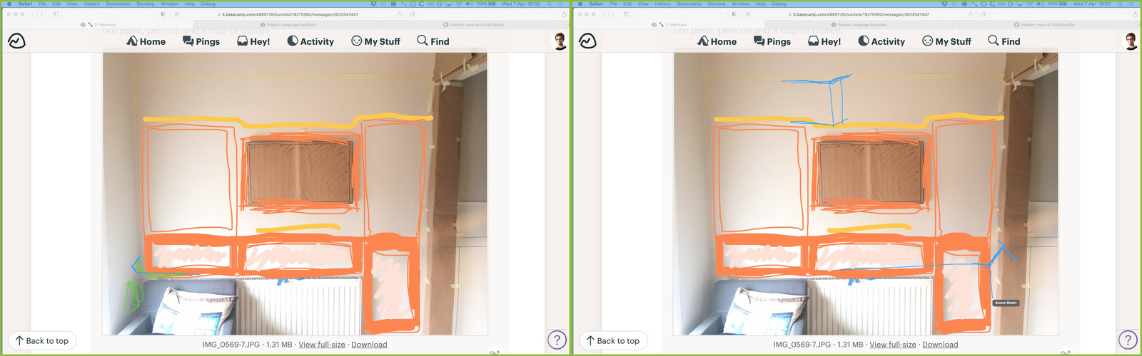
In my tutoring session Saman and I explored these ideas a bit more. We agreed that the radiator was causing an inharmony and that pulling the lower panelling out to make it all flush was a good move
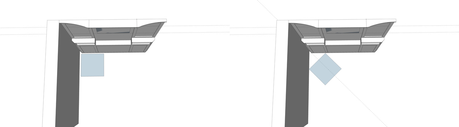
He then suggested why not add a screen in front of the radiator. I think this would totally work, and make it easier to avoid the alignment weirdness with the monitor since I’ll have more control of the vertical lines below.
This would have to protrude from the wall ~110mm, which would be around double the protrusion of the archway. We discussed this a bit and Saman came up with the idea of chamfering the sides of the panels so that there’s not such an abrupt edge.
This left the question of whether to do the same on the left hand side. Seems like it should work, but need to try it.
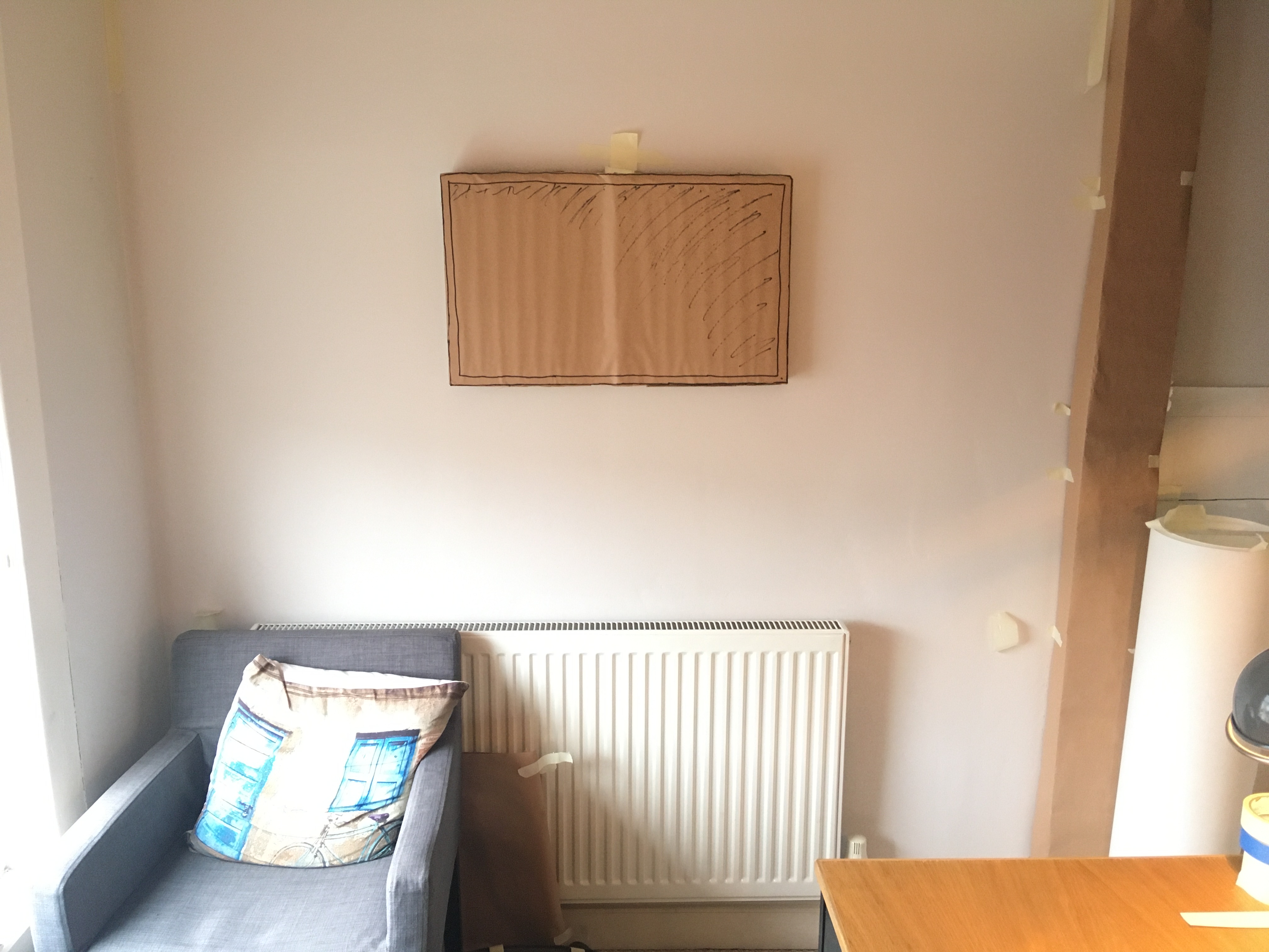
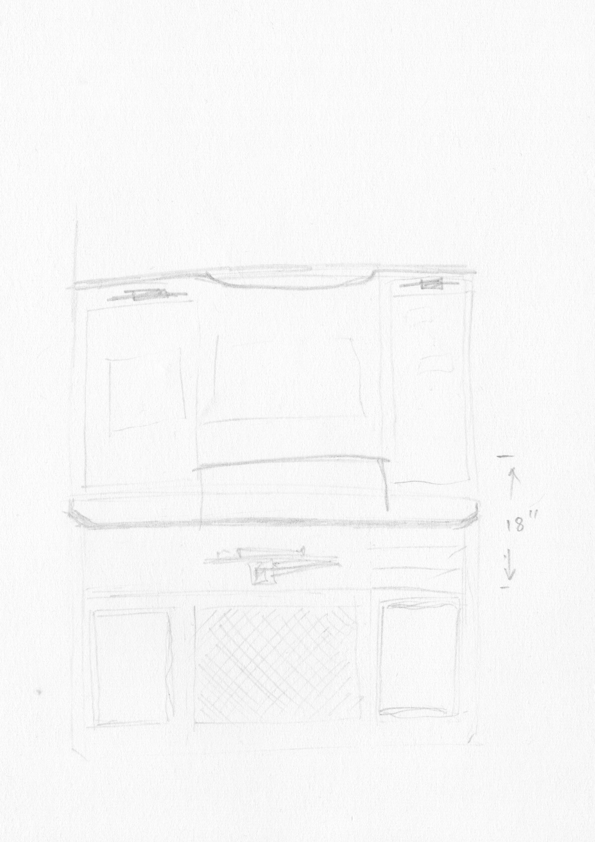
I’ve been mulling this over and it’s feeling good, so I sketched out a quick version on paper just to see if I could put down on paper what I was seeing in my mind.
This left me thinking about the mechanics of how I’d integrate the keyboard arm. The arm mechanism itself pushes fairly flush against the wall, but even when pushed back, the keyboard tray protrudes ~350mm from the wall, which isn’t great. It does fold up to a vertical position, but that needs ~500mm of space to do so.
Given the monitor height, and wanting to keep the ledge of the protruding panelling aligned with the hallway wainscoting, this took a bit of head-scratching.
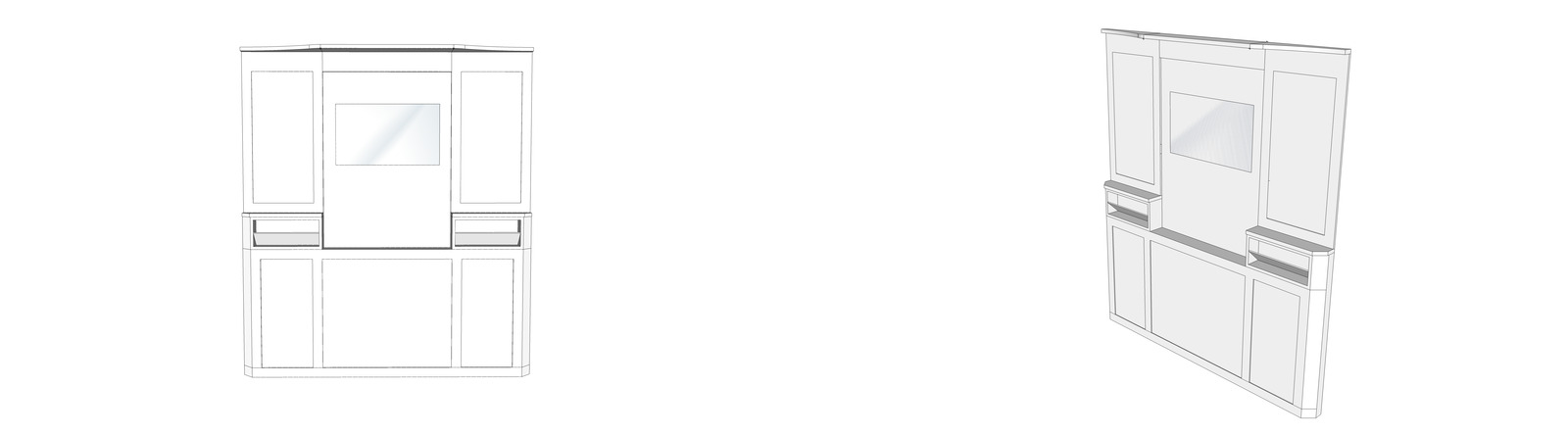
This is where I turned to Sketch Up. It’s so much quicker and easier to rough out forms with relatively accurate dimensions.
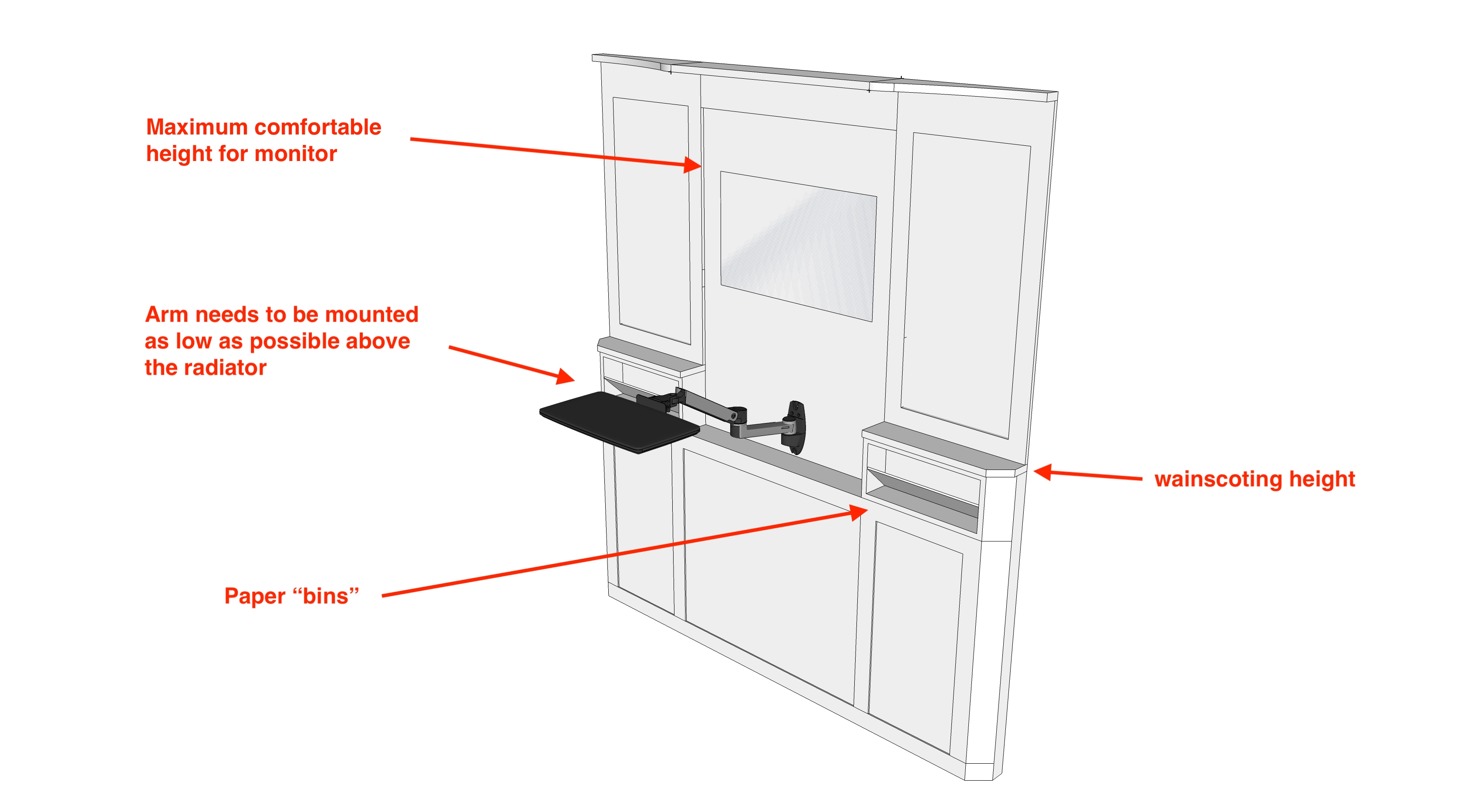
I’m not 100% on the paper bins. The idea is that they’re a place to just dump sketches or paper notes temporarily while arranging things on the pinboard mounted in the panels.
The gap between the monitor and the keyboard arm feels a bit empty… not sure what to do about that though. The gap above the monitor feels easier to solve – probably extend the panel downwards and mount some tiny 3”x3” pictures of family.
The top rail of the wainscoting is intentionally deeper to mount some subtle picture lights pointing inwards at the panels.
So all good in theory. Let’s try it…
I only realised after making all this the proportions of the hallway panelling are a bit out, but I probably don’t have the time to recreate them this weekend. In any case, it feels like the best iteration so far by a long way!
There was a suggestion that a cushioned bench would help connect the radiator wall to the window wall, but I just don’t think it’s going to work. While you’re in the room, the chair feels fine in terms of the amount of space it’s taking, but a bench under the window would feel mega cramped. I think the best I could do is a footstool that pushes under the chair.
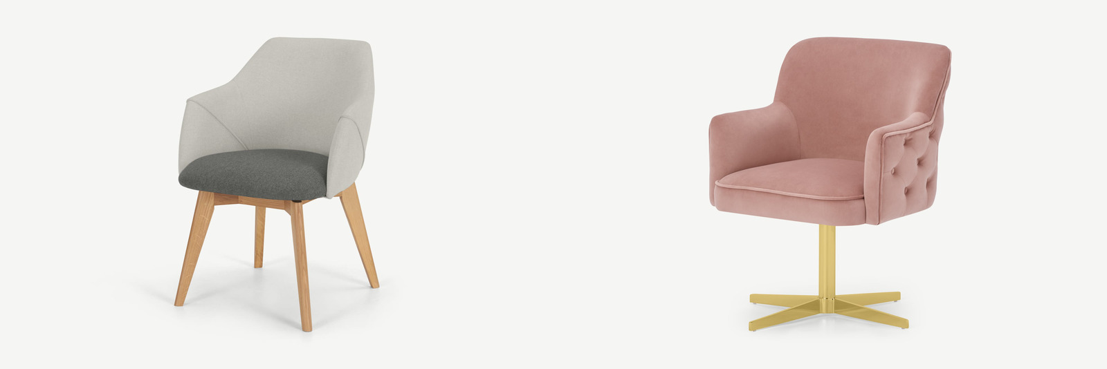
I’m going back and forth on the angle of the chair. On one hand, I quite like the “new” chair position because it’s much better in terms of connection with the best view from the window. On the other, it does feel… boxy… for lack of a better word. The chair as originally was at 45° did feel a bit better in terms of the shape of the remaining floorspace.
I’m not particularly attached to the current chair, so a possibility is to just buy a new chair that swivels. For example, something like this one or this one. That way it’s a bit more flexible in how it looks in the room.
HOME Competition
Building Beauty Faculty Member Duo Dickinson (who gave an amazing talk on modelling last year) runs an annual HOME competition that Building Beauty students can enter. I entered my House project and won the “Merit for Methodology” award!
He liked how the Jewels defined the vision of the house and how they directly translated to the final design.
Nature of Order
We’re done!
Beautiful Software
As usual, we’re having some really interesting conversations that are a bit difficult to summarise as weeknotes. I did recently read a paper though!
Why Software Jewels Are Rare
What inhibits software jewels from being created?
- The conditions of industry – selling stuff can be good, but it also adds substantial constraints
- We often choose capability or utility when we’re a customer
- We want compatibility; compatibility is useful, but unlikely to be beautiful
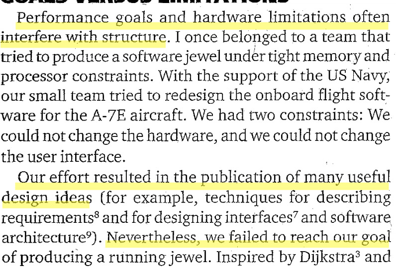
- Performance goals or hardware limitations
- Not being able to re-write the software based on new understanding
- Not Invented Here syndrome – we often solve the same problems in our own unique way
Are we doomed to failure? Not necessarily.
We can’t get rid of useful capability, but we can design general-purpose tools that afford several capabilities – the screwdriver! But we should also be able to hide things we don’t want.
It’s not the programming language…
It’s about design! Thinking about the composition and hierarchy of structures and the connections between them.