Visualising Uncertainty
One of the things I’m perpetually interested in is how we communicate what we’re doing when we don’t really know what we’re doing.
What I mean by this is that a significant amount of our Transparency work isn’t repeating the same project with minor variations for a new client or making incremental improvements, but actually pushing into new territory where we’re building to learn.
The mental model I have for this is “the fog of war” used in Real Time Strategy games.
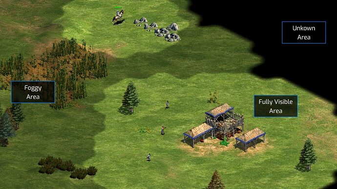
We have differing levels of visibility across our problem domain (the “map”), but don’t know how to connect them or what challenges we might find when trying to get from A to B. This makes it really difficult to put together a traditional “roadmap”. We’re constantly building new things to take steps forward, gaining new insights, changing direction, and all while the world is changing around us.
Making Good Moves
Recently I’ve come across a little thinking tool called a Wardley Map that makes this easier to visualise and have conversations about.
Here are some extracts from the talk.
It’s really difficult to quickly articulate the moves we want to make in prose. We use maps as a technology to help, but our “roadmaps” aren’t maps at all.
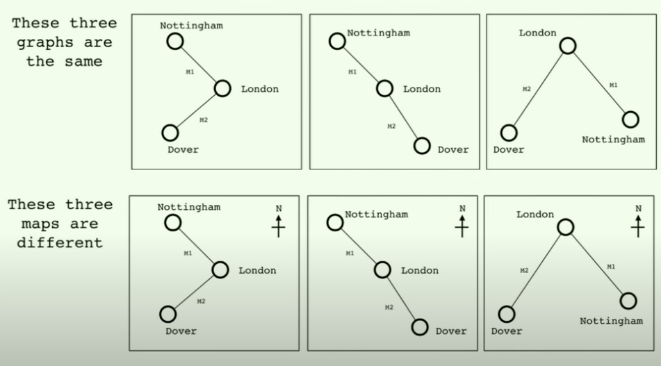
The key thing that makes a map a map is that space has meaning. Roadmaps are almost always one-dimensional based on time, but that’s only one of a number of useful dimensions that matter.
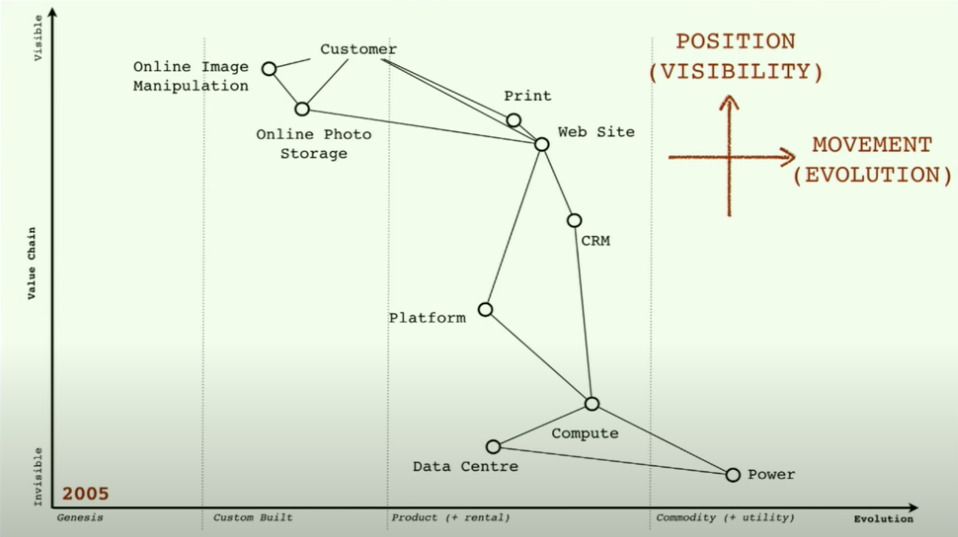
A Wardley Map is a value chain ordered by visibility to the actor who uses the service. Visibility matters because the closer it is to the customer, the more they’re likely to care about the specific implementation.
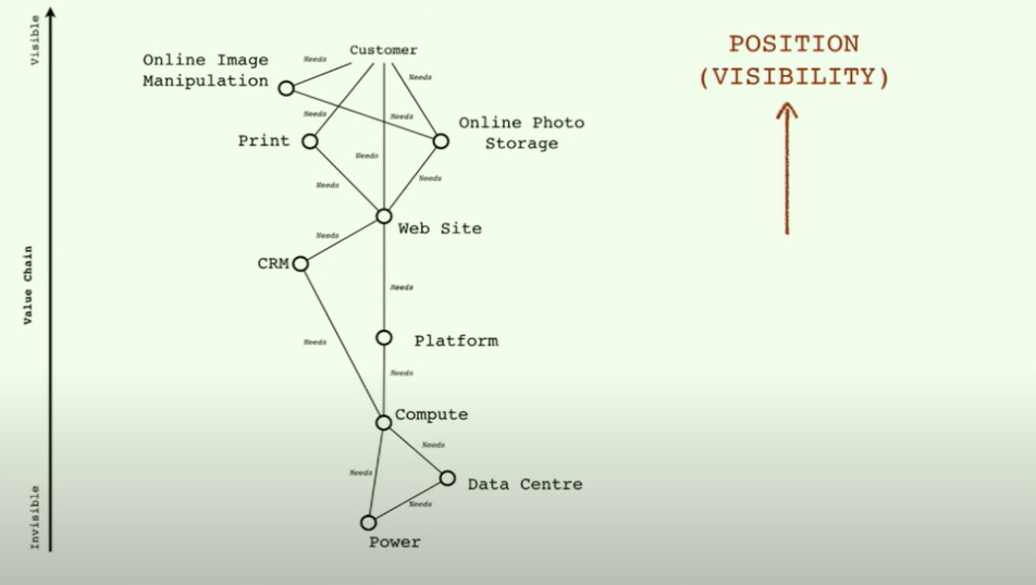
After the value chain is mapped, it is arranged on a horizontal axis of “evolution”. The broad categories are “Genesis” (there’s some desire for progress but no supply-side solution), “Custom Built” (actors cobble together solutions because there’s nothing better), “Product” (there’s someone providing a specific, differentiated implementation for the demand-side problem) and finally “Commodity” (it’s such a solved problem that there’s basically a universal solution).
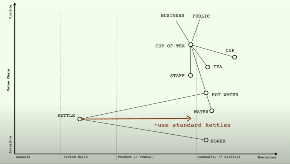
One of the examples is of a café. The value chain is mapped and we can instantly ask “Why on earth are we using custom-made kettles?!”. There might well be a good reason – part of the high-end branding – but we now have a way of literally looking at something that we can interrogate.
So how does this help us?
My rough “strategy” for the Transparency programme is a post for another day, but at team meetings I’ve trailered this idea about shifting our focus to journalists, connecting them with citizens, and then in some way making the citizens more like journalists in their own right.
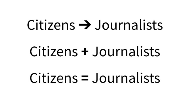
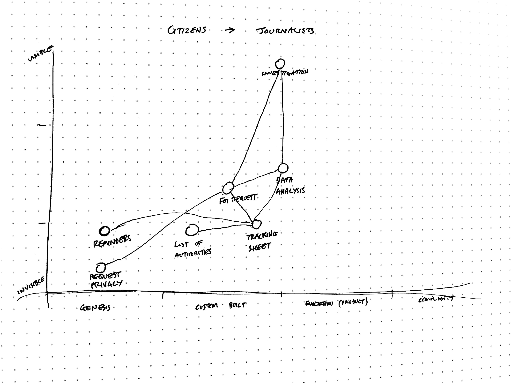
To test this Wardley Map idea I tried it on the first of these – Citizens ➔ Journalists – which we’ve already done in the form of developing Alaveteli Pro.
First, I roughly mapped out the key general components of what contributes value and connected them up. This was from the point of view of the domain before we developed Pro.
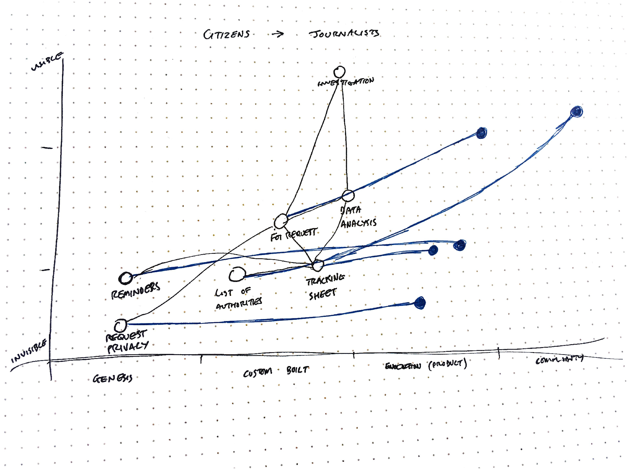
Then (in blue), we can take a look back at how we made progress for each of these value contributors. Critically, we made the FOI Requests much more visible with our eventual-publication privacy periods, and provided many of the previously custom-built areas as a product. WhatDoTheyKnow’s database of authorities is almost a commodity at this point. Instead of being hidden in cobbled-together spreadsheets on various journalists’ computers, we’ve collected a huge database of FOI addresses and made them available to everyone in a single place.
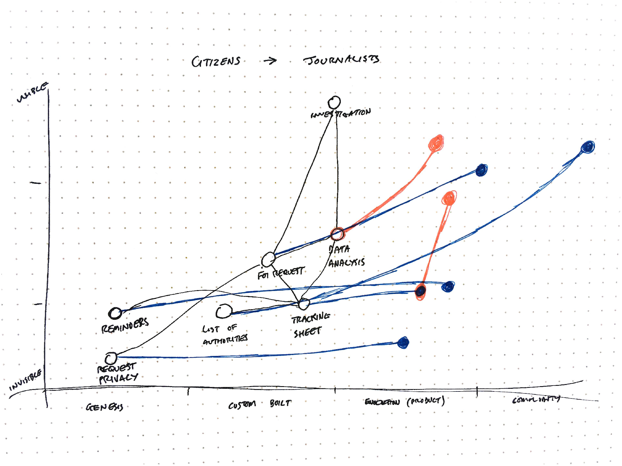
This visualisation allows us to have some really interesting conversations about what to do next (in red). We could look at exploring how to make the data analysis more visible, since that’s a huge value add in terms of our overall goals of more impactful use of FOI, but to do that we’d probably need to create a more repeatable process. The tracking sheet is already a known quantity, but it’s still quite hidden. Would there be value in making it more visible to the world at large?
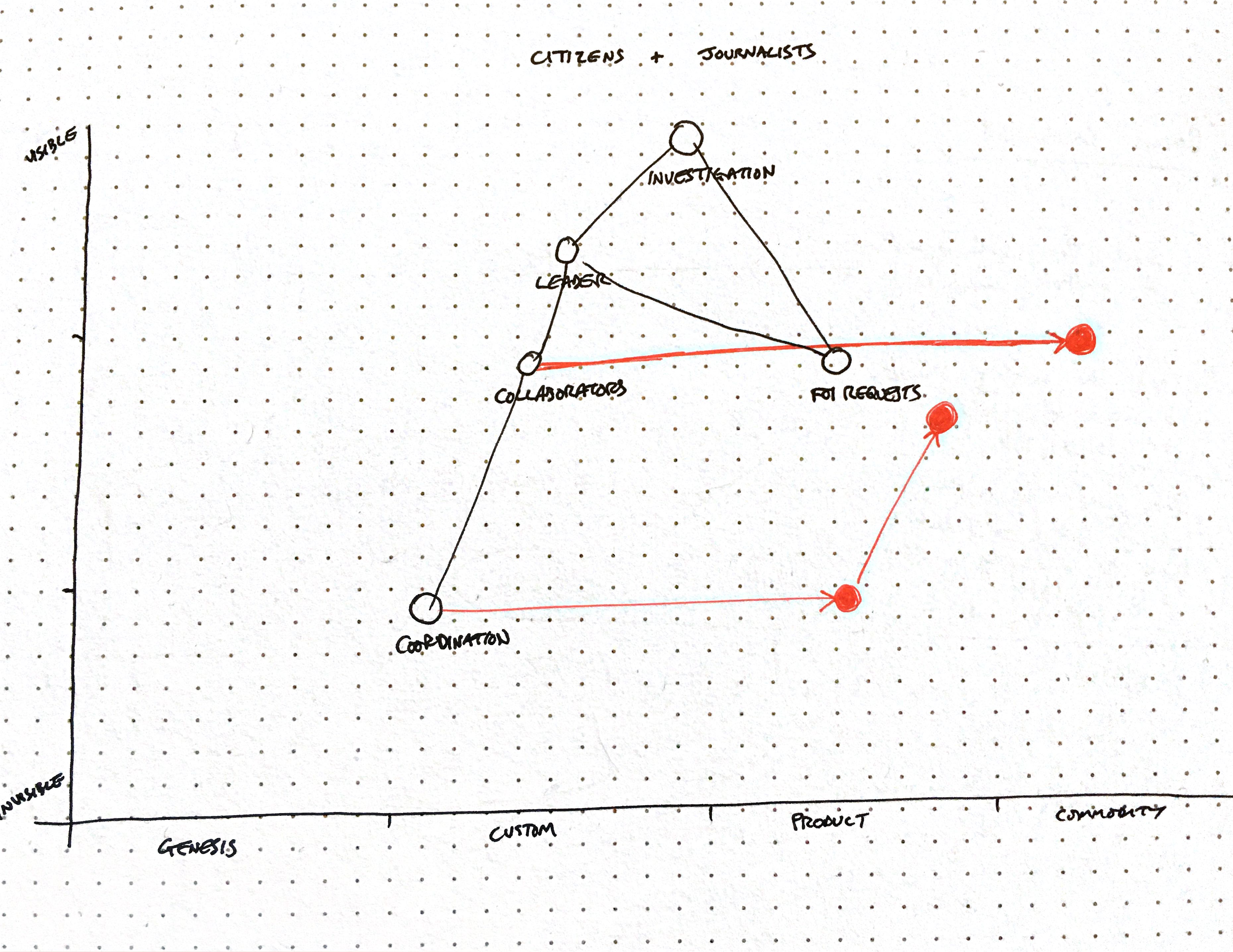
We can also use these to show a sequence of steps we might make. For our current work on connecting citizens and journalists through Projects, we could look at trying to productise the creation and coordination of projects (right now we need to create them through the application console) and then make them more visible on the platform (there’s no way of browsing projects yet). Or, we could look to use WhatDoTheyKnow’s huge user base to basically commoditise project contributors, though to do that we can see there’s a dependency on the coordination side that we’d have to tackle first.
This is about the extent of my use of these, but already they feel like a much better fit for how to think and talk about more exploratory programmes of work.
Communicating Outwards
The GDS-style “Now, Next, Later” roadmap doesn’t really convey the uncertainty involved with exploration. I don’t know the original intent, but every time I’ve seen a “Now, Next, Later” roadmap people read it as relatively linear and immutable, but in reality you must account for new information and the world changing around you.
I’ve written about why this never worked for us at length in the past, but haven’t been able to find anything that actually helps us communicate how we’re thinking about our direction of travel.
One way that might be useful to convey this is by ordering by uncertainty rather than time. I’ve experimented with this within an individual project, but that ended up being too granular to show a birds-eye view of progress.
Using the “GDS” model, we really ought to think about the things further out on the horizon as “very unknown” and significantly less likely to work out as we think they might right now.
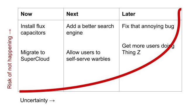
This would set much clearer expectations for people trying to figure out where something is its development and how likely it is to ever make it to completion. We might find that “Thing Z” is completely the wrong thing to do after we’ve allowed our users to “self-serve warbles”.
The time-based approach to column headings totally doesn’t reflect this risk or where the “items” are in terms of certainty. What seems to happen is that “Now” and “Next” are a collection of things at the top of our minds, and “Later” is just a dumping ground for everything else.
Looking back at our 2017 roadmap, our “Now” contains a huge variety of tiny tickets all the way up to huge fuzzy goals. This made it incredibly difficult to figure out how to coordinate the work.
My current thinking is to frame these columns in terms of what “parts” of the uncertainty we’ve uncovered. We can think of that in terms of demand and supply.
The demand side of the problem is our understanding of the progress actors are trying to make. This is solution independent, and often situational.
The supply side of the problem is our actual implementation that enables the desired progress. There’s almost always more than one way to enable demand-side progress, so we really need to shape our solution in a way that trades off the value to users and cost to us.
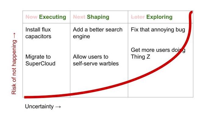
- Executing: We know what the problem is and how to solve it. (
+demand,+supply) - Shaping: We understand the problem but we need to figure out what solution we think will solve it (
+demand,-supply). - Exploring: We have a sense of an area of interest, but we don’t really know how we can help (
-demand,-supply).
Framing our current work in terms of these components gives a much clearer indication of the type of work each requires, and attempts to show what the pipeline of future work might look like, given what we know now.
All this is pretty early thinking, but it feels like framing our current work in terms of these components gives a much clearer indication of the type of work each requires, and attempts to show what the pipeline of future work might look like, given what we know now.